Far-sighted
This eyewear store discreetly demarcates between two areas of business. The look is modern but restrained

Fitting out a new retail store requires a careful consideration of the type of products to be displayed. Of equal importance is the feel of the new environment in terms of the patron group it is designed to attract.
Eyewear@Milford is a new mall retailer outfitted from scratch by architectural firm Wingate + Farquhar. Project designer Emily Bell-Booth says the design addresses several of the client's retail strategies.
"The client has two areas of operation one for spectacles and consultations, and the other as a sunglasses retailer," says Bell-Booth. "We subtly demarcated these areas by introducing two individual entrances, separated by a dividing wall."
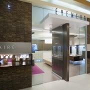
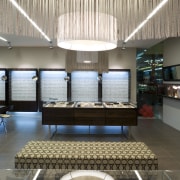
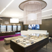
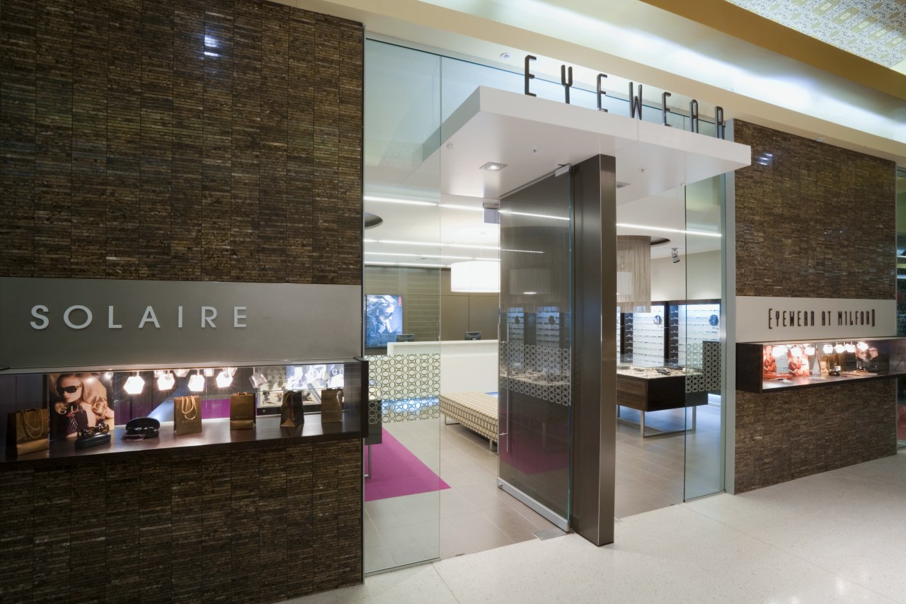
The storefront also differentiates between the two core business, with the smaller frontage to the left displaying sunglasses and the shopfront to the right showcasing spectacle frames. Inside the shop, a chaise longue separates the two different areas and a magenta carpet further delineates the sunglasses section.
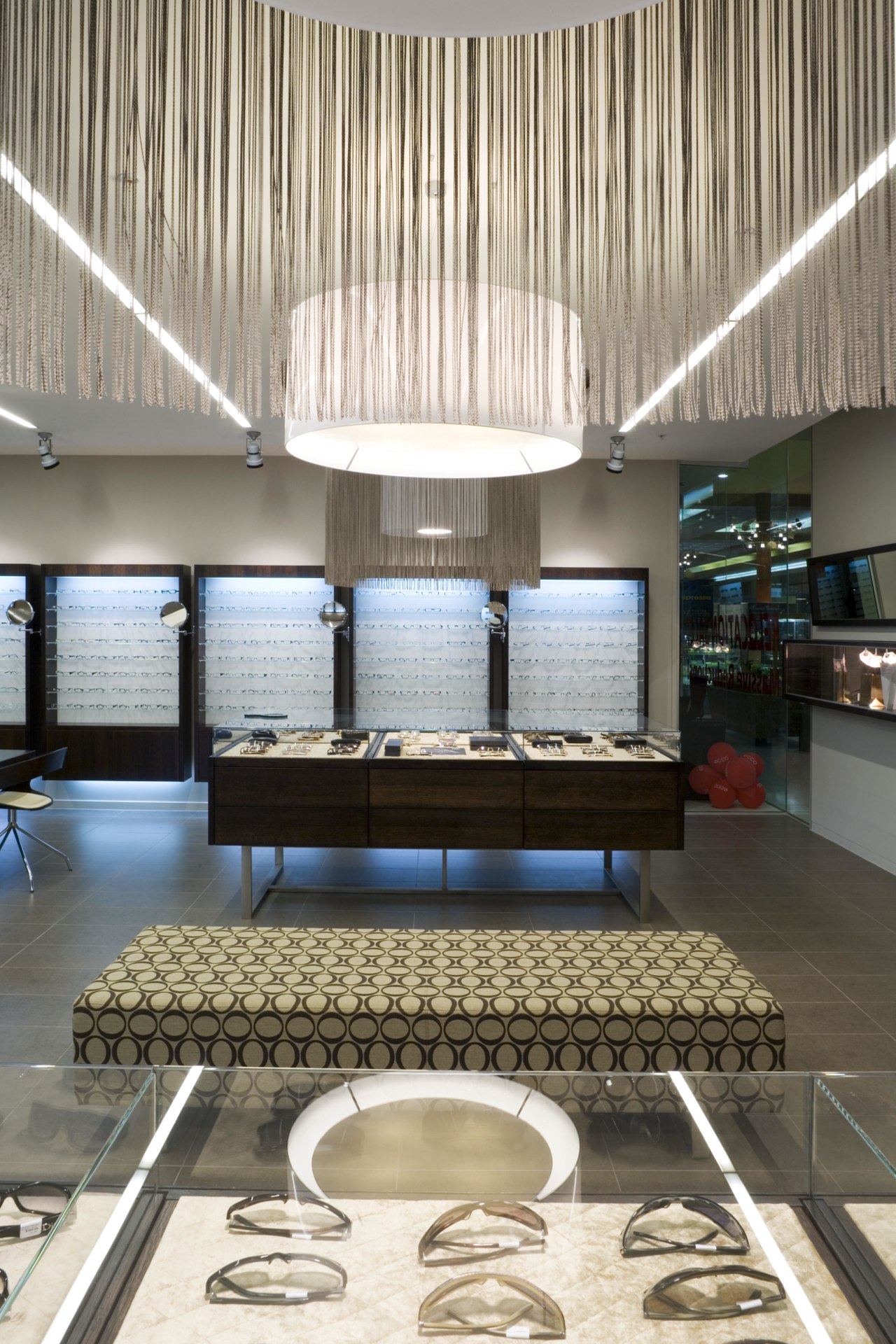
"We specifically looked at the frontage in terms of the articles to be displayed," she says. "Instead of a floor-to-ceiling glass window, we narrowed the display areas to narrow horizontal display windows. This plays up the eyewear's small, intricate nature giving shoppers the sense they are looking at a precious jewellery display."
This impression is furthered by the detailed mosaic tilework that frames the window displays. The reflective tiles create a rich, dignified facade well-suited to a prescription retailer and purveyor of name sunglasses.
The rich exterior avoids a jazzy look that might have put off the elderly customers who are also patrons of the eyewear specialist. A look of exclusivity also appeals to those entering the shop for consultations.
"The interior has a restrained feel, with neutral wall colours and a notable lack of sunglasses signage around the walls," says Bell-Booth. "With sunglasses, packaging is often part of the product attraction. The client wanted the cases themselves to act as signage for the brands, particularly in the floor display cases reserved for the most exclusive ranges."
These floor displays are lined with a luxurious velvet quilting, to add to the refined look of the eyewear. Both floor display cases, one for spectacles, one for sunglasses, are illuminated by fringed luminaires.
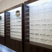
"Wall display cases were also given strategic consideration," says the architect. "Spectacle arms have increasingly become a feature of these products and we created deep display shelves so the products can sit with arms opened out to full effect.
"We also chose not to back-light the cases, as this would have silhouetted the glasses, making them difficult to appraise."
Credit list
Architect and interior designer
Shopfront cladding
Cabinetry and veneers
Cabinetry and veneers
Flooring
Furniture
Signage
Story by: Charles Moxham
Home kitchen bathroom commercial design
