Escape route
An extensive renovation to this city house has given it a strong street presence and created a private sanctuary for the owners

Not every renovation project involves an older home that is past its use-by date. Sometimes even houses that are just a few years old can benefit from a remodelling project that better suits the needs of new owners.
This city house, built in 2000, already had a strong presence on the street, thanks to its solid, two-storey form, and its position right on the boundary of the corner site.
But the overall impact of the architecture was somewhat reduced by its traditional white weatherboard exterior, says architect Andre Hodgskin of Architex.
"The exterior would have been designed to fit with the neighbouring cottages, villas and bungalows," he says. "There were many positive features, however, including its position on the boundary.Having the house on one side, created a sunny courtyard. The building also had good bones. It was very solid and severe on the street, with just a ribbon of windows that allowed the roof to be read as a floating plane."
But Hodgskin says several of the key architectural features were not maximised by the white palette, including the soaring end of the roof.
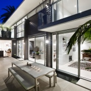
"We went to the other extreme, painting the exterior dark charcoal, almost black. This accentuates the roof form and gives the house a much stronger, and more dramatic presence on the corner."
Because the owners had requested the house be a city oasis much as their beach house was a seaside escape the architect added a privacy screen to the courtyard. Made from a folded, woven acrylic panels, the screen is backlit by the sun by day, and uplit at night. The courtyard was also remodelled to create a seamless link with the interior.
In keeping with the need for a more open, spacious layout, the interior was gutted, and several walls and part of the upper floor were removed. This ensures the house has open circulation areas rather than closed-in hallways.
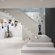
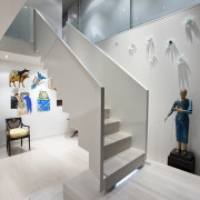
The front door now opens to a central, double-height atrium with a sculptural staircase that appears to float within the space.
"The stairs seem to hover above a plinth, which was dictated by the relatively tight space," says Hodgskin. "The stairs needed to turn, so we explored different ways to create a landing. The plinth makes the stair more imposing and the space seems larger."
All the living areas flow from the atrium the kitchen is near the staircase, in the former dining space, and is much larger than the original.
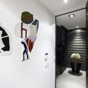
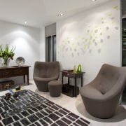
Despite the open-plan design of the interior, there are several large walls that form a backdrop for the owners' extensive art collection.
"A black, charcoal and white colour scheme extends through the house and into the courtyard," the architect says. "It's a subdued palette that allows the colourful art to be showcased. We also paid close attention to the finishing and used negative detailing to enhance the sleek, simplicity of the design."
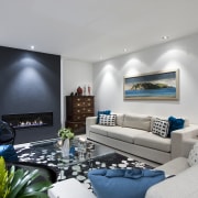
In the main living room, the fireplace was moved to an internal wall to improve the seating layout. Extending to the upper level, a plastered, charcoal chimney form visually links the two floors.
"Most of the upper level is given over to an extravagant new master suite," Hodgskin says. "This space was extended to allow room for twin bathrooms, a private seating area and a small balcony."
Other rooms on this level are a guest suite and a study that can double as a bedroom.
Credit list
Builder
Kitchen manufacturer
Wallcoverings
Furniture
Kitchen cabinetry
Oven, cooktop, refrigeration and dishwasher
Kitchen designer
Roofing
Wood flooring
Paints
Lighting
Benchtops
Ventilation
Story by: Colleen Hawkes
Photography by: Kallan MacLeod
Home kitchen bathroom commercial design
Marvellous in marble
Thrice as nice
The beauty of understatement

