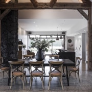
Country retreat
Adroit functionality and seamless integration were watchwords for this family kitchen with hidden scullery forming part of a rustic home
Designed by Davinia Sutton, Detail By Davinia Sutton
From the designer:
Our homeowners envisioned a kitchen design that respected and blended effortlessly into their architecturally designed, rural family home.
Functionality was a key driver to accommodate the family’s daily routine as well as larger social gatherings.
There was also a strong desire to create seamless integration and connection between the main living and entertaining areas beyond the kitchen space.
The design response focused on capturing the essence of the detailing throughout the architecture.
It was imperative to utilise natural materials, colours and textures to establish and reinforce the strength and presence of the kitchen within the open plan living area.
The kitchen is situated at the end of a large living and dining space reinforced with visually dominant recycled bridge beams.
As a result, the kitchen design had to respond confidently to that spatial context and be well grounded with its layout and detail.
The layout of the kitchen comprises a spacious galley format, complemented by a hidden pantry space beyond.
This kitchen design accommodates the needs of the owner's family unit but is also capable of expanding to allow several users to work simultaneously, thereby catering for larger family gatherings.
As a focal point, the island joinery is wrapped in horizontal crown-cut American white oak, stained in a darker tone, adding texture and defining the kitchen zone from the dining.
To provide a depth of form to this joinery, solid oak timber is stretched out to create an informal eating space at the end of the island area.
Applied in the same tone as the island joinery, it plays on a clever mix of horizontal and vertical lines, producing an informal practical space for some of the family to connect.
To further add to this hierarchy of layers, Natural Antique Brown Granite with a textured finish forms the benchtop surface to the island, as well as the cook zone and splashback.
Situated parallel to the island, the cooking zone joinery is contrasted with a natural warm off-white lacquer to imbue a sense of freshness and space.
This also establishes a seamless flow into a hidden pantry zone – the functional workhorse space behind the scenes.
Opposite the pantry entry, tall units with integrated refrigeration and a smaller breakfast pantry provide a practical solution to accommodate the rush of a busy morning schedule.
These units are fully integrated and therefore help to define the clean lines and attention to detail of the back wall area.
The combination of finishes, layered forms, mitred details, the tone and texture in the striking concrete floor, and the choice of fully integrated appliances results in a design that looks resolved, uncluttered and sharp.
The overall design is strikingly modern and yet retains the rural flavour of the home and respects the layered forms of the surrounding architecture.
The kitchen is the focal point of the large family and entertainment area and its functionality is fully embraced within the owner’s rural lifestyle and the day-to-day demands of the household.
Credit list
Handles
Benchtops
Taps
Flooring
Awards
Cabinetry
Kitchen sink
Oven, cooktop, ventilation, refrigeration, dishwasher
Lighting
Home kitchen bathroom commercial design
'Worthy of Architectural Digest'
Classic dovetails contemporary
Small space, big impact


