Community library in San Francisco on triangular site, set to achieve LEED Gold Certification
North Beach Branch community library in San Francisco by Leedy Maytum Stacy Architects with soaring interior, view corridors, ESD features

Design by community it sounds challengingand it is, but the consultation that went into the development of the master plan for the new North Beach Branch Library in San Francisco was key to its success.
The new library, designed by Leddy Maytum Stacy Architects, replaces a 1950s building that was overcrowded, seismically unsafe and separated on four levels, which meant it was not fully accessible to the public.
Architect Marsha Maytum says the resulting design for the new library followed the input of hundreds of residents at 35 meetings.
"The modern library is essentially a community living room," she says. "It's a place for interaction and exchange, and a whole range of community activities, as well as a place for reading and learning through different media experiences. The new library needed to provide such facilities, and it needed to address the immediate neighbourhood."
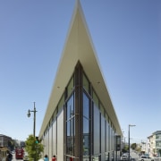
Rather than position the library exactly where the original building was, within a park, it was decided to place it in a far more strategic position a triangular site at one end of the park, at the crossroads of two leading city thoroughfares, Columbus Avenue and Lombard Street.
"This is a significant crossroads in the city, in an interesting and diverse neighbourhood," says Maytum. "The surrounding buildings are a mix of Victorian row houses and low commercial buildings, so we chose to provide an urban edge on the two sides that address the streets.

"The library's massing and articulation responds to the rhythm, proportion and patterns of these buildings, offering a modern interpretation of the local architectural vernacular. Tall, narrow windows and large-format tiles on the exterior reinforce the rhythm of the heritage buildings, yet there is a sense of connection and transparency, which was a key focus for the design."
The building also addresses the park a narrow lane was closed off behind the library to create a pedestrian precinct, which is where the main entry was positioned. This creates a direct link with the rest of the park and the Joe DiMaggio Playground.
Maytum says the library was also designed to maximise view corridors to notable San Francisco landmarks, including Coit Tower, the spires of two churches Saint Peter's and Saint Paul's and the Transamerica Pyramid Tower.
"We provided large areas of glazing at the nodes of the triangle, like urban lanterns, which respond to the views and also to the program inside. The sharp end of the building at the crossroads accommodates the children's area, while the other two corners are the adult and teen reading rooms respectively. Children can look out and see cable cars and busses passing by there's a lot happening right outside the windows. Windows in the teen area look out to Telegraph Hill, the Coit Tower and down to the Bay."
The interior also reflects the desire for connection and transparency. There are sightlines through the building, as well as to the outside. And the reading rooms are soaring, double-height spaces with exposed trusses and services.
"I myself carry memories of the great reading rooms in libraries I visited as a child," says Maytum. "These were very uplifting and inspiring spaces, and this was the idea behind creating such a volume in this library."

The extra height helps to maximise the natural light, in line with the client's desire for a sustainable design. With sustainability also embedded in the architect's own practice, it was a natural part of the design process. The building is on track to receive LEED Gold Certification.
Other key features include photovoltaic solar arrays on the sloping roof, high-performance and acoustic glazing and natural ventilation. Sunlight on the western side has been minimised to prevent heat build-up in the afternoons. The library also features low-VOC and rapidly renewable materials, such as bamboo for casework, panelling and tables. Reclaimed walnut features on the stairs and benches and lineoleum floors were specified.
In line with the more community-oriented nature of the modern library, there is a public meeting room on the second floor. This is used for a variety of events, including children's story times and cooking classes, teen tutoring, after-school sessions, book groups, poetry reading, language classes and computer literacy for seniors.
Maytum says raising the profile of a public library has had enormous spin-offs for the library operation and the wider community. Since the library opened, circulation is up 33% on the preceding year and registration for new library cards is up a massive 69%.
Credit list
Location
Architect
Structural engineer
Civil engineer
Lighting design
Environmental consultant
Main contractor
Story by: Colleen Hawkes
Home kitchen bathroom commercial design
Commercial Design Trends Vol. 31/7
Commercial Design Trends is aimed at our professional readers, and showcases commercial buildings. The book features reg...
Read More


