Character study
From the leafy bower at the entrance to the remodeled interior, this 1920s house has been redesigned to better suit a modern lifestyle

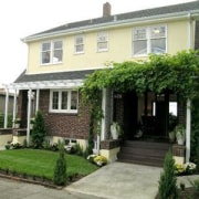


Every home has a unique selling point, and for this one, it was a spectacular view that sealed the deal for the new owner.
The house itself a 1920s Dutch Colonial with minor variations was less appealing, says designer-owner Steve Hoedemaker.
"In the 1950s, a freeway tunnel built nearby resulted in the house settling," he says. "Many of the floors were uneven. The house, which had been a rental for several years, also featured unattractive textured stucco walls and a dropped ceiling in the kitchen."
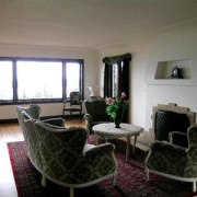
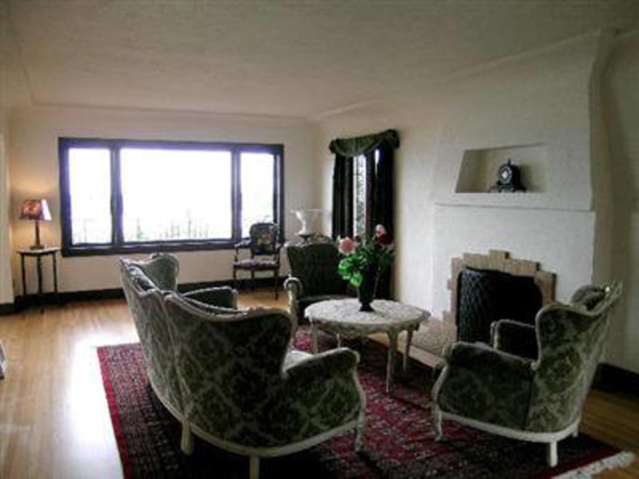
On the plus side, however, Hoedemaker says the main floor plan worked well, with an easy circulation through the generously sized living areas.
The designer says a key priority was to establish new landscaping at the outset.
"Because the house is very close to the street, I chose to screen it off with plants, which include a creeper, a new hedge and two parallel rows of dogwood trees. Three of the trees are on the grass between the sidewalk and street, and three are on the other side of the hedge. In time, these will form an attractive green canopy over the sidewalk."
The house, including the textured brickwork at the base, was painted a light shade to better highlight the greenery.
Keeping to the original footprint, the house was structurally reinforced and stripped back to its bare bones even the floorboards were replaced.
"Essentially, the interior has been made a lot simpler," says Hoedemaker. "But while I wanted to create a modern environment within an old house, it was important to respect its history."
To this end, the designer retained several key features, including the original windows and the fireplace in the living room, which features a decorative niche and painted tiled surround. An unusual coved edge at the top of the walls in the living and dining rooms was also retained.
"This is not traditional in any sense, but it is a distinctive element, so I decided to keep it as a quirky feature of the house," says the designer.
Several wide openings, including the opening between the living and dining rooms, were realigned, so they are now centered on the main axis of each room.
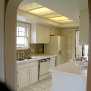
A new galley-style kitchen replaces the original space, which featured large appliances in awkward locations, and minimal storage.
"The room was a clutter of little cabinets the eye never had a chance to rest," says Hoedemaker. "It was important the new kitchen be as clean and simple as possible. Consequently, it is more like a butler's pantry, with all the large appliances integrated."
"The appliances take a back seat to the streamlined cabinetry and Carrara marble countertops. Even the microwave oven is concealed within an overhead cabinet."
The kitchen also features open shelving, with white plates and dishes complementing the white-painted cabinets.
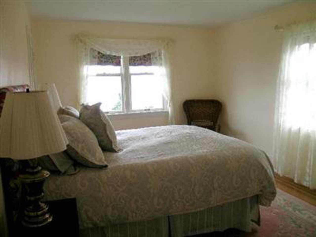
All the rooms, including the remodeled bedrooms and bathrooms, are painted in the same off-white shade that appears on the house exterior.
"I wanted the house to be visually restful," says the designer. "The objects and artworks within a house are more beautiful when seen against a neutral background just as the off-white exterior is a backdrop for the garden."
Credit list
Landscape designer
Builder
Flooring
Lighting
Lounge chairs
Coffee table
Dining chairs
Countertops
Sink
Oven
Structural engineer
Kitchen manufacturer
Paints
Blinds
Lounge sofa
Dining table
Kitchen cabinets
Backsplash
Faucets
Ventilation
Story by: Colleen Hawkes
Home kitchen bathroom commercial design
