Caving in to a good coffee?
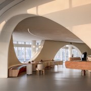
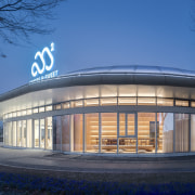
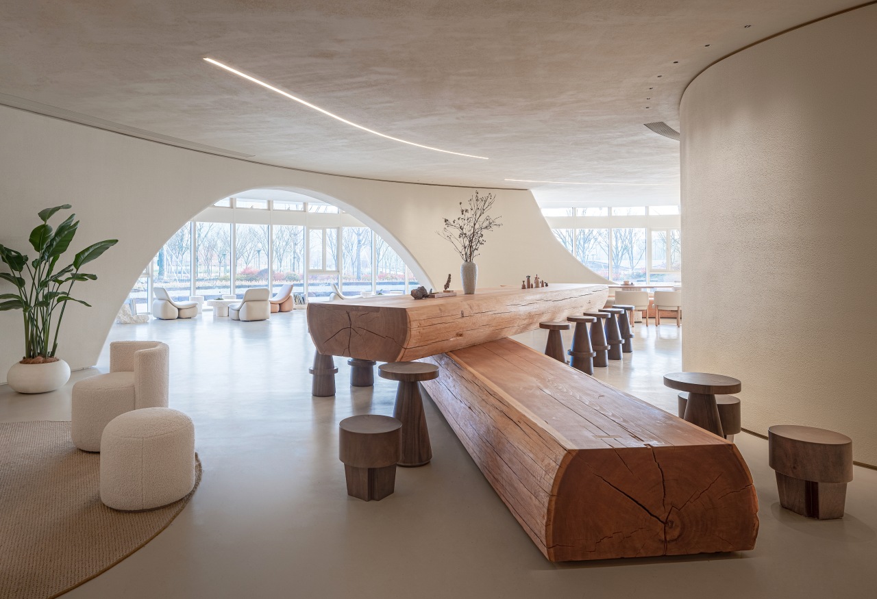
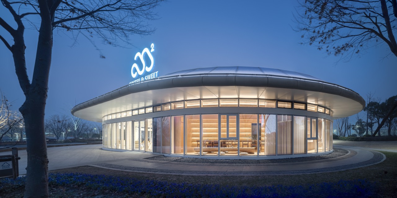
Cafe M²coffee & Sweet, by Dixia Architectural Design, looks out through arches to its park setting – but also looks inwards for a cosy, cave-like ambiance
Designed by Dixia Architectural Design
From the designers
M²coffee & Sweet is located in Jiaxing Xiuhu Scenic Area.
The design of this project aims to honour the strong natural atmosphere around the site and refine the natural elements and experiences around the site with a unified design approach.
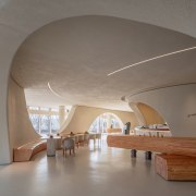
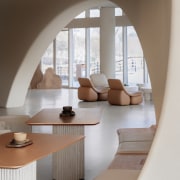
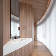
In order to extend the relationship between the arc-shaped building and the interior, rippling spiral strings are placed in the space, with softly curved walls connecting the structural columns of the site, and large-scale curved holes are opened on these walls – creating the feeling of exploring a cave when people can travel through them.
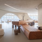
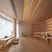
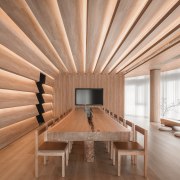
Following the curves into the inner boxes/spaces, the warm texture of the wood contrasts with the creamy white space outside, as if stepping into the depths of the jungle.
The natural elements also extend to the use of furniture, which is also the installation in the space – using natural stone and wood and organic curves to meet the function while imbuing the space with a texture and language that fits nature, and overall creating a more flexible emotional link for customers through interior finish and furnishing.
Project challenges
1. The column network in the space is irregularly scattered, which poses a great challenge to the plane layout.
2. The lower height of the original beam is 3.2m, and the height of the completion surface can only be 3m.
3. The whole building is relatively heterogeneous, or diverse, so the conventional straight wall cannot make best use of the scenery resources of the space.
Solutions
1. Connect the structural columns of the site with continuous and soft curved walls.
2. Continue the outer outline of the building and shift inward to better retain the advantage of the windows.
3. A transparent large space is designed to better extend the line of sight to the external scenery, and slowly open the large-scale curved hole on the curved wall, framing scenes to better help customers appreciate the scenery.
Credit list
Project
Award
Designer
Story by: Trendsideas
Home kitchen bathroom commercial design
Commercial Design Trends 40-2C
Keep up to date with what's happening in the commercial office, retail, hospitality, education market sectors and more, ...
Read More
