Brighten your home and mind with colour
When you’re looking to inject some personality into your room, there’s no better way to do it than with a dash of colour

By Edward Sloane, Managing Director of Sloane & Sons Stylish Chairs
The right hue can add vibrancy and life to the dullest space, or even make a small room feel expansive; but how do you choose the perfect colour from the multitude of choices available?
Studies have shown time and time again that colour can play a large role in mood. So if you want to liven up your home, then look no further: our round-up of colour profiles will help you narrow down the direction for your next decorating project or furniture investment.
____________________
Red
The colour of passion and confidence, red certainly isn’t a colour for the fainthearted. Ideally placed in a dining room, used sparingly the right shade of red will add vibrant energy to your next dinner party.

____________________
Yellow
Nothing brightens a room quite like the colour yellow. Youthful, warm and undeniably cheerful, consider using touches of yellow in your bathroom or kitchen to elevate the space – you’ll be amazed what a difference it can make.

____________________
Blue
A relaxing, soothing shade of blue is perfectly suited to restful spaces. Bedrooms, in particular, will benefit from the calming effects of this colour, but possessing such universal appeal, blue can be used to transform any room of the home. Adding a subtle hint of blue, perhaps in the form of a teal tub chair, can make a big impact on any space.

____________________
Green
With all the versatility of blue, but an added layer of warmth, green is truly an underrated colour in homes. Green has a comforting appeal and with its varying shades can make a room seem equally airy, cosy or fresh.

____________________
Purple
This rich, distinctive colour is often synonymous with royalty, for good reason. Purple simply oozes sophistication and creates warmth and depth in a room, ideal for entertaining.

____________________
Orange
While orange hasn’t been a colour seen in many homes over recent decades, it certainly has its place. The unbridled optimism and sense of freedom that this colour elicits make it a fantastic choice for home-gyms and children’s playrooms.

____________________
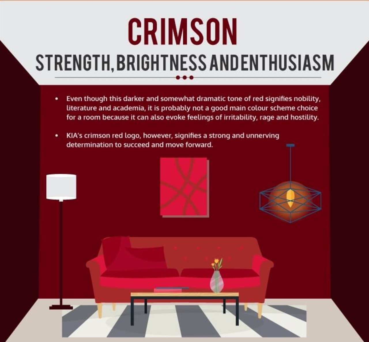
Crimson
Another underrated colour, crimson is warm and welcoming, yet serious. This deep, dramatic tone has an air of academia, making it an obvious choice for a reading nook or study.
____________________
Neutrals
With Scandinavian simplicity making a resurgence, the rise of neutral and monochromatic interiors has never been more apparent. A classy, restful neutral palette can’t be overstated, and with its timeless appeal, accentuating with pops of colour becomes effortless.

Story by: Edward Sloane, Sloane and Sons
Home kitchen bathroom commercial design