Blurring the lines
Traditional and modern styles are fused in this kitchen, for a clean and sunny look

Choosing a design direction for your kitchen is easier when you consider the rest of your home. Does the architecture suggest a kitchen with large features, or one with more delicate proportions?
The owner of this 1920s masonry villa wanted to retain the home's substantial, strong character.
"It was also important to have an open area where I could work and chat to family and friends, and an uncluttered space, with everything tucked away," she says.
Unusually for its time, both the flooring and the internal walls are concrete but otherwise the original kitchen was typical of the period, says designer Joanne Godding.
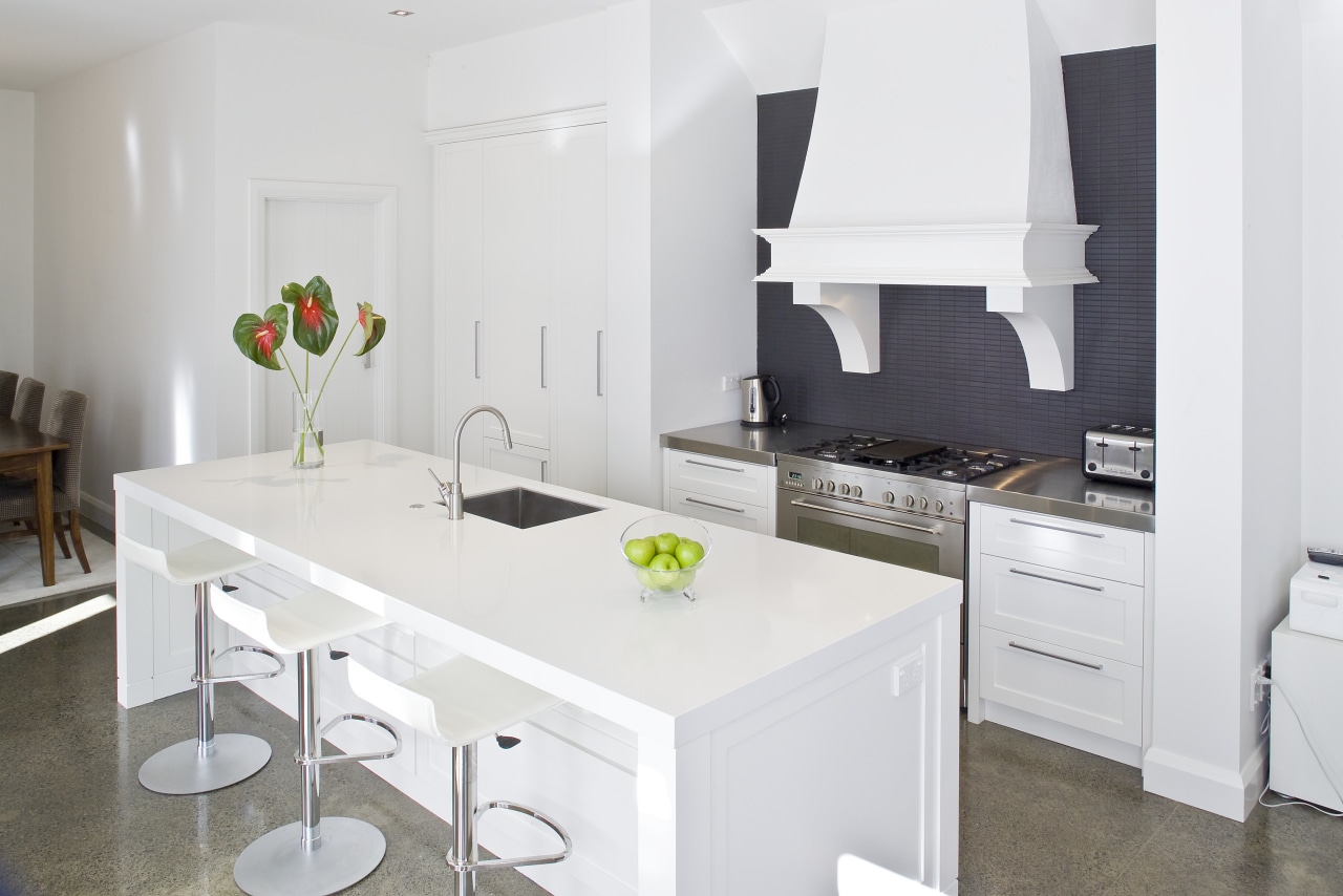
"The old kitchen was a little concrete room and the homeowner felt trapped in there she wanted a kitchen that was more open and interactive."
Crucially, Godding and the homeowner altered the architect's plans, to allow the kitchen to become the central element of the living space. With the new position established, attention could shift to color and form.
"I wanted to keep things simple and neutral and I felt that white was the only color that would suit the space in fact, the whole house is white. I softened it with a hint of black," says Godding.
The deep charcoal chosen for the elongated and honed porcelain tiles of the backsplash is echoed in the grey feature walls of the living area.
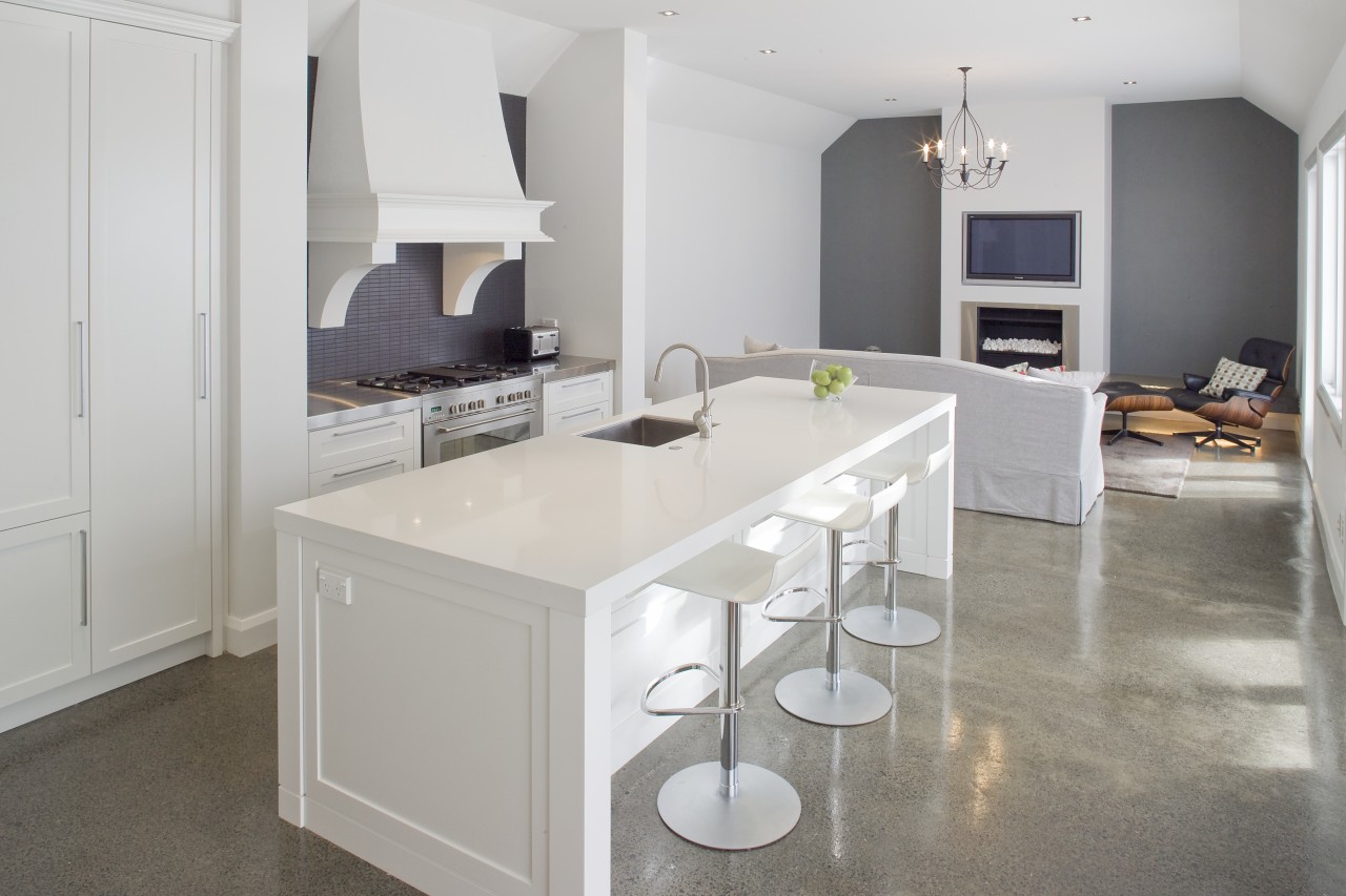
Other modern touches, such as the square sink and Silestone island top, are balanced by traditional features, such as negative detailing for the island posts and the framed door style of the cabinetry.
"We could have added internal beading on the doors, but I didn't want the kitchen to look overly traditional, or twee, so I've kept this detailing simple and masculine," she says. "Cutting-edge modernism wouldn't have worked either after all, this is a family home."
Credit list
Kitchen manufacturer
Range hood
Dishwasher
Cabinetry
Flooring
Faucets
Refrigeration
Backsplash
Countertops
Sink
Bar stools
Story by: Alison Wall
Home kitchen bathroom commercial design
