Black is the new black
An original, not to say quirky, design theme makes this fashion boutique a dead cert to stand out from the crowd
Floor space is an expensive commodity in High Street retail, and many vendors unsurprisingly opt for an interior design that optimises the sales potential of every square inch.
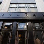
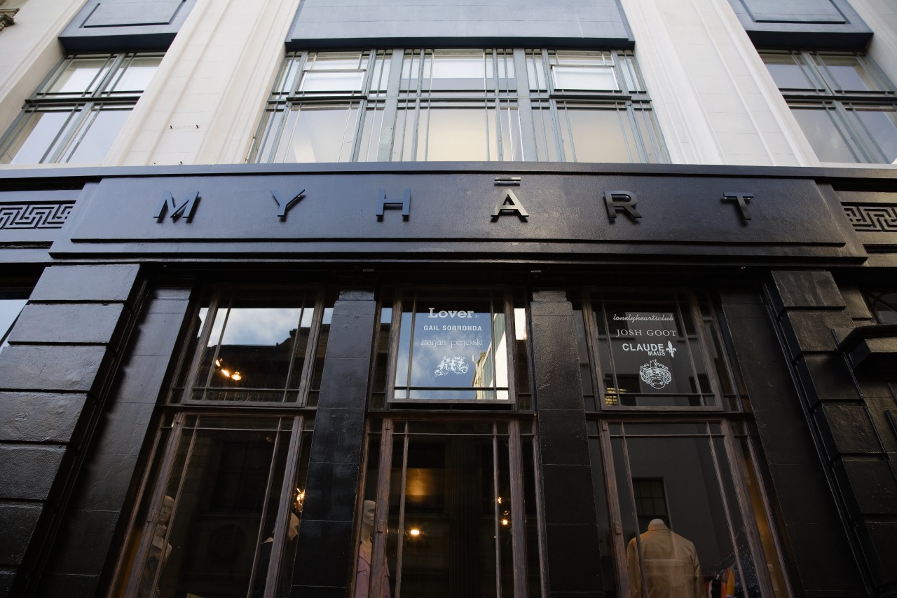
However, when Candywhistle designers Ben Wilkie and Craig Bond met the brains behind up-and-coming fashion label Lonely Hearts Club (LHC) to dream up a concept for its new Auckland boutique, it was exactly this hard sell approach that they chose to avoid.
"When people walk in to a store today, they are automatically put on thedefensive, because they are being sold to from the instant they enter, until the instant they leave. For the Myhart boutique, we wanted a design that would intrigue the customer rather than batter them with aggressive sales tactics," says Wilkie.
Candywhistle and the LHC designers came up with an edgy design concept secrets of the heart. With relative freedom from the usual sales imperative, Wilkie found the design process felt more like an artistic than a commercial project.
"A lot of retail design provides a proven and predictable answer to the question, How can this space shift product?' The approach with Myhart was to start with an abstract concept and work out laterally how to convey it through the design."
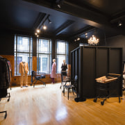
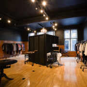
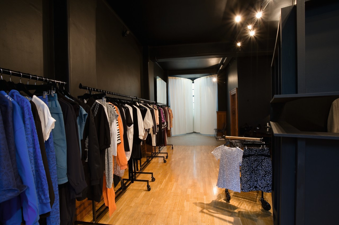
Given the dark undertone of the design concept, Wilkie settled on an anti-colour scheme of black. He describes the design narrative as non-linear; setting a scene intended, at least initially, to perplex. The central installation, a large, black crate, has a slot cut out of it which invites those who enter the boutique to indulge their voyeuristic curiosity and take a peek at its interior. "You feel like perhaps you shouldn't be viewing, what you are viewing. That you've let yourself in on a forbidden secret," Wilkie explains.
The intended effect is guilty pleasure perhaps the same as the emotional response to discovering a little-known, high-end fashion boutique and giving the credit card a bashing.
Wilkie wanted to incorporate disparate, found and modified objects into the decor and uniformly recontextualise them by painting them black.
"The idea is that everything looks the same in the dark," says Wilkie.
The sales counter is an antique, mahogany dining table, painted gloss black with one end cut off at an angle where it attaches to the wall. Wilkie says he chose the table because it infers the secretive transactions made over a clandestine dinner.
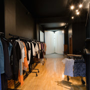
The shopping trolleys, which serve as display units, are borrowed from another, baser retail experience the supermarket. By replacing the plastic handles with solid oak dowel and painting them black, Wilkie elevates their value as objects to blend into the chic world of high fashion and in so doing pokes fun at the concept.
"You can tell a lot about someone from what you can see in their trolley, so their presence also refers to what constitutes individual identity," Wilkie says.
A huge mirror a more conventional element of boutique design hangs in the corner. However, functionally it does more than just accommodate the prissing and preening of customers. It helps integrate the corner space, where the changing areas can be found, into the central area. As the windows are obscured behind the white, changing area curtains, the mirror is also used to direct light into the boutique. In addition, the reflection visually completes the semi-circle half-made by the curtain of one of the changing areas.
Story by: Trendsideas
Home kitchen bathroom commercial design
'Hygge' in the highlands
Playing with blocks
Holidaying at home

