Bento box
Japanese cooking is an event in itself, so for this Hollywood restaurant the focus is on the chefs, while aesthetic design elements reflect a refined Japanese style
Japan is renowned for its simple and refined design aesthetic, and its cuisine is no exception. Japanese food is always neatly packaged, and in terms of flavour, it is both simple and refreshing.
As one of three Katsuya restaurants opened in Los Angeles for master sushi chef Katsuya Uechi, Katsuya Hollywood is designed to reflect the idea of a Japanese bento box, like the ones served in the restaurant. The interiors were created through a collaboration between designer Philippe Starck, the SBE design teams, and architects DesignArc. Chief creative officer at SBE Theresa Fatino says that despite the requirement to create a high-end and exciting new concept, the focus of the restaurant had to remain on the food.
"This is why the bento box concept fits. Bento boxes can appear like jewel boxes and the most expensive of them are created from exquisite materials, such as silver leaf or lacquer. Despite this, they are strong and simple in form, and create surprise. The presentation of the food is the most important," she says.

The interior design is based around symmetrical lines and geometric shapes. The ceiling and walls are hemlock wood veneer, giving the impression of an ornate lid placed over the contents.
"All the seams between these wooden panels line up, which reduces the amount of visual activity in the space. The square stone floor tiles also reflect the shape and seaming of the wooden panels," says Fatino.
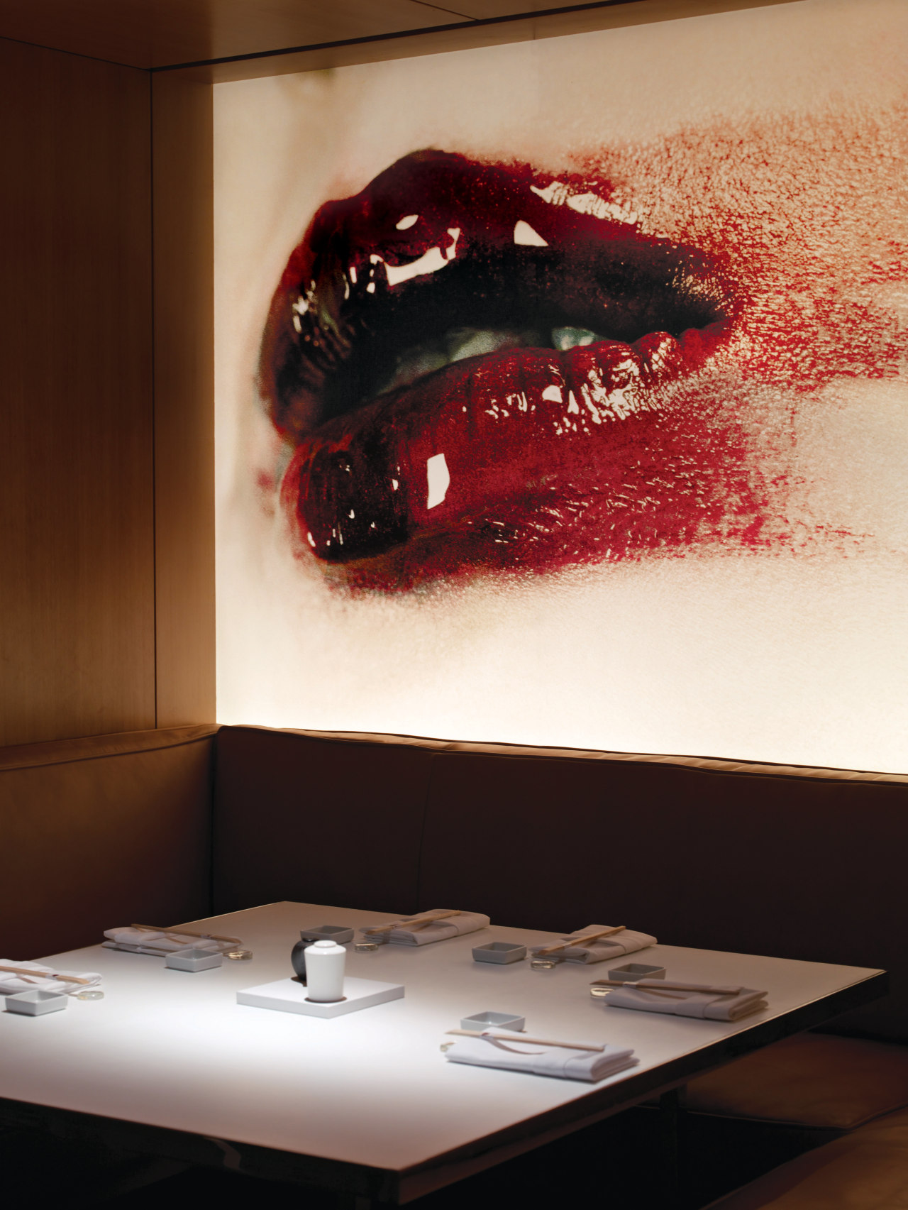
The most obvious and prominent feature of Katsuya Hollywood is a series of oversized, close-up Geisha prints that adorn the walls. Fatino says the thought process behind these images is that the restaurant patrons when inside become a part of the Geisha, which is representative of all things Japanese.
"They are enveloped by the Geisha. She gives a sideways look in one corner, a wry smile in another, and the customers are a part of that."
Furniture is designed and selected by Philippe Starck to reflect the ideals of Japanese design, while also providing comfort. Thonet chairs have comfortable curved backs and arms, while the Vitra chair combines white-painted angular metal legs with wooden seats for a soft contrast. Aluminium Emeco chairs are also used.
When putting the design into action, particular attention had to be paid to the needs of the chefs. Japanese chefs take their jobs very seriously, and hold the belief that their spirit is carried in their knives. Designers and construction staff working on the project had to respect the sacredness of the cooking spaces. In one area, a black Noren forms a shrine to the sushi chefs.
Credit list
Developer
Designer
Mechanical and electrical engineer
Window coverings
Ceiling
Kitchen consultant
Acoustical engineer
Story by: Camille Butler
Home kitchen bathroom commercial design
Thrice as nice
Marvellous in marble
The beauty of understatement


