All grown up
This kitchen forms part of a lifestyle expanding renovation – the bright new kitchen facilitates flow and reflects the lines of the expansion
Designed by Tim Hogarth, Box Build
From the designer:
Anyone who has teenagers will understand the need for a home that is bigger than 100m².
When the owners bought their 1920s bungalow 16 years ago, adolescent antics weren’t part of the priority list.
The brief was to expand the small house on the modest Ponsonby site, while offering something contemporary and compliant in the strict heritage zone.
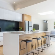
The small galley kitchen was demolished and replaced with a bigger, brighter kitchen with an island bench, extending the existing home's small footprint.
The owners wanted a modern kitchen, beautifully balanced with generous bench space – enough for the couple and their two children to express their creativity on the culinary stage.
The new kitchen has been strategically located in the centre of the extended and renovated home.
The brief was to create a harmoniously shared relaxed space where the family could congregate, cook, and commune.
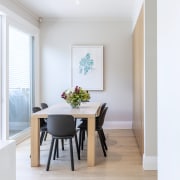
This resulted in a floor plan that combines an open-plan living room and dining room off the kitchen, a space to gravitate and relax in the evenings.
The kitchen is spatially conceived as a bridge between the old and the new, as the space straddles the existing bungalow footprint and the new extension.
This transition is expressed with the changing ceiling heights, higher in the old, and lower in the new, with a large skylight at the end of the island.
The home feels spatially larger due to the close proximity of the large west-facing deck, which captures the summer light for long, entertaining dinners.
The material palette is a sympathetic warm mix of black, white, and timber.
Birch plywood timber lines the full height cabinets and the island fronts, linking both areas of the kitchen together.
Thermoformed white melamine is zoned to the top and bottom cupboards to the back benchtop.
A benchtop mix of lightly marbled white Silestone, satin-finish stainless steel and a black granite splashback ties everything together.
The owners describe the alterations as 'life changing' – for example, there is now a much appreciated separation between generations.
The sweet little house the couple fell in love almost two decades ago is now all grown up.
Credit list
Kitchen designer
Splashback
Taps
Ventilation
Dishwasher
Lighting
Cabinetry
Benchtops
Kitchen sink
Refrigeration
Flooring
Awards
Home kitchen bathroom commercial design
Classic dovetails contemporary
Tranquil waters
'Worthy of Architectural Digest'


