Addition of office and lab building, reception, and cafe at Synlait milk product company
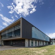
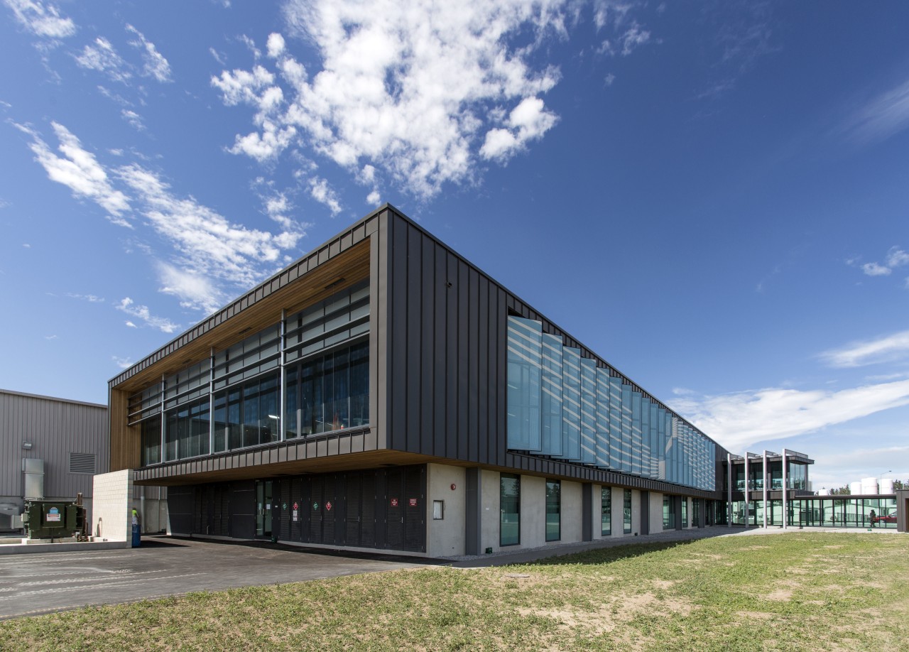
Simple cantilevered, steel-clad forms shape the new Synlait administration and laboratory building created by Calder Stewart Construction.

Keeping up with business growth means more than just expanding your facilities. Ideally, both the architecture and fit-out will also embody a sense of team connectivity and personal well-being that simply makes work a great place to be.
And such was the outcome with the expansion of the innovative dairy processing company Synlait. The complex project was undertaken by design and build company Calder Stewart Construction, with the near-simultaneous interior fit-out by Unispace.
Calder Stewart's base build included the addition of a two-level 3585m² administration and state-of-the-art quality-testing laboratory building connected to the existing dry store. The original, separate, administration offices were partly reinvented as a vibrant staff cafe and a reception-and-meeting rooms space was added between this and the new admin and lab facility all linked by a glass corridor. And to connect the admin building to Synlait's blending and consumer packaging facility and third large-scale spray drier, a high-level suspended walkway was built through the dry store.
Calder Stewart's lead designer on the job, Kieran Cooper, says one of the trickier aspects of the build was that the demolition of redundant structures and the construction had to be undertaken while Synlait was in full operation. Logistically, this meant stepping stages to fit around staff movements.
Another important consideration was building a temporary, pest- and water-proof wall on the dry store when it was opened up prior to connecting to the administration building that was underway.
The main challenge, however, was designing the labs on the ground floor. The extent of mechanical services that had to run up to the roof required careful design consideration.
"In terms of design and aesthetics, a key part of the project was to make staff feel great about their workplace," says Cooper. "As part of this, the admin building is oriented to take in the spectacular mountain scenery via extensive top-floor glazing.
"In particular, the main meeting room extends out over the glass corridor on the west facade. The box end provides an unobstructed view of the alps."
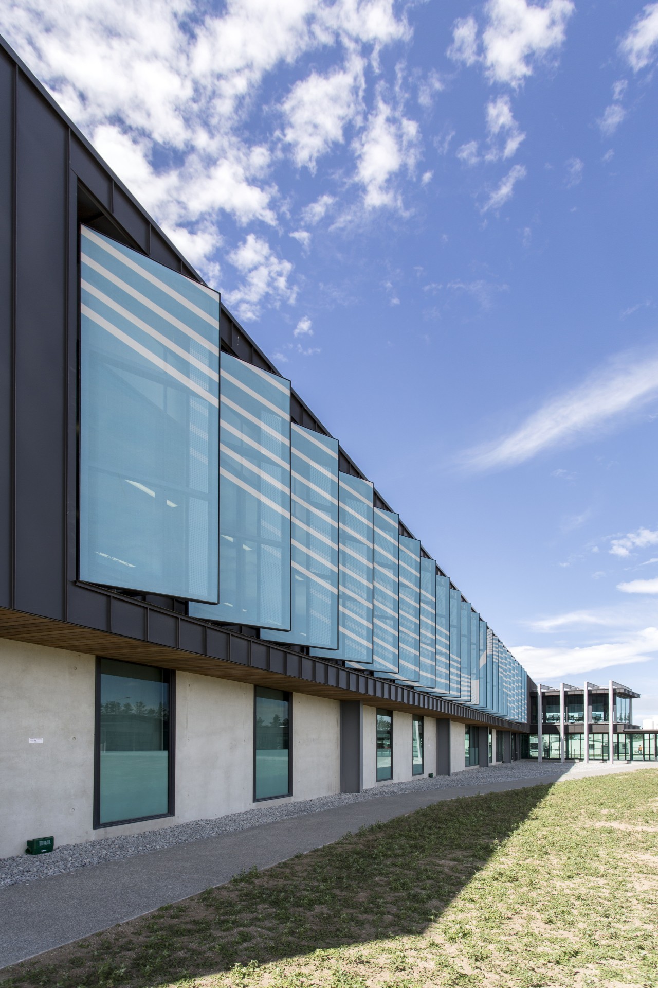
The admin facility's simple cantilevered design with decorative steel portals ties in visually with other structures on the site. And choice of materials also connects the building to its environment.
Bare precast concrete panels at ground level complement the existing dado panels on the dry store buildings. Above this, the Euro-Tray cladding connects to the use of profiled metal wall cladding elsewhere on the site and its use in the rural sector generally. The cladding's slate colour contrasts the white backdrop of dry stores and drying towers.
Cedar soffits on the main building and reception offices bring warmth to the design and, in the latter case, draw visitors to the new entry space.
Custom shade screens provide relief from the afternoon sun on the western fae§ade. While they don't obstruct views, they did provide the opportunity to splash the distinctive sky-blue Synlait swish logo along the length of the new building.
The interior design for the reception, the main building, and the cafe space went hand in hand with the base build. Unispace associate Steve Toomath was project leader on the internal fit-out.
The architecture created a sense of lightness, openness, and connection and also reflected the tones of nature, appropriate to Synlait's semi-rural setting. Both these features were continued and added to on the interior, says Toomath.
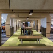
"The administration building is airy and open, and we maintained that feel in the fit-out. For example, a central communication highway, that runs right through the open-plan offices upstairs is framed by a wood pergola which doesn't quite touch the ceiling," says Toomath. "And while the pergola brings a sense of comfortable enclosure when viewed straight on, by turning 90 degrees the blades all but disappear, offering no obstruction to the views."
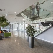
Over-arching wood was only one way of bringing the natural world inside. A dramatic living wall runs up both floors behind the stairway with its own irrigation system built into the wall behind just one instance of the base build and interior fit-out being in-tune from the outset.
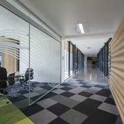
Furthering the natural connection, the central runway' also features green carpet tiles that echo the look of the rolling Canterbury plains. However, these change to black and grey in the work areas adjacent to this visual corridor.
And the egalitarian layout of the offices is another feel-good aspect of the design: everyone is part of the same open space executives included. The sense of connection extends to other areas of the facility, too, with a window introduced to look from the offices down into the dry store next door.
"The aesthetic is similar in the reception, while the cafe has a colourful, breezy look and opens to the outdoors," says Toomath.
The upgrade is summed up by Synlait's managing director and chief executive Dr John Penno.
"Staff response to the new spaces has been extremely positive basically, we came in and operated as a close-knit team right from day one."
Credit list
Designer and builder
Lab design and client representitive
Temporary walls
Mechanical services
Insulating panels
Lift
Partitioning systems
Office chairs
Veneers
Web chairs
Interior design and fit-out
Project management
Cladding
Walkways/platforms
Floors
Screens
Workstations
Blinds
Lighting
Story by: Charles Moxham
Photography by: Jamie Cobel
Home kitchen bathroom commercial design
