Adaptive reuse project transforms historic warehouse into modern commercial space
1920s Mason Bros engineering warehouse has been reworked as modern office spaces including project architect Warren & Mahoney's own studio
With staff numbers growing from 30 to 115 over the lease cycle of its existing premises, Warren and Mahoney (W+M) needed a new Auckland home. This would be a timely move for the practice, as it brought the opportunity for change, to enable a stronger engagement with partners, peers and the public.
With the benefit of a broad knowledge of the city's architecture and properties, the practice hit upon the adaptive reuse of the 1920s-built Mason Bros engineering warehouse at the heart of the new Innovation Precinct in the Wynyard Quarter.
There were many pluses to W+M's adaptive reuse of the warehouse as a commercial development, ranging from its location and historic character to its spacious interiors with plenty of natural light.
Principal Scott Compton says a key driver for the practice's new studio was to achieve a high visibility and sense of transparency both between staff and in particular to visiting clients.
"And our treatment of the warehouse and our studio within it succeeded in achieving this."
The approach to the adaptive project was to suspend a highly reflective gold-toned glazed form within the existing warehouse volume, while separating it spatially from the rugged brick and concrete walls maximising contrast between the historic exterior and the new rectilinear insertion.
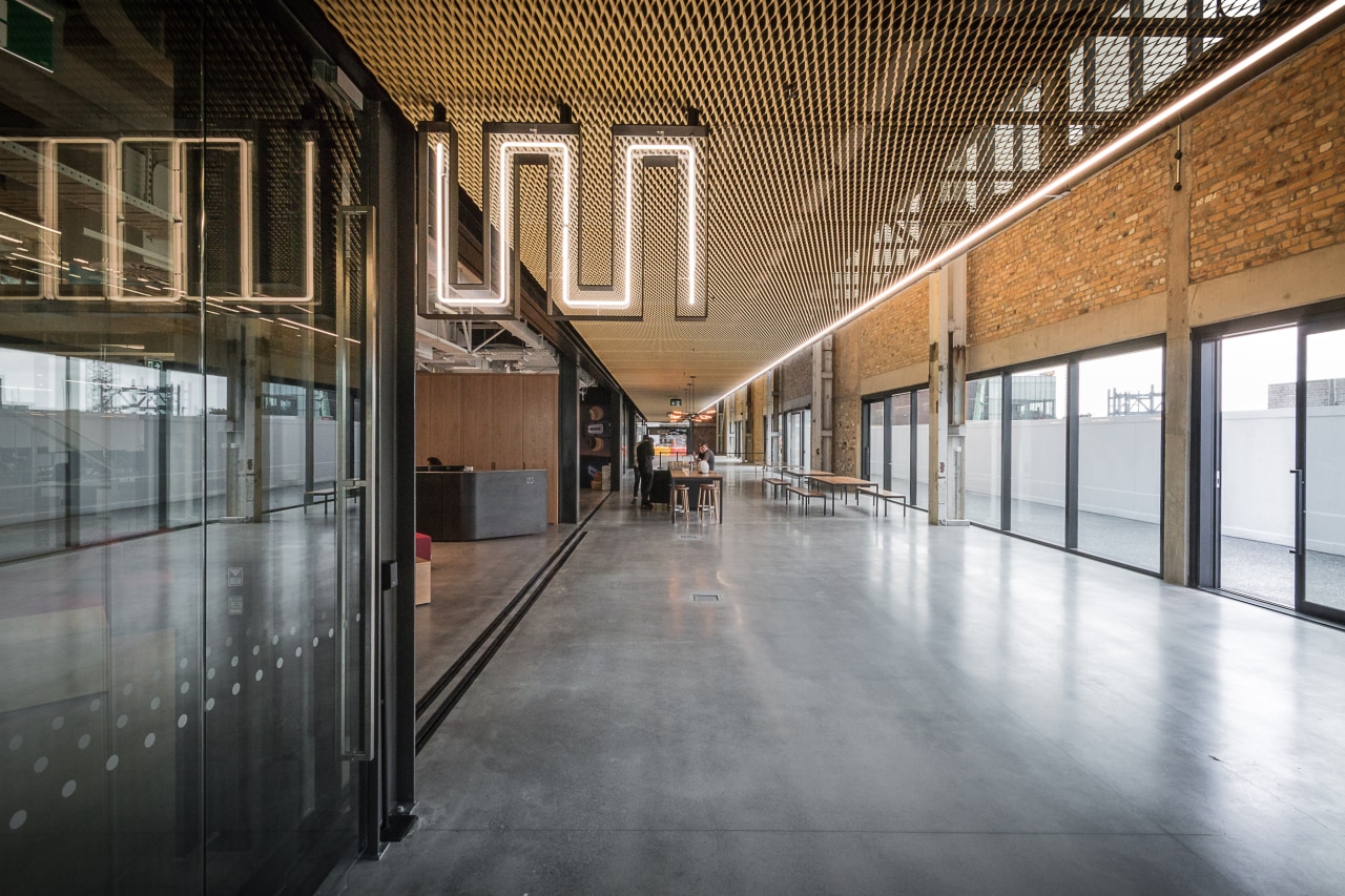
"The effect is like a ship in a bottle," Compton says.
The former character of the warehouse was retained, with the dramatic saw-tooth roof form dropping south light into a broad, 60m-long internal lane. This acts as an internal pedestrian link down the length of the building, while also providing a pedestrian thoroughfare.
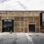
As well as retaining the saw-tooth roof and various pieces of a metal crane used in the warehouse building's first life, the facade brickwork was exposed and restored on two sides of the building, with many bricks taken out, to address glazing, and then carefully replaced. This was not a case of simply sandblasting back to brick.
The front of the building is much as it was, restored with new windows and a new entry door opening to the internal lane. Just inside the front door, and another echo of the past, visitors can see the tiled remnants of the original urinals although the beautiful tilework is not that recognisable for its original function.
"The rear exposed brick facade is punctuated by modern black aluminium insertions, much like angled, expressed window frames," says Compton.
"These allow occupants to enjoy light and views from what may have otherwise been the darker end of the building if overshadowed by construction in the future. These metal insertions further contrast the old with the new and add a sense of intrigue and glimpses of the interior from the street."

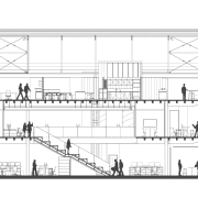
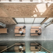
The building delivers approximately 5700m² of commercial floor space over three levels, with lower and upper levels connected via triple height spaces and an upper level glass balustrade offering views down to ground level.
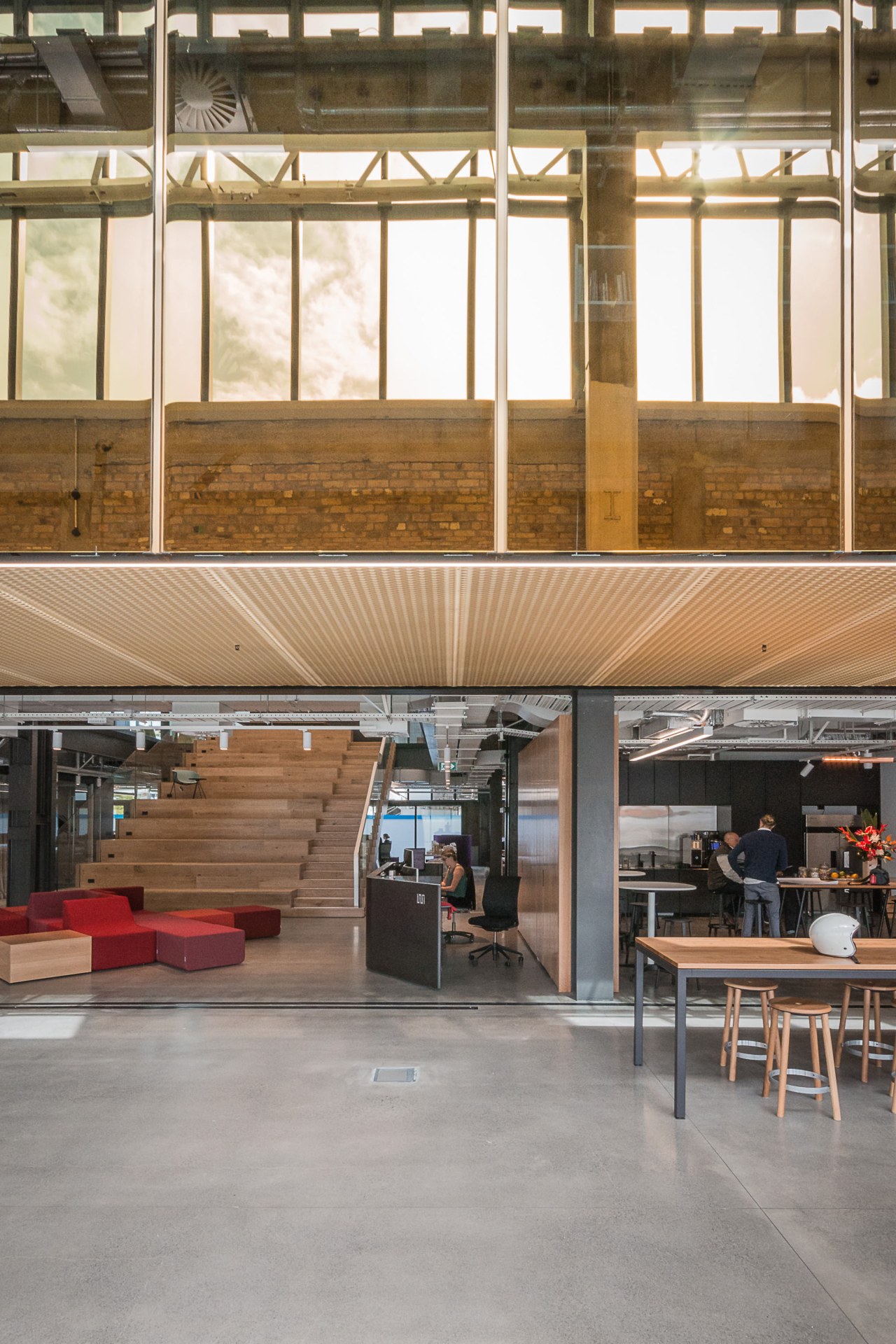
On entering the building from the south with the lane straight ahead and Warren and Mahoney's own studio directly to the left, the realised potential of the fit-out for the architects is clear transparency plus. The architects' studio is completely open to the laneway at this level.
In a similar design move to that seen in the practice's recently completed Christchurch studio, a central auditorium staircase acts as a town hall, and is used for meetings, proposals, film showings, or social gatherings. The only buffer between stair and the public-use internal street is a grouping of colourful modular furniture.
To the right of the staircase is the reception area, while to the left is the board room, walled in glass as another example of internal and client-architect transparency. Natural light flows right through the boardroom from the front of the building, adding to the natural light in the auditorium space. To bring even more light into this southern end of the building, two illuminated ceilings were introduced, one within the boardroom. The more private, confidential aspects of client business are conducted on the upper level.
The fit-out aesthetic is as bold and honest as the warehouse it inhabits. Finishes are mainly concrete and glass together with stone accents and blackened steelwork all appropriate to the setting.
Directly beside the expansive opening to the architects' studio, and separated from it by an internal wall, stands the staff kitchen. Traditionally a utilitarian, private space buried at the back of premises, here it takes front stage and even spills out into the laneway. The cafe provides a place for architects, designers, clients, and the public to all mingle and enjoy the classic-meets-contemporary space the perfect symbol of egalitarian work relationships and community spirit.
Credit list
Developer
Studio fit-out
Civil engineer
Quantity surveyor
Fire consultant
Facade design/construction
Lift
Ceilings
Furniture
Architect
Construction
Mechanical and electrical engineer
Landscaping
Cladding
Glazing system
Hardware
Partitioning system
Carpets
Awards
Story by: Charles Moxham
Photography by: Dawid Wisniewski
Home kitchen bathroom commercial design
Commercial Design Trends Vol. 33/2C
The Property Council New Zealand Rider Levett Bucknall Property Industry Awards are New Zealand’s premier commercial pro...
Read More