A new master bathroom suite gets an opulent touch by the simple use of black and gold
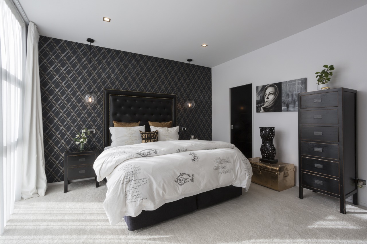
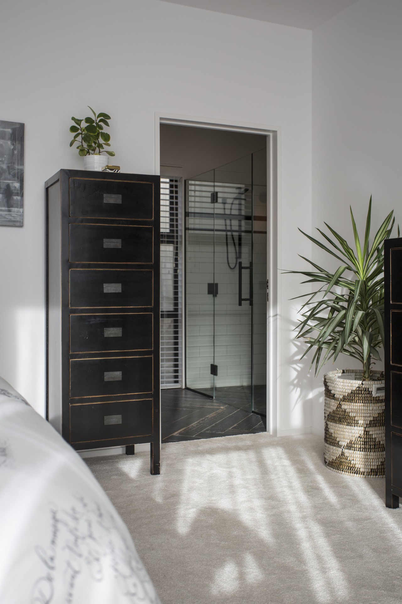
Black wood-look tile floors, a black custom vanity and bedroom tallboy all contribute to a black and gold theme in this master bedroom and bathroom

The old adage, less is more, certainly holds true when creating a sense of luxury in a room, especially when using an evocative colour such as gold. Why coat a room in a precious metal, when just a hint could be more effective?
Designer Ange Hynes knew instinctively she wanted to use black and gold as the hero colours when it came to fitting out and decorating her new master bedroom and bathroom.
"I wanted both rooms to feel slightly opulent, and I thought these two colours would create that luxurious ambience.
"Even though it was a new bathroom, I didn't want it to look new, or even modern," Hynes says. "The theme I really wanted to evoke was that of a glamorous New York loft, with wooden parquet-like flooring, subway tiles, and furniture that looked slightly worn as though it had been there for a while."
The trick in introducing two strong colours is to not overpower the space. In both the bedroom and ensuite, black has been used extensively as the fill-in colour, but with an aged look to soften it.

Gold is used as an accent colour, applied to highlight details like the studs in the button-backed leather headboard and the round pulls on the vanity. This colour also features as the fine pinstripes in the diamond-patterned wallpaper.
"The starting point for the ambiance in the bedroom was the oversized headboard, which I designed and had custom made," says the designer. "From here, I selected the wallpaper that had a graphic diamond pattern that matched the one the studs marked out on the headboard."
The antiqued black side tables and tallboy continue the theme, while the designer spray-painted an old travelling trunk in gold gloss, just to give it some pop.
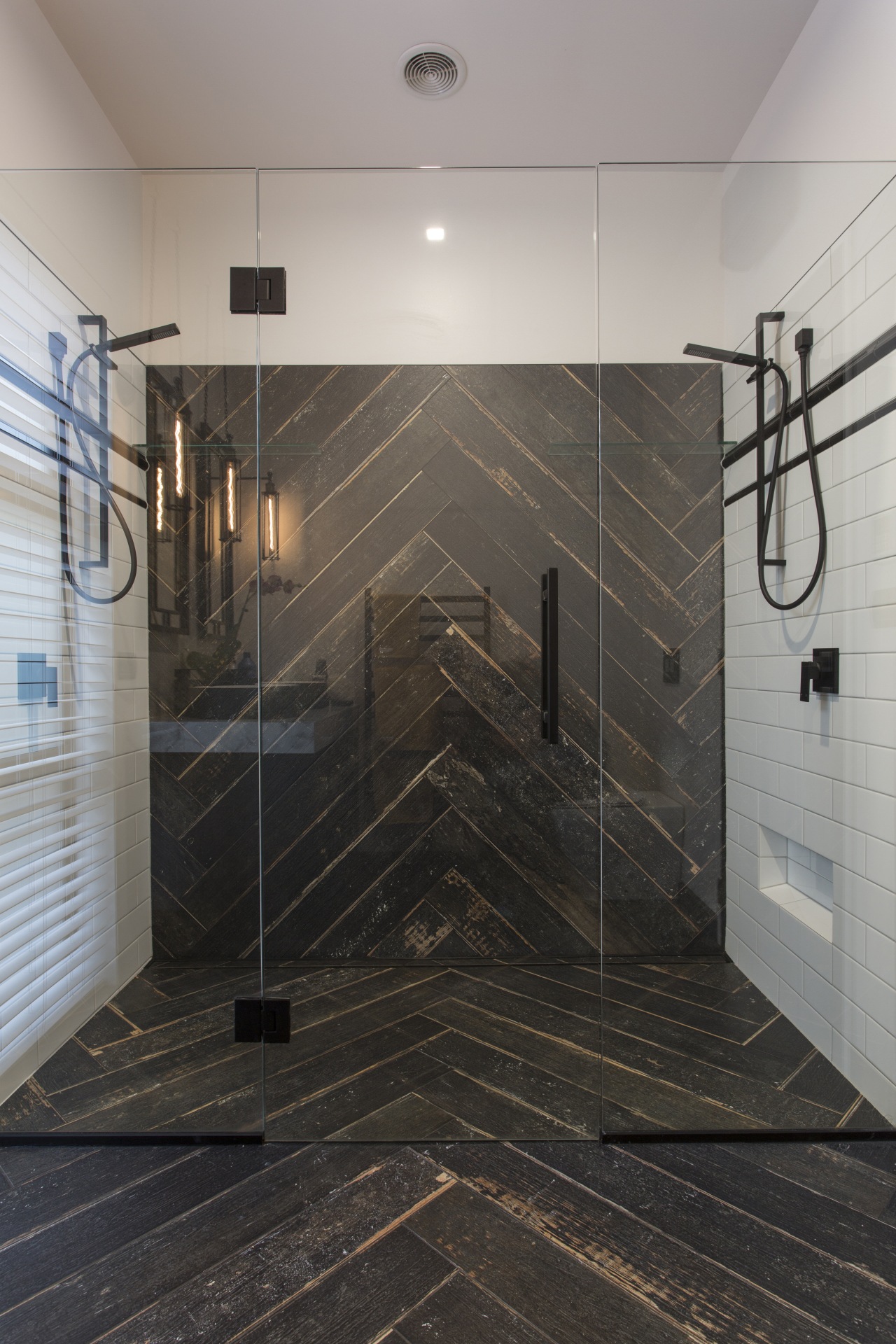
Black and gold are again the dominant colours in the bathroom, but here the standout feature is the tiled plank floor, laid in a herringbone pattern that stretches up the back wall of the double walk-in shower.
"I came up with the idea of laying them in that pattern to evoke the feeling of an old parquet floor but on a huge scale," Hynes says.

The ceramic tiles have the appropriate look of aged, blackened floorboards in keeping with the designer's theme.
The twin mirrors suspended from chains above the vanity were custom-made from square-profiled tubular steel, then powdercoated in black. All the fixtures and fittings in the bathroom were chosen for their similar angular profile, then powdercoated black, too.
The designer says her only departure from the angular theme in the bathroom are the twin round sinks and decorative drawer pulls on the his-and-hers vanity.
"I used the glow of old-school filament lighting in both rooms to add a certain moodiness the look is reminiscent the New York loft theme I was wanting to create," says Hynes. "I especially like the three sconces in the bathroom they give a great atmosphere in the evening."
Story by: John Williams
Photography by: Graham Warman
Home kitchen bathroom commercial design
'Worthy of Architectural Digest'
Classic dovetails contemporary
Small space, big impact
Home Trends Vol. 33/4
Home is where the heart is, but what we love about a house varies for person to person. Is your ideal home one with clas...
Read More


