Windows on the world
With a colour scheme inspired by the vibrant art that adorns its walls, this penthouse apartment is an airy, lively and light-filled space

Stark and minimalist; lacking in warmth, character and room to move. If there was a stereotype for contemporary apartments, it could quite possibly read a little like that. Thankfully, reality is often very different, as the apartment on these pages illustrates.
A stereotype-busting example of apartment design, this penthouse sits atop a boutique 1960s commercial building. Located at level 15, it is the result of a recent redevelopment of the structure. When bought, the new owners commissioned Nick Murray and Caroline Loke, from Nicholas Murray Architects, to undertake the redesign.
"When the client first purchased the penthouse it was quite blokey, it was a bachelor pad that was a little bit cold and grey," says Murray.
Even though the apartment was almost new, the new owners wanted it completely redesigned.
"There were some quite specific spatial requirements, which required a complete reorganisation of the rooms," he says. "We took the three-bedroom apartment and rearranged it into a space comprising master bedroom, office and a large open-plan space that is made up of the kitchen and two sitting areas. Upstairs, the entire footprint is replicated as a rooftop terrace," says Murray.
Amongst other building works, sections of the ceiling were replaced, the air conditioning system was completely reworked, a complex C-Bus system was installed for full smart home functionality, and because the existing windows leaked, all the home's glazing was replaced.
"Many of the fittings and fixtures are custom made, such as the audiovisual cabinets and the charcoal leather-wrapped kitchen cabinetry," says Murray. "The floors are Tasmanian blackwood, but there are also imported materials, such as the Canadian cedar, chosen for its aromatic qualities, used for the wardrobe interiors."
In selecting the materials, colours and furniture for the apartment, the homeowner worked with Michael Rigg, an architect and designer with whom she had collaborated on many other interior designs. The result was an interior colour scheme that took inspiration from the extensive and varied collection of Australian artworks.
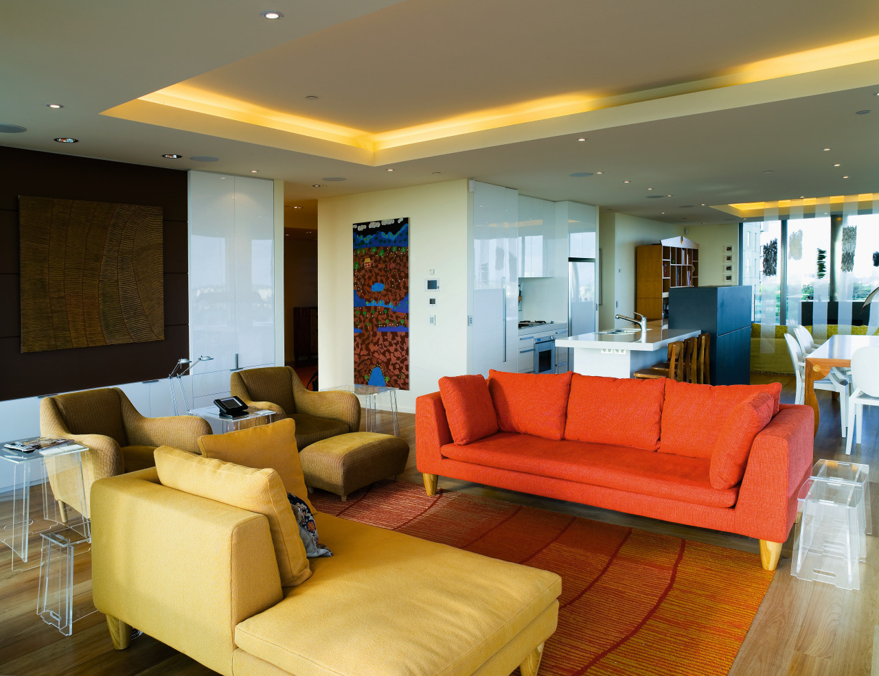
"Many of the carpets, furnishings and paints were colour matched to the art, so there are hues reminiscent of Uluru at sunset, exotic plants and the colours of the desert. The carpet artwork on the wall in the entrance was designed by Aboriginal artists, and crafted in Afghanistan."
In the morning room, with its comfortable olive- and beige-coloured seating, the weave of the handmade rug incorporates a tinsel-like fibre, which creates an effect of twinkling lights. The design of the carpet in the other sitting area, which features ochre and red furniture, features a motif inspired by a nearby artwork.

"When we bought this place, it was all concrete floors and carpeting. Our first decision was to add warmth with wood floors. However, saying that, I was still slightly nervous about the windows leaking, even though the problem was solved when we replaced all the windows," says the homeowner.
As a safeguard, and also as an aesthetic embellishment, an evaporation trough filled with decorative pebbles was installed at the base of the window joinery. Design-wise, this also ties the interior to the landscaping of the exterior decks.
The kitchen was one area of the house where some of the original cabinetry was retained.
"It's built from emporite an ageless and durable material so we just added to it, although, as the island was designed for a tall man we replaced it," she says. "The kitchen is white like a blank canvas, and the surrounding colours are all the more vivid because of it."
Credit list
Soft furnishings consultant
Blinds and drapes
Carpets and rugs
Paints
Kitchen cabinets
Refrigeration
Builder
Flooring
Furniture
Audiovisual
Benchtops
Story by: Trendsideas
Home kitchen bathroom commercial design


