well connected
A young, energetic freight forwarding company called for an office design that reflected who it was and where it was going


No matter what industry you are in, today image is everything. A 30-year-old industrial building situated on the edge of a bustling city bay provided freight forwarders On Time Express with sufficient space, but the interior bore no resemblance to the company's corporate identity.
The brief to interior design and consulting firm Destination Limited requested a design solution that enhanced the existing area enough office space for current use and expansion plans, with a large adjoining storage warehouse while encapsulating the philosophy of a young, energetic company.
Designer Nathan Tsang says his aim from the outset was to impress, inspire and capture visitors and staff alike. The interior was to be as contradictory to the ageing facade as possible while retaining an industrial edge.
"The interior theme stems from the two aspects of the client's freighting business we found most easily translated into practical design the sea and the air. The colour blue in the reception area and office doors symbolises the sea; and the multicoloured flooring through the office the airport runway."
A stark, hi-tech look emanates from the large, glossy white reception area, which is offset by the use of dark walnut timber flooring and a raw concrete reception counter. White leather seating, splashes of chrome and playful use of city names etched on to sandblasted glass behind the reception desk softens the space. A pendant light fixture, engraved with logo, symbolises the company's global image.
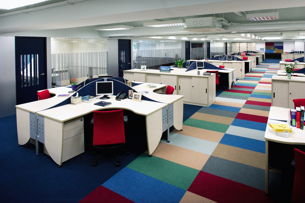
The youthful staff demographic was another influence for fundamental design elements in fulfilling the client's brief, Tsang says. He used colour, transparency, concise circulation, playfulness and graphics to convey a message of constant movement and growth. Exposed high ceilings visible throughout the office reflect the industrial nature of both the business and the building.
A clear central corridor runs through the open general office area as natural light streams through from the management offices positioned along the length of the building.
Emphasis was placed on the use of the client's corporate colours in the selection of the workspace chair fabrics, which allows for splashes of colour to be dispersed throughout the entire office. A carefully-selected spectrum of coloured carpet tiles delineates the circular route around the office.
"There wasn't a lot of existing built-in furniture in the office but the underfloor wiring was good and allowed us flexibility in how we used the space. We wanted to give this area some heart and soul, make it feel funky and light, and the furniture we chose reflects this," says Tsang.
The conference room, with its black barrel-shaped table and leather and chrome chairs, is complemented by a full arrangement of the latest audio-visual equipment.

A barcode pattern made from 3M silver adhesive runs the length of the central corridor, midway up the full-height glass partitions that face onto the open office area. The design interplays with the negative pattern cut into the doors of each room, providing privacy without blocking natural light.
When it came to the back of house areas, Tsang says he wanted to create a cafe and bar-like area, relatively untypical of most Hong Kong office pantries.
"We used natural timber flooring, exposed dark orange-coloured celings and beams, white walls and a playful selection of resin chairs, stools and glass-topped tables along with wall-mounted kitchen cabinetry and hanging pendant lights to achieve a space that is both neutral and escapist."
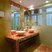
A semi-transparent partition at the end of the pantry area screens off the male and female toilet doors. Those areas retain the out-of-office feeling as dual-coloured tiles formed in mosaic patterns adorn the vanity, walls and flooring, atop large neutral tiles. Bowl-shaped basins and contemporary tapware complete the effect.
Tsang says being given a concise brief and a free hand by the client made the world of difference in being able to achieve a result that has encapsulated the essence of a young, progressive company now and for the future.
Story by: Trendsideas
Photography by: Chan Yiu Hung
Home kitchen bathroom commercial design
