Warm traditions
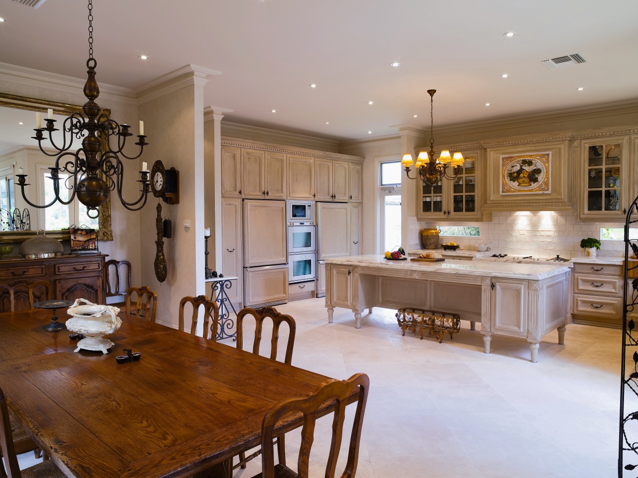
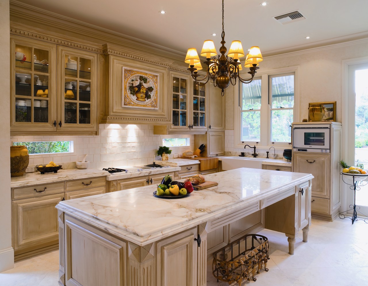
From the solid ash cabinetry to the hand-painted ceramic mural, this period kitchen reflects a Provene§al influence

Traditional Provene§al kitchens, with their solid timber furniture, relaxed colour schemes and handcrafted detailing, continue to inspire designers and owners to this day.
For the owners of this new kitchen, an elegant and established country feel was called for a look that would sit comfortably with the rest of their Victorian holiday home.
A kitchen island for informal eating and food preparation was specified, as well as plenty of storage space within easy reach, a large sink facing the sash windows, and generously proportioned benchtops.
To create the authentic period character the owners wanted, designer Jos van Bree looked to the farmhouse kitchens of Provence. He opted for marble and solid ash, a limited colour palette of warm neutrals, and a symmetrical layout to keep the space welcoming but still refined.
"This is a good-sized kitchen with a lot of appliances," he says. "I didn't want to clutter it with features that were too intricate, or lose the established solid look created by the main shapes.
"I have incorporated some detailing here and there, but I was more interested in achieving balance than specifying detail in every nook and corner."

The cooktop and sink, as the two most frequently used work features in the room, were placed a comfortable distance from each other. The cooktop is slightly lower than the adjacent benchtops, to give the cook more control while working.
Van Bree positioned the butler's sink underneath the sash windows rather than on the island a traditional planning solution he believes makes the best use of space in a busy kitchen. Placing the sink here also gives the owner natural light and views of her garden while working. The fridge, microwave and dishwasher were positioned nearby, with the dishwasher raised 30cm off the ground for easier loading and unloading.
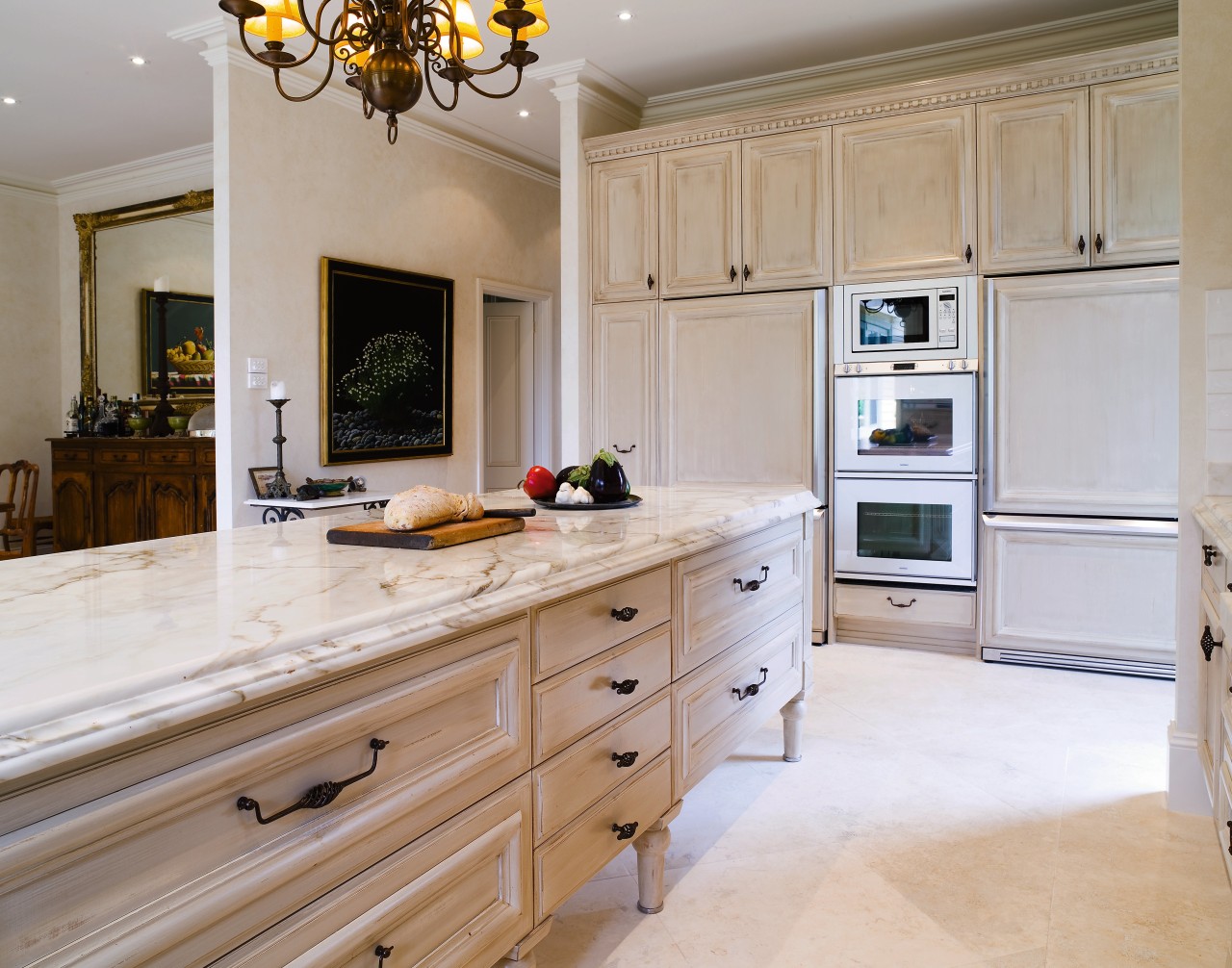
Generous use of natural materials also helps to establish the kitchen's period feel. The calacatta marble benchtops and island top are 20mm deep with a triple layer at the edges. The ash cabinetry is solid timber, with a similar weighty feel.
"I was keen to replicate the sturdy look associated with cabinetry that has been in place for decades," says van Bree.
The white splashback tiles behind the cooktop and benchtops are hand-made, and each one is a slightly different size and shape.
"I wanted all the tiles to be white so that instead of different patterns or colours, the texture would do the visual work," he says.

Once the colours for the splashback tiles, flooring and benchtops were chosen, paint for the cabinetry could be mixed on site. The cabinetry was hand painted with a base colour and a slightly paler second coat, then lightly sanded to create a distressed look.
Above the cooktop is a hand-painted ceramic mural sourced by the owners from the Mediterranean. The mural acts as a centre point for the cabinetry that is positioned symmetrically on either side. With its rich colours and detail, it also functions as the kitchen's main focal point, much like a painting in an art gallery.
"Having one picture on a plain white wall is much more effective than lots of paintings crammed together," says van Bree. "It's exactly the same with a room."
Other features were also suggested by the owners. Jan Nienaber, a keen gardener, wanted narrow windows inset into the backsplash on either side of the cooktop.
"I wanted extra light in the kitchen, as well as the chance to view my garden while I'm sitting at the island," she says.
Credit list
Cabinetry
Flooring
Tapware
Ventilation
Dishwasher
Benchtops
Lighting
Sink
Microwave
Refrigeration
Story by: Trendsideas
Home kitchen bathroom commercial design
Sculptural centrepiece
Radical yet respectful
With deep affection


