Twice as good new kitchen by Leon House
Traditional kitchen by Leon House
Matching a kitchen to the architectural style of a house makes good design sense, although a complementary style can be a more appropriate response than a strictly enforced theme.
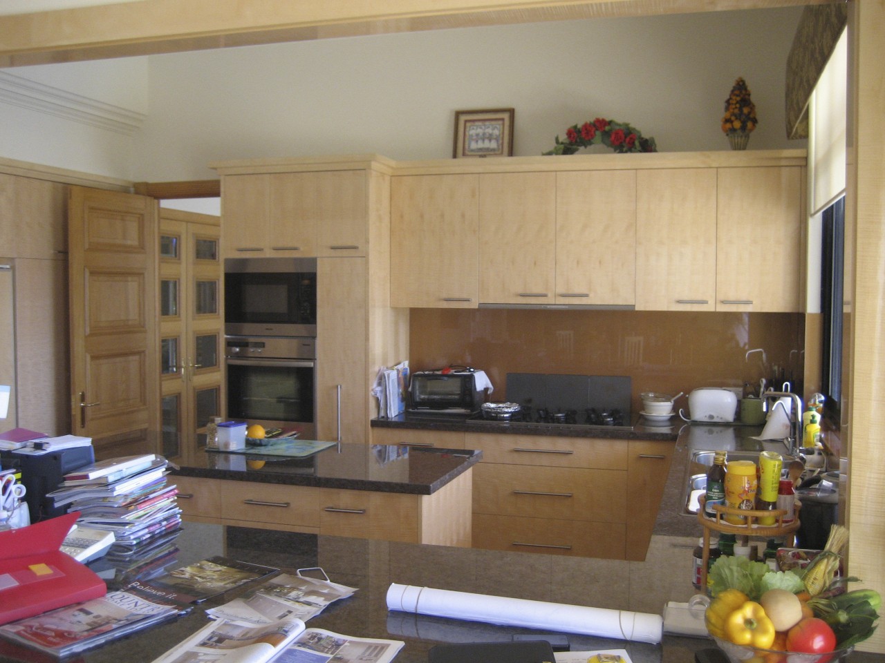
This Tuscan-style house had a sleek, Melamine kitchen that seemed out of character with the house. It was also too small for the owners' requirements, says kitchen designer Leon House.
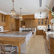
"The owners have a large family and love to entertain. To create space for a larger kitchen, we removed the wall between the kitchen and dining room. This doubled the size of the kitchen, giving us plenty of room for an extra-large island and table, a separate cooking island and a lot of perimeter storage and work space."
But it was not just the size of the kitchen that doubled. There are now also two ovens either side of the cooking island a freestanding Ilve range, and a Miele underbench oven. And there are two porcelain butler sinks, plus a third sink on one end of the island, and two refrigerator drawers as well as a large refrigerator.
Having so many workstations makes it easy for several people to work in the kitchen at the same time.
House says the design was influenced by the work of renowned kitchen US kitchen designer Johnny Grey, who has often incorporated round cabinets in his fitted kitchens.
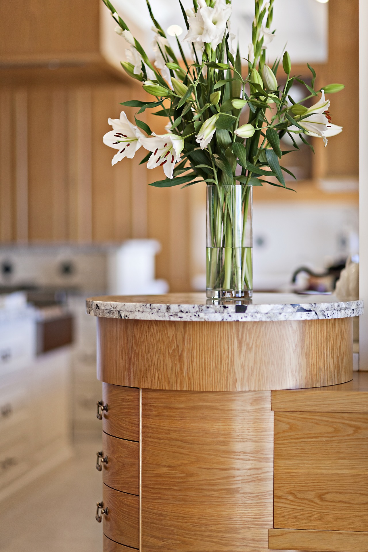
"The perimeter cabinets, which are all in American oak, are bookended by round cabinets that soften the look, and help with the circulation," says House. "These feature handcrafted drawers that fit flush with the unit. Other doors and drawers have raised and fielded panel doors."
The designer says the oak was custom stained to match the existing doors to the kitchen. However, because the kitchen is large, he wanted to avoid a monotony of wood cabinets. The islands are consequently painted a light almond shade, which tones with the floor tiles and splashback tiles.
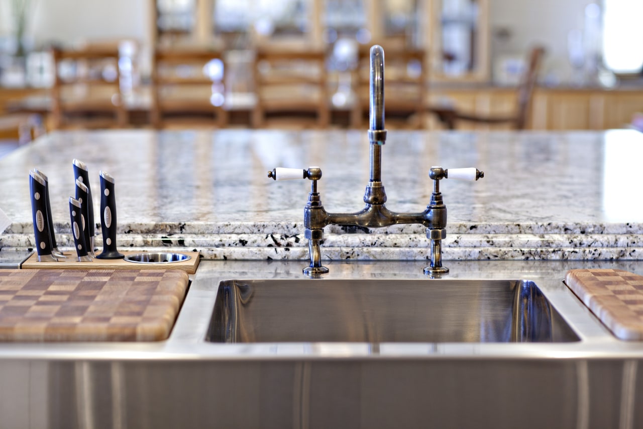
For added visual interest House added a low table to one end of the large island. This features hand-carved cabriole legs, and incorporates a drawer designed to accommodate the daily newspaper. The other end of the island has a dedicated food prep area, with a stainless steel sink, custom chopping boards and built-in knife stand, waste disposal system and paper towel dispenser.
This workstation is lower than the granite island top, ensuring this remains a distinctive feature of the kitchen. Granite also features on the tops of the round cabinets and on a coffee station, while the rest of the perimeter benchtops are Corian.
Credit list
Kitchen manufacturer
Cabinetry
Splashback
Blinds and drapes
Sink
Range
Ventilation
Dishwasher
Story by: Trendsideas
Home kitchen bathroom commercial design
Marvellous in marble
Thrice as nice
The beauty of understatement
