Traditional home renovation adds indoor-outdoor connections
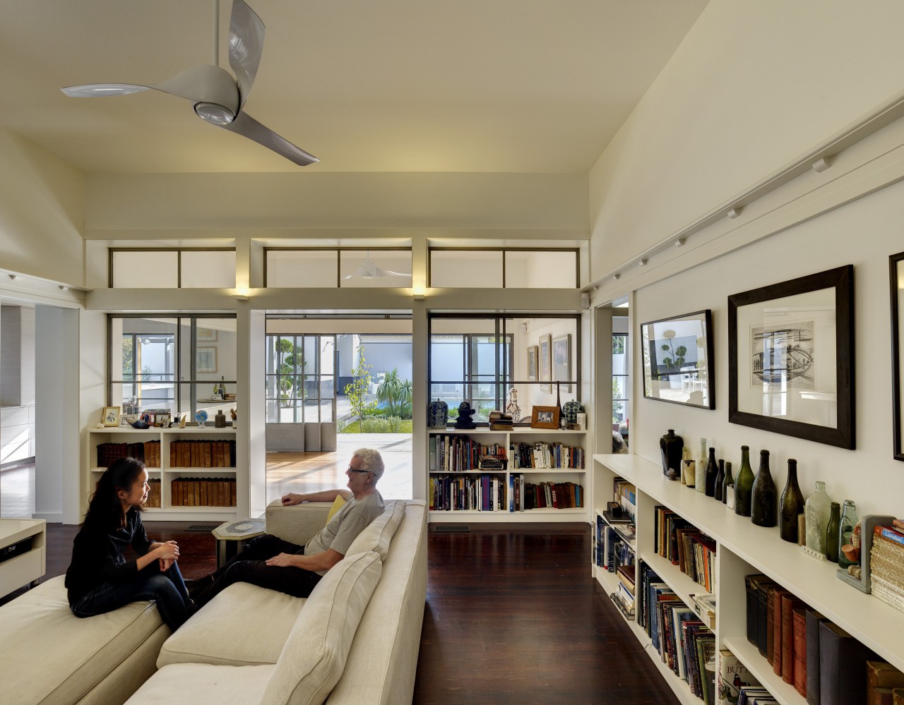
This Edwardian house was tastefully renovated to better connect the home from front to back.

It's one thing to add function and interior space to a traditional home but quite another to do so without ruffling the original aesthetic.
On this project, by architect Peter Willett, the existing house, built in the early 1900s, had undergone several unsympathetic renovations. The owners asked Willett to remove this design clutter and bring light to the dark interior spaces while connecting the front living and dining spaces to the rear of the home and back garden.
"They also required additional bedrooms and a modest flat over a new two-car garage in place of the existing single garage. All of this was to be done without disturbing the look and scale of the original architecture.
"We took the house back to its original base, removing the ill-considered earlier renovations, and opened up the rear in sympathy with the fabric of the original design. For example, the veranda was extended around to the back."
To achieve front to back indoor connections and bring light into the interior, Willett dramatically reconfigured the interiors. The front rooms remain much as they were, with expanded doorways both internally and to the outdoors. However, the rear of the home was transformed.

"Moving away from the trend of open-plan living, we reverted to separate kitchen, living and dining areas. These are linked by a series of frames, created by the newly expanded door openings," says Willett.
The interior now has two axes oriented to the reworked back garden. One is a staggered path, zigzagging from living to dining room and on to a new central family room, or sun room. This in turn opens to another informal family space, with the garden and pool beyond. The central room benefits from the light from an adjacent new stairwell and has the airy feel of a sunny internal courtyard. The other axis follows a direct line from the living room back through a new elongated kitchen to the outdoors.
"These sight lines don't stop at the home's boundaries, either," says the architect. "We lined everything up so the neighbours' trees to the rear and an established park to the front both further extend the green outlooks."
The rear views are also enhanced by work on the backyard garden and re-sited pool.
"In this area, which slopes away from the house, we designed a new double garage with the requested flat on top. Supporting piles had to be dug as the earth in this area is very sandy and wouldn't have supported the two-storey construction. As the land slopes here and the reworked garden was to be brought up to the ground level of the house, we were able to first excavate and add a series of subterranean service and storage spaces.

"Essentially, you leave the garage and walk through the underground spaces to pop up on the new rear verandah."
To add the additional rooms, a new floor level was discreetly inserted under the existing roofline. The subtle external changes included an extension to the main ridge of the roof culminating in a large house-wide dormer at the rear. Other new dormers were added on the side of the house away from the street to optimise exposure to the sun.
The new upstairs bedrooms and bathroom are designed to follow the angles of the roof. To keep the bedrooms uncluttered and timeless, storage space is integrated into a wall panel system which echoes the detailing downstairs.
An upstairs veranda is set into the large rear dormer this overlooks the repositioned pool, the new double garage, apartment, and garden.
Story by: Charles Moxham
Photography by: Michael Nicholson
Home kitchen bathroom commercial design
Silver moons rising
Vibrant spiral stairs improve penthouse connections
Sculptural centrepiece
Home Trends Vol. 32/1
This latest edition of myTrends HOME has a strong emphasis on openness – homes that open to the view, indoor-outdoor flo...
Read More


