Time traveller
A Tudor Revival mansion is renovated in keeping with its heritage and its neighbours – interiors are reworked for modern living now and into the future
Renovation by MXMA Architecture & Design + Chamberland Design
From the designer:
An English-style manor house takes a step back in time to an era when the Tudor style dominated England between 1479 and 1607
A family in town
The owners, a blended family with six children, decided to leave Montreal's South Shore to move closer to the city centre.
The move was designed to enhance their quality of life, while also adopting a more sustainable lifestyle through easier access to local services and community facilities – reducing their carbon footprint by minimising commute times, and by utilising a variety of environmentally friendly modes of transportation.
Hidden treasure
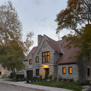
Situated on the western flank of Mount Royal, close to the Queen Elizabeth Gardens, the house offers breathtaking views of the city from its imposing south-facing rear façade.
The building shares its neighbourhood with other historic homes – one in the Tudor Revival style, and another a Georgian villa in the neoclassical style.
Originally built in 1936, this house is a majestic, all-stone structure rising two storeys, with an attic and garden level at the rear.
Its Tudor style is characterised by an irregular facade and elevation composition featuring slender doors and windows with mullions and leaded stained glass, and a steeply pitched roof clad in terracotta tiles.
With its original layout, authentic materials, and distinctive form, the house is of inestimable historic and artistic value, and is a preserved example of a singular architectural style contributing to the city's rich built heritage.
It was the exceptional quality of the neighbourhood, the charm of the built environment, the privileged location of the house, the lush green surroundings, and the singular architectural value of the building that convinced the couple to buy it – despite its need for love and renovations.
When exterior charm conceals interior disorder
Despite the great heritage value of the house's exterior, the interiors had lost their coherence due to multiple transformations over time.
The layout of the rooms created a maze of spaces, fragmenting the different rooms.
These interior layouts reflected the home's origins and domestic lifestyle of yesteryear.
In addition, two staircases, located in different parts of the residence, failed to effectively link the four levels.
Only the main staircase, aligned with the entrance hall, stood out for its imposing character.
On the garden level, the mechanical room and bathroom were located along the rear wall, with narrow windows.
To the right, on the west side, a small salon opened onto the garden through a narrow door.
With its low ceilings and dark, confined rooms, this level was completely isolated from the backyard.
Unexpected discoveries
Initially, the couple planned minor renovations to modernise the interior.
However, this idea was quickly abandoned when a thorough inspection of the building revealed its alarming condition.
During the winter, heavy condensation invaded the house, caused by a lack of insulation in the masonry walls and the dilapidated state of the original wooden doors and windows.
Additionally, the roofs were accumulating ice, leaking in several places, and revealing severely damaged framing.
In the basement, water was seeping through cracked foundation walls, and some wall coverings contained asbestos.
Finally, a number of load-bearing partitions had been demolished in the course of successive alterations, leading to structural deformation of the floors.
In a short space of time, hopes of a light renovation evaporated, giving way to the need for major renovations.
The owners considered putting the house up for sale, but its unique, distinctive character and ideal location convinced them to go ahead with the project.
From that moment on, the couple realised that they needed to carry out two major projects simultaneously: the renovation of the house's exterior envelope, and the complete overhaul of its interior spaces.
The main challenge lay in finding a balance between the neo-Tudor style of the original residence and the contemporary aesthetic sought by the owners.
To bring their architectural vision to life, the couple sought the expertise of architect Maxime Moreau of MXMA Architecture & Design.
Light and openings: the genesis of the concept
To meet the owners' needs, the architect undertook a complete interior renovation, removing all the house's partitions.
With heritage preservation in mind, the composition of the original windows on the south side of the rear elevation was carefully rethought.
The aim was to create a vast, fluid living space – open and flooded with natural light.
This approach made it possible to redevelop the kitchen along the courtyard, while respecting the historic value of the original paned windows.
It also enabled the dining room and living room to be designed in an L shape, guaranteeing abundant light from morning to night.
The owner shares her enthusiasm, saying: "What I enjoy most in the morning is seeing the light flood the whole kitchen."
Furthermore, the L-shaped layout extends to a large covered outdoor terrace, accessible via imposing French doors from the living and dining rooms.
Thus, both indoors and out, the home's residents enjoy panoramic views of the surrounding landscape, vistas of the St. Lawrence River, and the splendor of century-old trees in the courtyard.
Influence of the kitchen on interior architecture
The kitchen has been adroitly fitted out with minimalist modules from the renowned Danish company VIPP, harmoniously blending functionality and aesthetics.
These wall-mounted modules cleverly conceal all the necessary equipment and storage space while adding a touch of modernity to the house's historic setting.
A vast central island provides a generous workspace and dining area for the whole family.
The kitchen design favours an aesthetic more reminiscent of fine furniture than the conventional features of a built-in kitchen.
The contemporary shapes and deep black of its modules create an elegant contrast with the classic ambience of the house – effectively blending tradition and modernity.
The clean aesthetic of the kitchen modules inspired the entire interior design, with a timeless colour palette and meticulous attention to detail, as evidenced by the glass doors, window frames, fireplace mantel and, above all, the main staircase.
A continuous staircase to the heart of the house
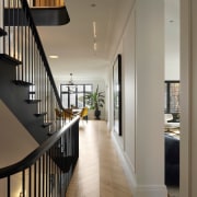
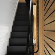
At the heart of this home, the architect transformed the original entrance hall and staircase into an innovative staircase that extends like a continuous ribbon, centrally linking all levels of the house.
The new staircase, in elegant black, emphasises the simplicity and refinement of the contemporary style desired by the owners.
Its design represents a true technical feat, combining exceptional craftsmanship with a subtle use of materials and ornamentation.
The new black oak staircase echoes its predecessor, incorporating delicate mouldings under the nosing and graceful curves at the landings.
Sleek detailing translates into a continuous handrail and minimalist metal balusters, meticulously integrated into each step and the herringbone floors.
It embodies refined luxury while harmonising the different levels of the house and contributing to its singular charm.
The staircase, a true centrepiece of the design, adds an extra dimension to the residence and perfectly illustrates the owners' vision of transforming a historic house into a contemporary residence, while preserving its heritage.
The staircase is now the central element of the house, harmoniously unifying its four levels in a modern, elegant ambience.
A luminous haven of peace
The architect used existing windows to create a light corridor linking the second floor to the master parents' suite, ensuring the circulation of natural light throughout the house.
Two fluted frosted glass doors offer privacy while maintaining a visual link with the outside environment – this design dramatically improves the look and functionality of a simple hallway.
Behind this canopy, a small wood-clad vestibule creates a soothing space for the parents, with hidden doors leading to the bedroom and closet room on either side.
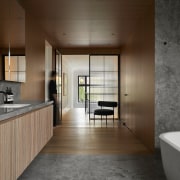
Passing through this vestibule, the warm atmosphere of the wood gives way to a palette of soft greys in the bathroom.
Huge slabs of frosted marble cover the floors, walls, window surrounds, countertop, and even the shower surfaces, creating a monochromatic aesthetic.
The natural patterns of the marble add a subtle dynamism to the walls, while the clean transitions between the marble and the cabinetry panels add a contemporary touch.
A large window lets in natural light and highlights a century-old tree in the garden, creating a poetic ambience.
The bathtub is positioned opposite the window, allowing the parents to relax while enjoying the view of the St. Lawrence River.
The bathroom features a large vanity in fluted white oak, in harmony with the delicate, refined style of the house.
Wall cabinets reflect natural light and echo the glass partition leading to the shower.
The toilet is strategically concealed behind the bath, making for a symmetrical, balanced bathroom.
The entire bathroom, with its functional organisation, elegant finishes, and clean lines blends seamlessly into the home's classic setting, while taking advantage of the generous fenestration to create a soothing space.
The colour experience
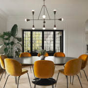
In this English-style home, steeped in the Tudor era, luminous white-panelled walls create a calm, refined backdrop for the couple's contemporary art collection.
Subtle sophistication permeates every room, thanks to a meticulous selection of brightly coloured, minimalist furnishings carefully integrated into the architecture.
Family members live in an atmosphere of light and airiness, where every space is harmonious.
On the first floor, the library, with its bold navy blue colour, offers an immersive experience.
From the ceiling and woodwork to the pedestals and built-in furniture, blue creates a clean, playful atmosphere, inspired by the Danish expression 'hyggelig', which evokes a sense of well-being.
This warm, intimate space is ideal for reading, study, and contemplation.
The original grey stone fireplace mantel recalls the house's past, while complementing the white oak floor.
On the second floor, the master suite is a haven of peace, isolated from the rest of the house by a wood-clad airlock.
The white walls of the hallway give way to the softness of white oak panels and frosted marble slabs that clad the walls and ceiling for a monochrome look.
In the attic, hidden behind a secret door, a bright pink bathroom comes into view.
Walls, floors, ceilings, and even countertops are adorned with pink ceramic tiles, creating a playful yet romantic ambience.
This enchanting space is a source of joy for the youngest member of the family, who is lucky enough to occupy it.
An inspiring basement
The architects transformed the basement in a major way, digging it out by .6m to create comfortable living spaces connected to the outdoors.
Four large French doors, aligned with the original openings on the upper floor, now provide access to the garden.
These south-facing bays flood each room with natural light, transforming a once dark and neglected space into a bright and welcoming place.
The strategic location of one of these doors, aligned with the main staircase, allows anyone descending to the garden level to immediately enjoy the magnificent view of the courtyard landscaping.
What's more, the concrete floor – capable of capturing and releasing the sun's heat – contributes to the family's comfort, while improving the building's energy efficiency.
The renovation has radically transformed the space, creating a bright, eco-responsible environment for the family.
Preserving history and introducing modernity
Restoring the original lead windows, famous for their geometric patterns, proved to be one of the most complex tasks.
The narrow windows and large bay windows of the period required a meticulous reproduction of their glazed compositions. T
his meant incorporating these architectural features into the design of the new windows and doors, while obtaining the necessary permits.
The restoration of this home aimed to preserve the integrity of the building, while introducing the contemporary style desired by the owners.
It was essential to respect traditional construction methods and minimise environmental impact.
Reclaimed stone was reused to replace damaged parts, roof tiles were cleaned and reused, and copper zinc work was carried out.
These far-reaching restoration efforts will ensure that this historic building endures as a testament to Montreal's rich heritage.
'We started from scratch'
With its heritage status, the design of the house required several elevation studies and many exchanges with the authorities and manufacturers to obtain the numerous building permits.
The renovation also required a prodigious amount of structural gymnastics to achieve the liveable house the owners had in mind.
Fusion of architectural styles
This renovation represents a real tour de force in terms of the mastery of materials and the art of combining tradition and modernity.
The design approach was a lesson in modernisation and heritage preservation, subtly blending past and present.
The result is a classic setting with a modern, European-style interior, where a sophisticated ambience perfectly reflects the personality of its residents.
This transformation is a testament to the magic that happens when history meets modernity.
Credit list
Interior designer
Engineers
Home kitchen bathroom commercial design
Renovations
Renovating your home is an opportunity to refresh, expand and renew. Here's all the inspiration, ideas and information y...
Read More

