Style vs lifestyle
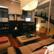
Contrasting tones, styles and textures elevate this warehouse from a cool sterile space to a warm home


Designer pieces can bring a strong sense of identity to a decor, but they can also create a showpiece rather than a welcoming atmosphere to come home to.
An eclectic mix of chic contemporary pieces and earthy traditional elements breathe character into this warehouse the selection was a joint effort by owner/architect Rob Mills and interior designer Louella Potter.
Several elements were addressed to tame the large, cool space and give it a homely feel, says the interior designer.
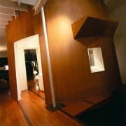
"Very little was done to the structure or the warehouse's original large volume," says Mills. "We breathed life into the space simply by painting it, adding colour highlights, and introducing a contrasting mix of furniture styles, textures, graphic art pieces and lighting."
The architect painted the central living area in pale tones to provide a restful family living environment and to work as a backdrop for the large works of art.
"The pale tones worked well with the pre-existing wood flooring and highlights of red were introduced to break up the space and also provide visual interest," says Potter.
Mills had originally focused on large, solid traditional pieces of furniture to anchor the interior.
"Elements such as a large Normandy farmhouse table, antique dining table and a large Spanish chest brought an aesthetically pleasing, classic tone to the living area," says Mills.
The interior designer then mixed up the space with the introduction of more playful contemporary pieces and contrasting textures. For example, the dark, rough-hewn dining table is contrasted with the modern, plastic Panton dining chairs.
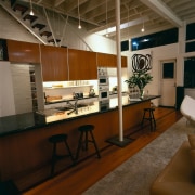
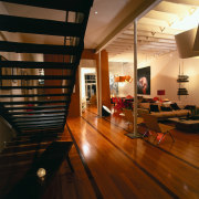
The open-plan space has an eclectic mix throughout. Its various uses are demarcated through furniture placement, materials, lighting and even the artworks.
"There is a soft, blonde Scandinavian feel right through the downstairs area the woven flax chairs, for example, are a Danish design," says the designer.
But overall, there are three loosely defined living spaces. One warm and cosy near the fireplace, the central dining area and the third big and loungey area near the kitchen.
In terms of materials, the dining area features predominately dark wood and colourful plastic, while the larger living area is focused on the contrasting floor timber and soft upholstery.
Artworks also played an important part in giving the large warehouse space a more intimate, homely perspective.

"The architect's preference for graphic decorative pieces complemented the overall visuals of the space," says Potter. "The large butterfly artwork has the advantage of scaling down the expansive wall it hangs on. It also provides a defining focus for the larger seating area beneath it."
Two other large paintings predominate over the dining and fireside areas.
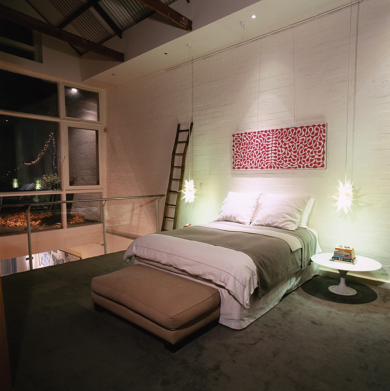
Upstairs, Potter divided two bedroom areas with the simple addition of a fine cotton curtain screen on tensioned wires. A painting featuring swirling reds is featured on a pale wall, extending the colour scheme on the lower floor.
Lighting is important in the design and is supplied by several lamps which provide pockets of intimate light. Drove table lamps in sheet metal feature in the both the living area and master bedroom.
"A home should tell a human story and not just be a showcase," says Potter. "Solely contemporary or traditional pieces would have produced an empty feel the mix achieved here has given it character."
Credit list
Architect
Tables
Flooring
Antiques
Other artefacts
Story by: Trendsideas
Photography by: Andrew Ashton
Home kitchen bathroom commercial design
At home in the country
More than an addition
Eclectic meets elan