Steely resolve
This sleek kitchen maximises impact by minimising the material palette

Sweeping surfaces and strong lines can create a kitchen that looks as much like a sculpture as a utilitarian space. Minimising the material palette only heightens this effect.
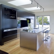
For this project, part of the renovation of a classic villa, designer Robyn Labb was asked to create a highly contemporary kitchen within an open-plan layout. A consideration for the client was to ensure the space had an uncluttered, abstract appeal, says Labb.
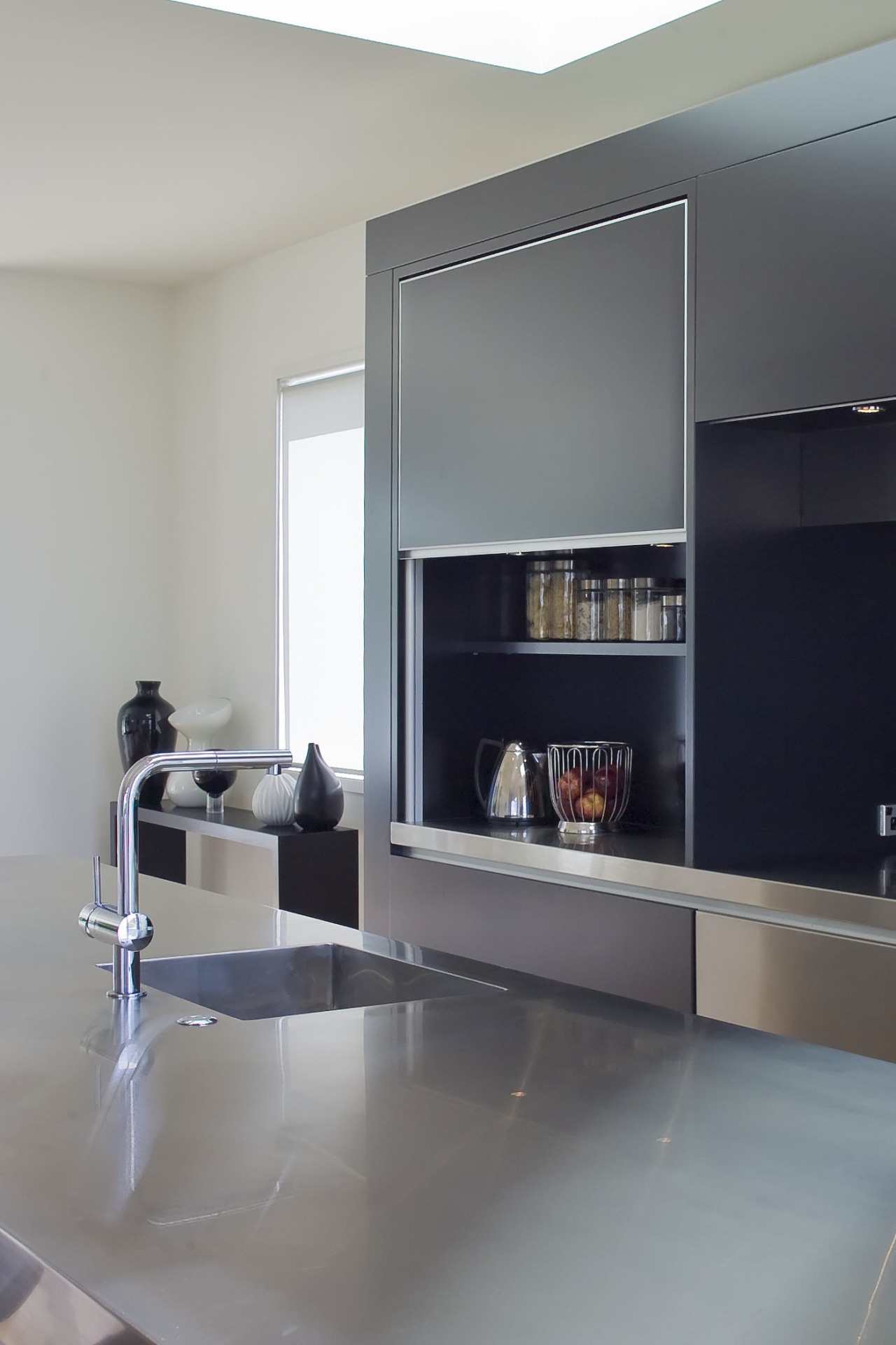
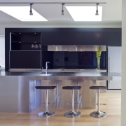
"The stainless steel island is the key feature of the kitchen, both for its minimalist appearance and its sheer scale," says Labb. This is the largest domestic piece the manufacturer has created.
"I designed the kitchen keeping detail to a minimum and using two main materials the matt stainless steel, and a two-pot black lacquer in a satin finish," says Labb. "The only other material is the black back-painted glass on the splashback, which melds with the dark surfaces of the cabinetry."
The designer says the dark, dramatic colours were appropriate because the area is flooded in light from the French doors and skylights. One reason for selecting the satin finish was to prevent too much light bouncing through the kitchen.
Stainless steel also features on wall cabinetry behind the island and is used for a pelmet over the rangehood. The matt finish contrasts with the dark cabinetry, and the smooth surface contributes to the clean-lined aesthetic.

"Creating a minimalist kitchen means paying close attention to form and removing distractions to the eye," says Labb. "For example, setting the refrigerator on a plinth aligns it with the top of the pelmet and encourages the onlooker to see the kitchen as simple geometric shapes."
Screening the rangehood with the metal pelmet contributes to the streamlined appearance.
"The kitchen has ample storage, including a Blumotion pull-out pantry," says Labb. "Drawers with recessed handles are part of the pared-back look. These each contain several smaller drawers."
Credit list
Kitchen manufacturer
Cabinetry
Taps
Cooktop
Refrigeration
Flooring
Bar stools
Island and benchtops
Kitchen sink
Oven
Dishwasher
Lighting
Story by: Charles Moxham
Home kitchen bathroom commercial design
Classic dovetails contemporary
Small space, big impact
'Worthy of Architectural Digest'


