Starting over 1970s home remodel by James Fraerman
1970s home remodel by James Fraerman
A house built in the early 1970s is likely to have an immediate connection to its surroundings. However, when a series of 1980s design excesses has obscured the good bones of the original architecture, it is time to make sweeping changes.
This was the case when architect Jim Fraerman, interior designers Anne Kaplan and Bruce Goers and kitchen designer Mick De Giulio were asked to give this 1973 home a more modern aesthetic. The planar exterior was cleaned up, but the interior was transformed, says Fraerman.
"The essence of this project was to free up spaces from alterations that occurred bit by bit sometimes only one room at a time," says Fraerman. "By removing the architectural and decor clutter, sightlines were revealed and the logic of the spaces became readable at a glance."
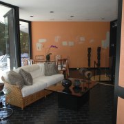
Entering the residence through the sheltered entry court, the living area with huge picture windows is directly ahead. However, one of the earlier remodels included a 1980s-style floating fireplace in the center of the room.
"This outmoded piece interrupted the flow, downplaying the room's generous proportions, and obstructed the views. To improve the room we took out the fireplace, along with black brick flooring from the same period," says Fraerman.
The stripped-back space was returned to its original splendor a clean, open volume with decor choices accentuating the lines, says Anne Kaplan.
"This project felt like an architectural dig at times unearthing the good bones set in place by the original architect."

A tonal palette of brown, gray and taupe was chosen and a new dark-stained wood floor laid. The narrow colorway and ebony floors feature throughout the public spaces, except for the kitchen.
"A strong use of contrast builds on these hues. Dark is set against light window frames are near-black alongside light walls, and pale rugs grace the floors.
"Two silk rugs anchor the large space, defining the furniture settings. With a fine texture that looks different from every angle, they offer a visual metaphor for the ever-changing lake beyond the windows."
In the adjacent family area, Fraerman removed a bar that had all but blocked off pedestrian flow between the rooms. The architect replaced it with a more modest version, set into the wall, leaving the two spaces more open to each other and the now-expanded views. A mirrored spiral staircase part of the original home was also removed from the family room, freeing up the flow to the kitchen behind.
"I gave the family room a warmer, more textural appeal. For example, while silk rugs reflect the refinement of the living room, the tufted rug in this area suits its more relaxed use," says Kaplan.
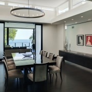
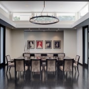
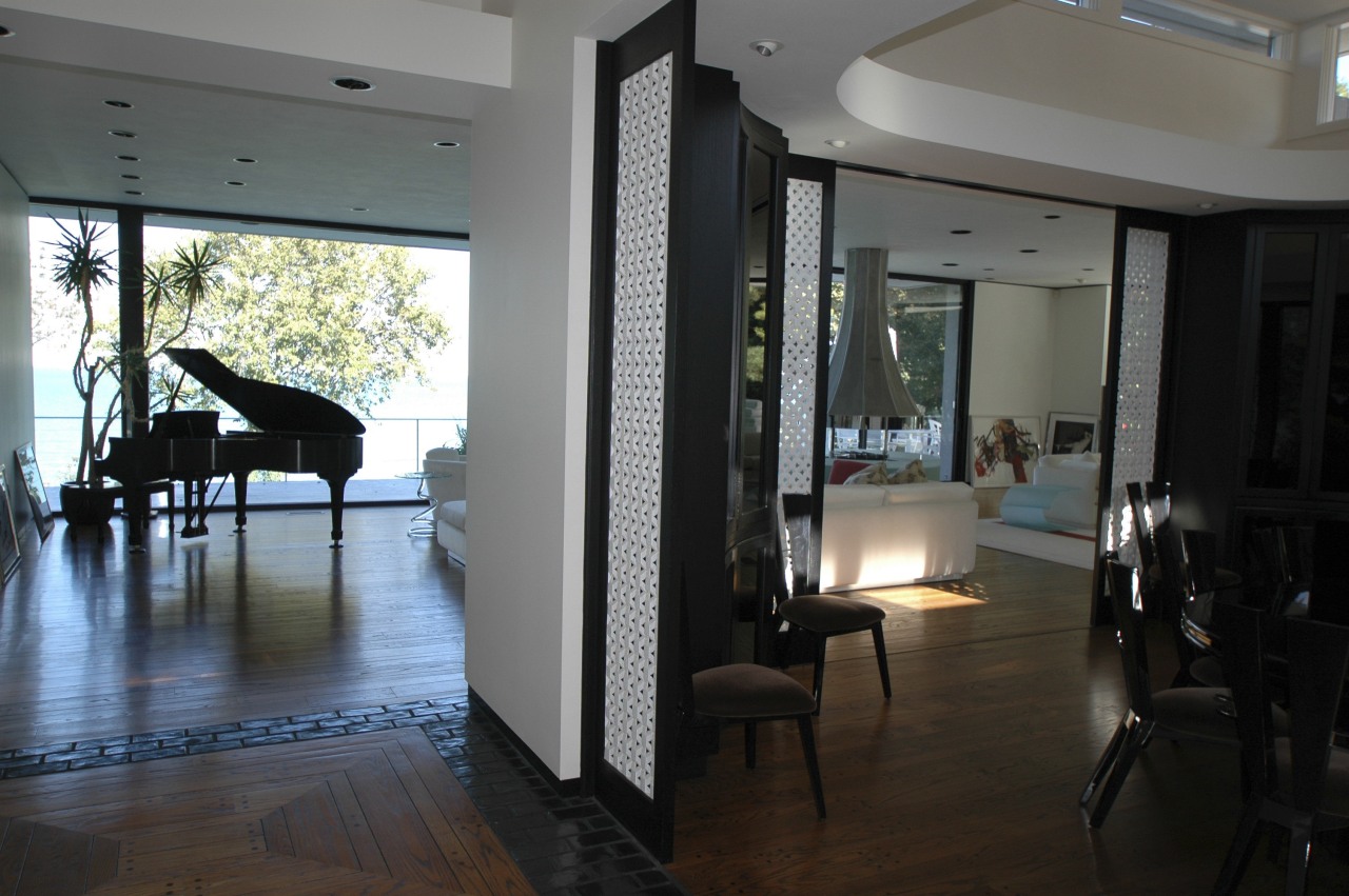
The dining room set at the center of the public spaces had been obstructive, with oppressive curved cabinetry, several standing screens and ornate doors that only partially opened to the living room.
Fraerman says the dining space, as with the adjacent public rooms, has been streamlined and made more transparent. Sliding doors now feature at the broad entries to the room. These are often left open, creating the feel of one large volume.
The kitchen, at the corner of the home, had been quite separate and locked off from the views. A corridor opened up alongside the dining area improved circulation and created a vista to the lake from the kitchen.
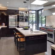
Kitchen designer Mick De Giulio was asked to bring the newfound sense of transparency and modernity into this area. He says the existing kitchen had a semi-industrial aesthetic and an overall effect that was uninviting.
"I gave the kitchen a warm, light-filled appeal and continued the themes of connection and contrast by making extensive use of wood, natural stone, glass, and metal. The polished stainless steel of the appliances and fittings are set against the ebonized wood cabinets, which play off cream marble surfaces," says De Giulio.
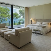
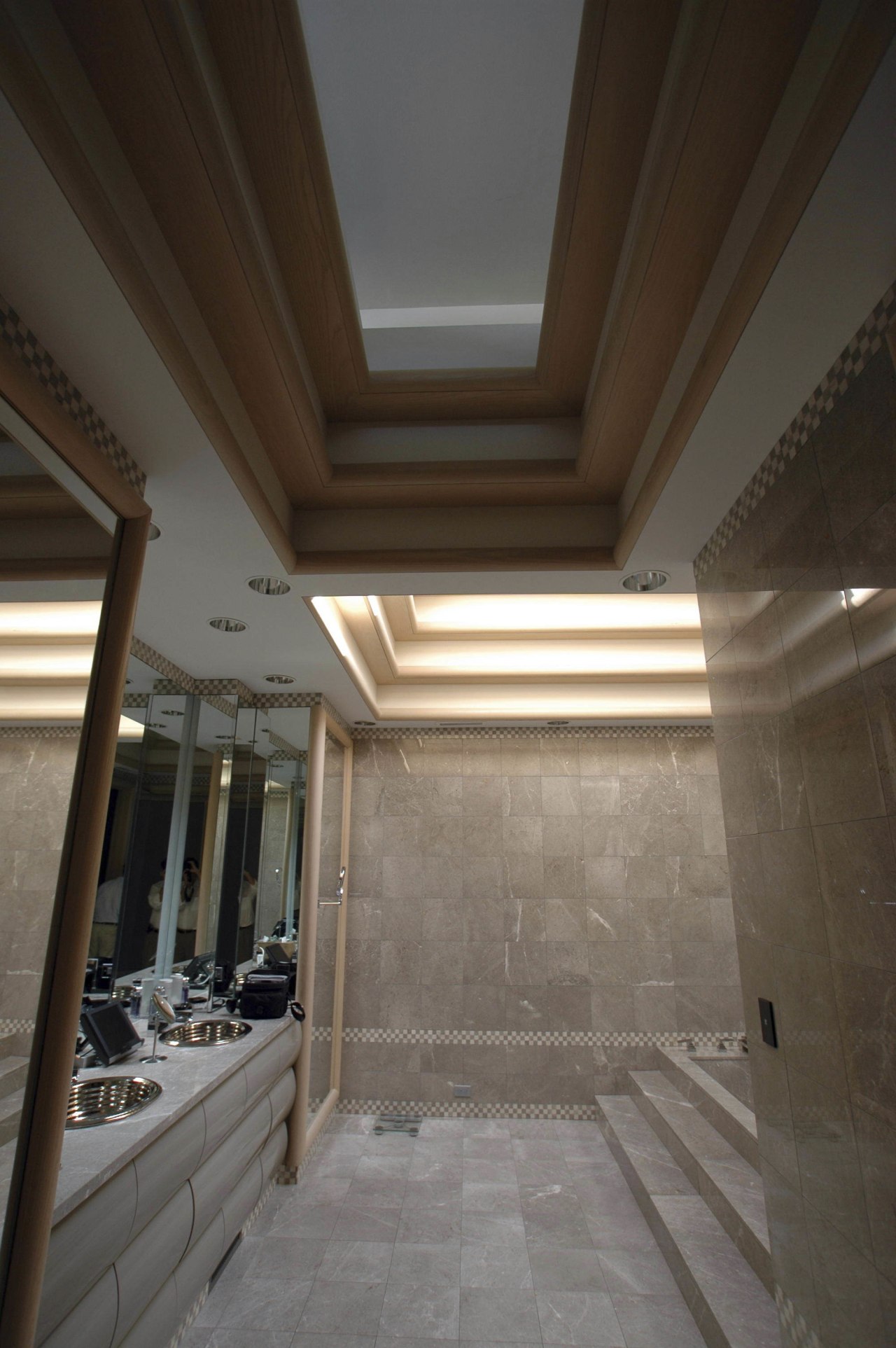
Substantial work was also carried out in the private areas of the home, with the master suite dramatically reconfigured to improve inter-room connections, optimize outlooks and to make way for a study. Downstairs, a clutter of locker and steam rooms was reshaped into open recreation areas, on similar lines to the floor above. Another stairwell, near the entry, has been widened and exposed, making the way to the recreation level more apparent.
"An ability to understand the spaces as you move through them brings a sense of comfort as well as beauty to the now classically modern home," says Fraerman.
Story by: Trendsideas
Home kitchen bathroom commercial design
Small space, big impact
Classic dovetails contemporary
Tranquil waters

