Splash of colour
A number of design devices and colourful elements ensure memories of visiting this office and training facility will linger on
It's an irony, but working with large budgets doesn't always guarantee the greatest success. Perhaps this is most apparent in advertising, where low budget guerilla' campaigns can have greater depth and create longer-lasting memories than endeavours with more resources behind them. In the world of office fit-outs, the same theory often applies. It seems that reasonable budgets can promote greater inventiveness and produce more imaginative results.
The fit-out of the Blueprint Centre for Learning a private training enterprise that specialises in delivering a diverse range of training programmes to all kinds of health, mental health, addiction and social sector agencies is a case in point. After being introduced to the empty, untenanted space which was last updated 20 years ago, Blueprint worked with CCM Architects to realise the potential of its new office and training centre. In its previous incarnation, the third floor of the 1940s building wore a collection of late-80s garb, including bright blue powdercoated trim and sage-green Formica. In other words, it was sorely in need of an upgrade.
"The client's primary aim was to achieve a lively space that would provide students and guests with a memorable experience. Visitors come here from all over the country, so we wanted to make the place an event in itself, a dynamic and positive experience for all those that utilise the building," says Guy Cleverly, director at CCM.
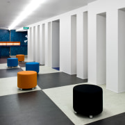
The fit-out required modifying the internal spaces, incorporating a reception area, boardroom and training rooms. Where possible, services were re-used and upgraded. Importantly, circulation routes, identifiable by black-and-white checked flooring, were widened to provide breakout areas that allow visitors to access the internet without requiring fixed desk space while on their respective training courses.

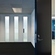
"The circulation route is also a communal area. At the reception end, a yellow bench provides space for casual computer use. The wall that runs along that side of the space has columns with deep recesses and glass behind to allow views into the offices, while avoiding the fishbowl effect," says Cleverley.
The overall colour scheme of the flooring is mostly monochromatic. This has the effect of highlighting the carefully chosen colourful elements.
"Because the far end of the communal area receives little natural light, we had to use other methods to pull people in," says the architect.
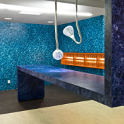
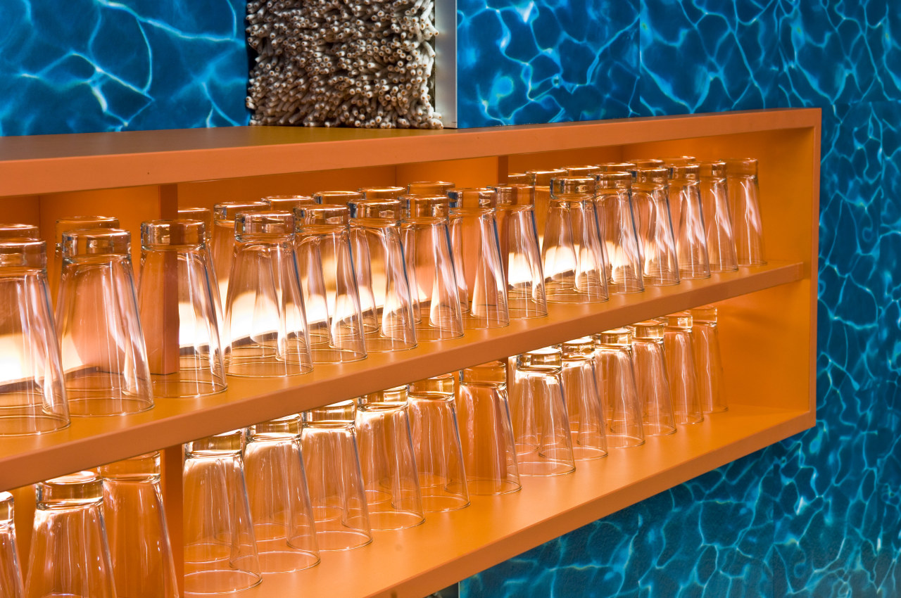
"The fluorescent lights, for instance, were arranged in a linear fashion down the centre of the ceiling, effectively drawing the eye back. Vinyl flooring, with a water motif, was given a role on the back wall, and as you approach it the pattern becomes more apparent and adds a sense of movement and visual interest that draws you in."
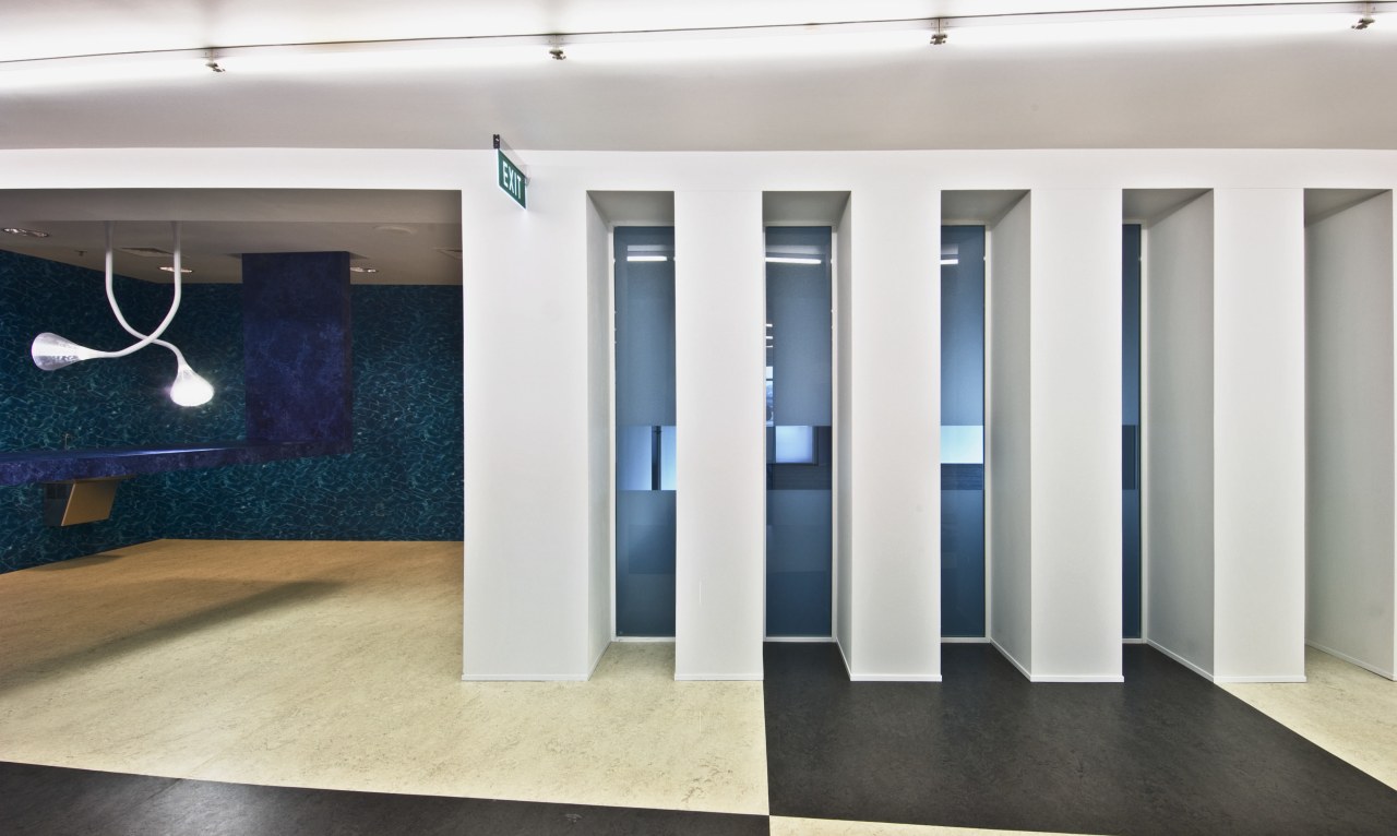
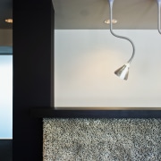
The water station, as the area is known, features a blue formica, island-style work and leisure area. Rather than being grounded at both ends, one side of the island rises up into the ceiling. Two sculptural Herzog & de Meuron-designed Pipe Suspension lights add further distinction.
"This break-out space was essential, so we wanted to deliver something visually powerful. Throughout the project, we were exceptionally lucky to be working with a client who was open to suggestion and interested in moving beyond the conventional."
At a training centre, educational spaces that enhance the capacity for learning are essential. The designated training room at Blueprint previously had a slightly claustrophobic atmosphere, due to a low, 2.5m ceiling. To lighten the mood, the ceiling was raised above the gang nail trusses. The trusses and ducts were painted white for a light, continuous finish, and acoustic tiles were applied to the new ceiling to enhance the room's tonal qualities.
Story by: Mike Barrett
Photography by: Paul McCredie Splash of colour A number of design devices and colourful elements ensure memories
Home kitchen bathroom commercial design
'Hygge' in the highlands
Playing with blocks
Holidaying at home
