Shipping news
A layout and materials that emphasise waves, curves and sails reflect the maritime nature of the business conducted in these corporate headquarters


Corporations often want the interior of their headquarters to refer to the company's business interests. However, this needs to be achieved without being comic or impacting on function.
SI Design was called in to design the interior for new corporate offices for Wilhelmsen Maritime Services, a global provider of services to the shipping industry.
"In view of the nature of the company's business, we felt an understated nautical theme was appropriate," says Brad Walls of SI Design.
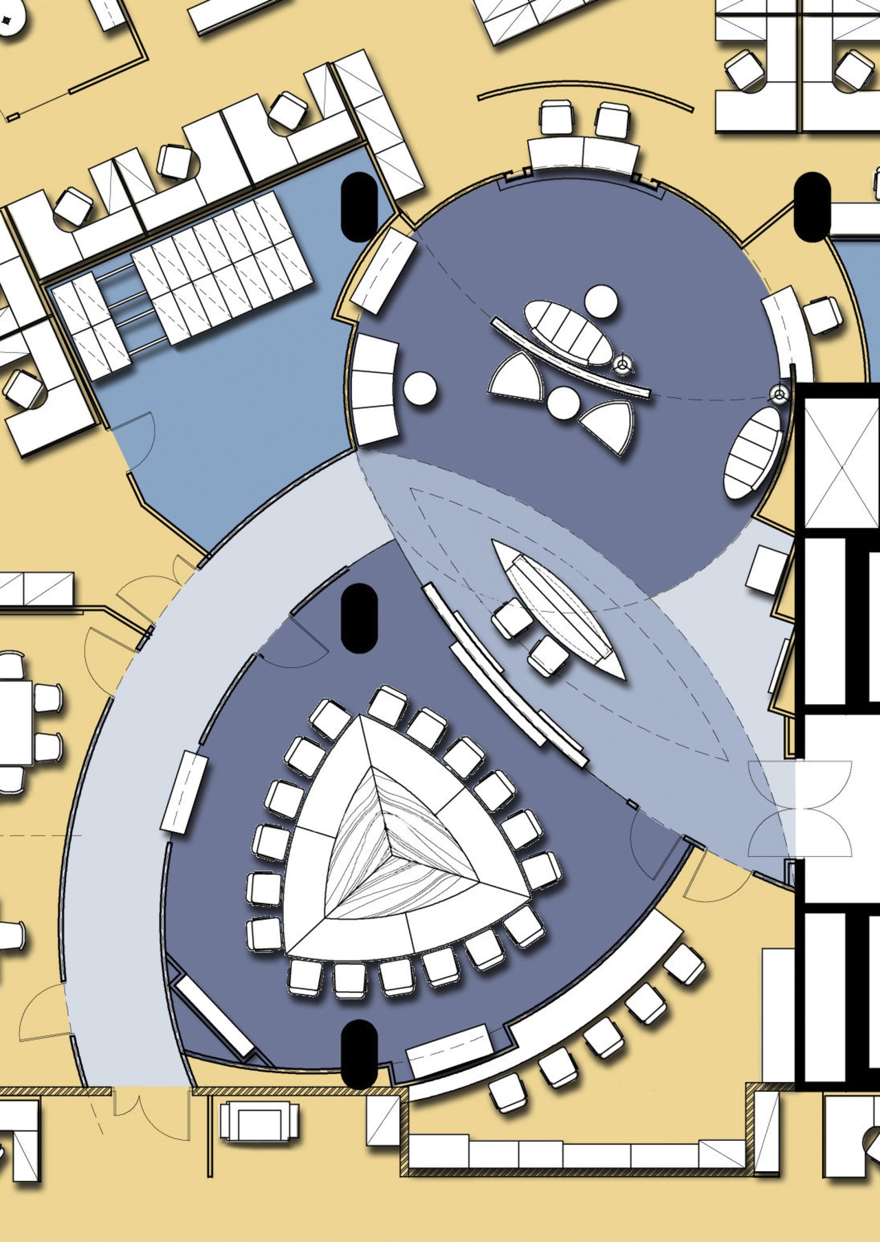
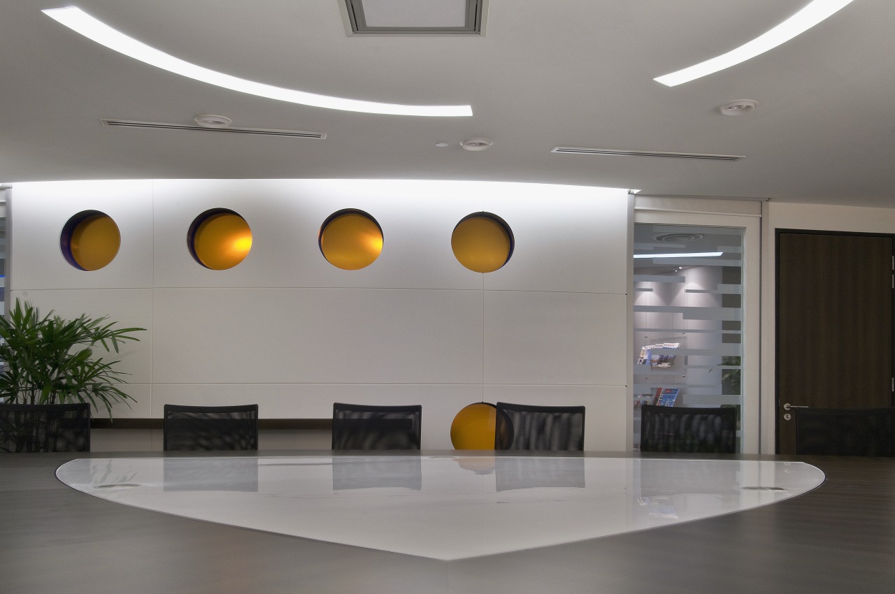
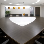
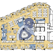
The whole building is an unusual sail-like shape, so the space planning followed this, beginning in the reception where the desk has the footprint of a boat.
Because offices and meeting rooms all flow from the reception area, the overall layout was planned as an interplay of curves simulating the movement of waves.
"This encourages visitors and staff to move through the offices, and makes transitions from one area to the next gentle and subtle, like waves," says Walls.

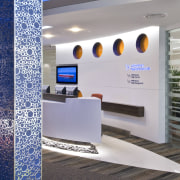
Interconnecting with the reception is a sail-shaped boardroom dominated by a triangulated table. Portholes in the wall between the reception and boardroom are filled with orange translucent glass, so shape and movement can be seen, but privacy is not compromised.
"This particular table shape fits well with the company's policy of open communication. The table seats as many people as a round table, but everyone is much less spread out," the designer says.
Colours were chosen for their warmth and vibrancy. A focal wall clad with metallic blue panels inscribed with chromed circles creates a strong visual impact in the reception. Chairs in a selection of bright colours accentuate the design and add interest to the space.
Story by: Mary Webb
Home kitchen bathroom commercial design
