Serious investment
The world's largest Islamic bank has announced its presence in Malaysia with a grand gesture a fit-out that raises the bar for personalised banking facilities

Large international companies will commonly have a corporate fit-out that can be rolled out in a new branch anywhere in the world. But sometimes a new market calls for a different strategy, which was precisely the case for the world's largest Islamic bank.
When the Saudi Arabia-based Al Rajhi Bank extended its services into Malaysia for the first time, the move was seen as a chance to set a new standard for personalised banking facilities. To this end, SI Design a specialist interior design and project management company was contracted to develop a concept that could, in turn, be rolled out in a further eight branches, a trading facility and a data centre.
Executive director Brad Walls says changes to the financial marketplace in Malaysia are opening up new opportunities for Islamic banking, and the Al Rajhi bank wanted to enter the market with a serious statement.
"Personalised banking and the simplification of Islamic banking are major focuses for the bank," he says. "The penetration of internet banking in Malaysia is very low, which means bank facilities are used to a much greater degree than in other countries."
Walls says it was essential that the interior design of the Kuala Lumpur headquarters reflected the bank's international standing.
"The design needed to reinforce its modern, progressive outlook the headquarters was always destined to be the flagship for the bank. The owners wanted to bring a breath of fresh air to the Malaysian banking system."
An existing, low-rise tower one of a block of four diagonally opposite the Petronas Twin Towers was chosen for the new premises, which occupy the basement and first two floors. The extensive refurbishment programme, undertaken on an accelerated timetable, included the building of a new 743m² mezzanine level.

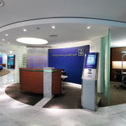
The design provides separate entrances and reception areas for customers and office workers. These areas are linked by expansive marble flooring, which extends up walls and across reception desks.
"The bank wanted a reception area that was warm and welcoming," says Walls. "We have introduced sweeping curves to the marble and carpet flooring to provide an easy flow from the entrance."
The curves on the floor are mimicked by curved ceiling elements slightly lowered plasterboard bulkheads and cutouts that help define the reception and internal walkways. Comfortable lounge seating, similar to that of a five-star hotel, is also a feature of the main reception area. Here, television screens display promotional items and the current Forex index.
In keeping with the bank's desire to incorporate state-of-the-art technology, the reception area provides a computerised scanner that reads customers' personal ID cards, which are available to all Malaysian citizens. This information, along with relevant details of customers' accounts, is then relayed to tellers.
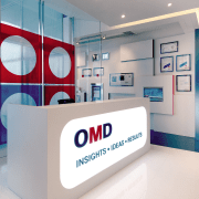
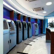
The curved, main reception desk, which features a wenge wood laminate, has a corporate blue backdrop. A large illuminated screen, perforated with an Islamic pattern, is positioned to one side. There are also curved, slump-glass screens that help to contain the space visually, while providing a sense of transparency. This entire area is illuminated at night, and can be seen from the adjacent ATM lobby.
A new atrium and stairs near the rear entrance were designed to replace an ageing semi-circular staircase. Curved cut-outs in the ceiling draw the eye up to the vaulted space.
"The atrium was a way to bring extra light, albeit artificial light, into the building," says Walls. "This space could easily have looked like an oversized lift shaft, but we have designed it to make a strong visual statement it highlights the simple, elegant look we set out to achieve. It's a very contemplative space, and is often used by staff as a quiet breakout area."

A water feature in the atrium not only picks up on Feng Shui principles, it also serves an acoustic purpose.
"The hard marble surfaces tend to echo," says Walls. "The water feature enhances the acoustics by muffling the echoes."
Feng Shui a key concern of most companies operating in Southeast Asia also determined much of the layout within the bank.
Other significant features of the design include the high level of technology incorporated into meeting areas, such as the boardroom shown opposite.
"This room is wired to the hilt," says Walls. "As well as table-top power and data entry points, there are full video conferencing facilities with button microphones and both internal and international satellite links. There is also a 72-inch plasma screen, a high-end projector, and a Bluetooth sequencer. This is programmed to adjust audiovisual settings, lights and blinds at the click of a button".
Much of the work involved in the fit-out, however, was behind the scenes. Walls says considerable floor strengthening was needed as point loads were excessive. The building programme was also accelerated to meet a tight timeframe.
"Despite the challenges, we were able to complete the headquarters on time, and deliver a model that is now being translated through to the branches."
Story by: Trendsideas
Home kitchen bathroom commercial design


