Rustic Italian
Artisanal finishes and dark hues help this kitchen evoke a rich sense of history
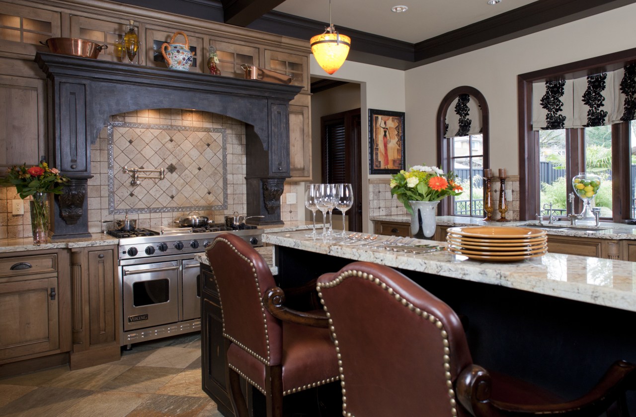
Creating an aged look in a kitchen involves more than distressed finishes on the cabinetry. A skillful designer will factor everything into the mix, from the hearth to the ceiling beams.
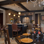
This rustic kitchen was created by designer Earl Lawson for an owner who wanted a French/Italian country feel for her new home.
"Features of this project include the island, which has an unusual shape, and the attention to finishes and detailing throughout.
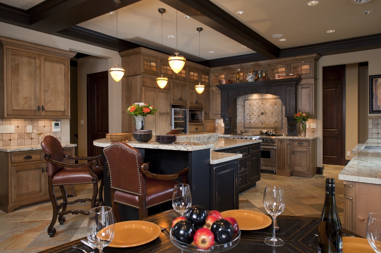
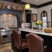
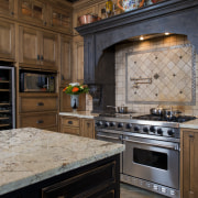
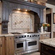
"The focal point is the hearth surround this has a dramatic blackened, textured finish that resembles burnt, charred wood, as though it has withstood many years of use."
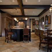
Building on the idea of well-worn elements drawn together over time, Lawson introduced traditional inset cabinetry built in knotty alder, with heavy wearing, antiquing and distressing. Rugged granite counters, a marble backsplash and tumbled marble floors contribute to the feel.
"Textures on the island also provide appeal," says Lawson. "This element is finished in black rub-through paint with Salem stain overtones.
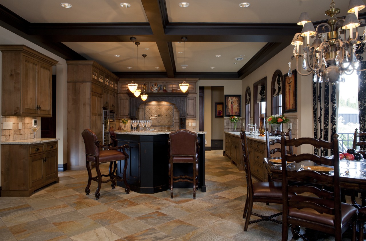
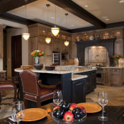
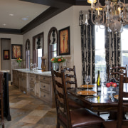
"With several dark accents in the design, an unadorned ceiling could have seemed too plain. I introduced aged black ceiling beams to bring balance. These run right through the rear of the home, and help connect the open-plan spaces."
The kitchen is carefully considered in terms of functionality, with the island again playing a pivotal role. The front of the island is a soft L shape, made up of two raised eating counters. These are separated at the corner of the L by a rounded presentation and storage element. The lower surfaces of the island are conveniently near the perimeter cooktop and refrigerator.
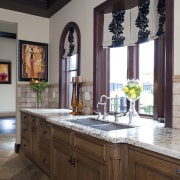
On the opposite wall, a washing-up sink is served with undercounter DishDrawers. Upper cabinetry was avoided to allow the windows and views to take center stage. To compensate, there is ample plate storage in the island and in a next-door butlery, also created by Lawson.
Credit list
of history Interior designer
Cabinet company
Countertops
Microwave
Dishwasher
Story by: Charles Moxham
Home kitchen bathroom commercial design
