Renovation transforms living spaces
Opening up the kitchen and living spaces makes the most of the existing footprint when renovating this home
Architect: Broad Architecture
Photographer: Greta Costello Photography
About the project:
Sandringham House is a renovation/extension project that takes its formal cues from the gable roof forms of the existing house and strategically alters the existing ground floor layout to open up living spaces to decks and garden beyond.
The design brief for the alterations and additions was to incorporate:
A small extension, internal alterations and spatial reorganisation of the existing dwelling to create an additional, more spacious living area that connected with the backyard
A new kitchen that wasn't visible upon entry to the house
More effective storage reconfiguration of existing garage for more tailored storage
The owners were particularly interested in the following qualities:
An architectural outcome with sensitivity to the character of the existing house
A strong connection to the outdoors/maintaining views out to garden
What were the key challenges?
Difficult site orientation - The existing house faced north towards the street with secluded private open space located predominantly to the rear of the site, limiting opportunities to access direct northern sunlight
Sensitive integration of an extension with the dominating gable roof form of the existing houseInstilling a sense of richness, texture and detail that would compliment the materials of the existing house
Fulfilling the client's brief within the constraints of a tight budget
Orientation was a key concern for the project given the block faced north to the street and secluded private open space was located south of the dwelling.
In order to fulfil the clients' brief and minimise alterations to the existing building for cost reasons, the additional living space was located at the rear (south side) of the existing dwelling where the ex-kitchen used to be.
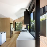
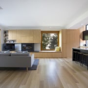
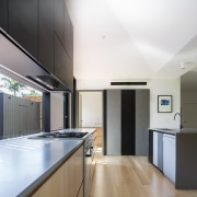
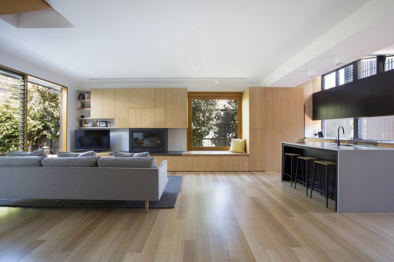
While generally not ideal, it became evident that the removal of internal walls that defined the existing kitchen, laundry and powder room in order to create one large space open to the east and west via new and enlarged window and door openings would be an efficient and effective way to significantly improve the feeling of spaciousness and quality of light within the ground floor living spaces.
Moreover, an improved porosity through the dwelling could be achieved thus connecting outdoor living spaces on both sides with living spaces within and imbuing the interior spaces with a sense of being much larger than they actually were by borrowing perceived space from outside.
The laundry and powder room was relocated and reconfigured into the under-utilised, southern portion of the ex-living room. In these rooms, white rectangular wall tiles and mirrors have been used to bounce light around and continue the play between perceived space vs actual space.
Considered insertions of joinery within new and reconfigured spaces has provided the house with more useful and tailored storage solutions.
The reorganisation of the plan also meant that the sitting room (ex-living/family room) was tailored to more intimate and useful proportions and, with its northern orientation, has become a favoured place for my clients' to withdraw and indulge their passion for music.
The existing garage was demolished to make way for the new deck.
The new deck, which projects out from the new kitchen to meet the new brick boundary fence was positioned to gain direct access to northern sunlight. The location of the new deck also enables passive surveillance of the street and a visual connection to neighbours.
Two smaller, function-specific outbuildings were built to the north and south of the deck to accommodate the clients' garden storage and bike storage needs in a tailored manner, providing partial enclosure to the deck for a level of privacy and a sheltered nook for the BBQ when not in use.
The formal expression of the extension took its cues from the gable roof forms of the existing dwelling.
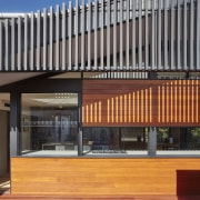
By seeking to notionally distort the gable language along the west and south elevations of the extension before terminating at the ground, the formal approach aims to tie new and existing parts together through an understandable dialogue.
The raking form also has functional benefits for the extension, enabling a high-level timber batten screen to be integrated into the form of the extension to offer protection to western glazing while simultaneously invigorating the ceiling height over the new kitchen internally. Warm air can also rise and be expelled through high-level louvres when required.
The timber batten gate and high-level screening seek to add a level of detail, transparency and softness to the house while the material selections throughout are restrained and add a sense of warmth and texture while not feeling out of place against the existing palette.
Story by: Trends
Home kitchen bathroom commercial design


