Renovation of Mid-century Modern house in Melbourne, originally designed by Woodfall & Reynolds
Mid-century Modern home renovation retains original features, bluestone walls, American oak cabinetry, courtyard house, designer furniture
Finding an older home in its original state can be a lot more exciting than walking into one that has been upgraded so it's scarcely recognisable from the original.
The difference is all in the architecture, as this project illustrates. Owners Victor and Janice Maree, long-time devotees of the Mid-century Modern style, were thrilled to find this good example of the genre in its original condition.
"The house, designed by architect Linton Reynolds of Woodfall & Reynolds in 1962, is a classic," says Victor Maree. "But it would have been quite experimental in its day, being one of the first limestone houses to be built in Melbourne.
"Although some elements had become run-down over the years, the house had not lost any of its integrity and was in sound condition."
Maree says the proportions of the house set it apart from many modern reproductions.
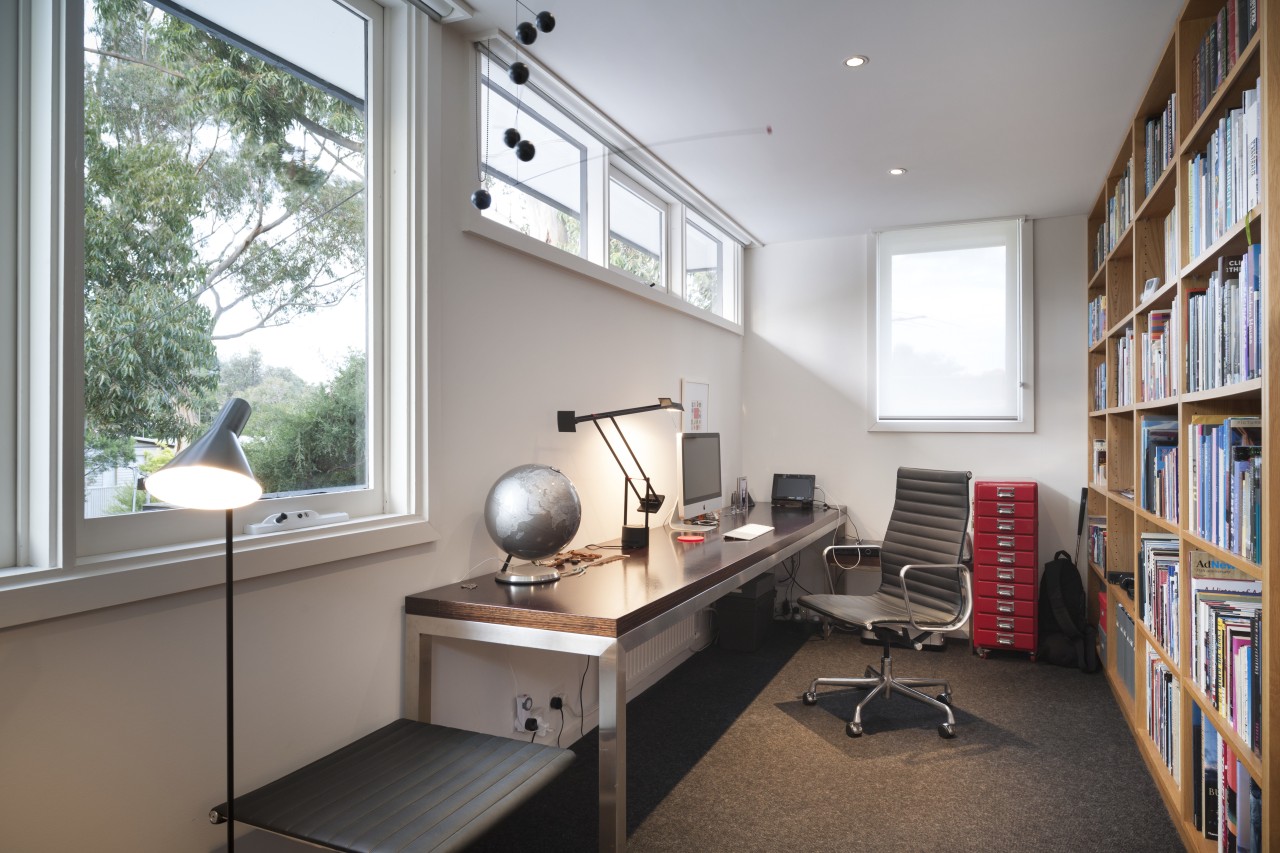
"For example, the ceilings are an ideal height, neither too high nor too low. Natural light has been introduced very intelligently the little high windows are perfectly proportioned. The house also has a wonderful simplicity that is hard to find in many new homes. Nothing is contrived."
Maree says the pair set about renovating the property with the help of interior designer John Bastiras, who is a long-time friend and the owner of Luke Furniture. Bastiras has a particular knowledge and passion for this era.
"Right from the outset, this project was about authenticity and remaining true to the spirit of the house," says Maree. "And because the original house was built all at once, we decided the renovation should not be piecemeal, but also undertaken in one go."
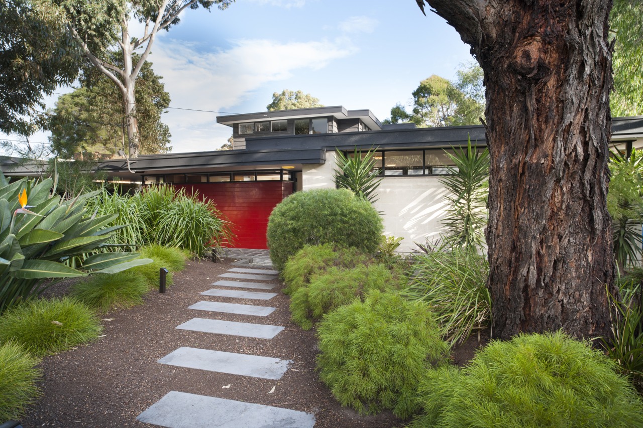
Visible changes to the exterior included new landscaping to accentuate the entry, and a glossy red paint finish to the existing meranti timber cladding at the front.
"This timber could not be restored easily to a good finish, so we chose to paint it instead," says Maree. "The post-box red is a popular Mid-century accent that reappears inside the house, albeit in more subtle ways. Here, it defines the meranti timber box that wraps around to form the entry on one side, and a wall in the carport on the other side."
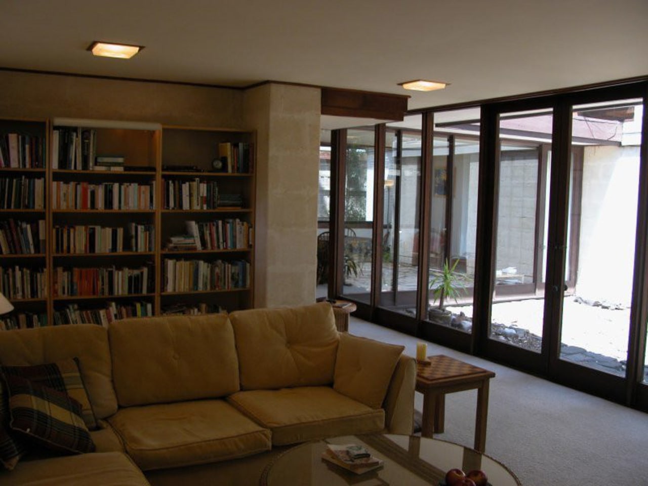
On the interior, the design had to be unobtrusive, and as close to the original architecture as possible. The existing cork and resin flooring had petrified and cracked over 50 years, so this was replaced with blue-grey ceramic tiles that replicate the colour of the original bluestone that clads a wall in the living room and forms the paving outside.
"The tiles create the same effect as the bluestone, but are not an imitation," says Maree.
To simplify the interior and remove any suggestion of clutter, Bastiras designed custom American oak cabinetry the same wood veneer appears in the built-in cabinets throughout the house. The veneer matches the colour of the original meranti timber that still features on a freestanding wall in the kitchen, and the front of the peninsula, which was left intact.
"The new joinery has a very minimal design, so it almost fades into the background I wanted it to look as though it had always been there," says Bastiras. "The simple backdrop also made it easier for the owners to personalise the house with their furniture, artworks and homewares."
The American oak veneer appears on kitchen cabinets, cantilevered cabinets in the living room, and a modern unit in the dining area. The veneer is also used for shelving, bookcases and stair balustrades.
Maree says the balustrades were originally a Canadian pine that didn't work visually.
"The new balustrading, designed by John, includes solid American oak handrails, and is much more sturdy."
An extensive collection of Mid-century Modern designer furniture enhances the link with the past. But the Marees and Bastiras have also included appropriate modern furniture, such as a B&B Italia sofa, which is teamed with a classic Eames chair and Noguchi coffee table.
Wherever possible the existing moulded square light fixtures were left intact, further enhancing the authenticity.
The visual connection with the outdoors that is so much a part of the house has been reinforced with the renovation.
"We love the large doors that open up the entire living room and dining room to the central courtyard," says the owner. "With such extensive glazing, this has never really felt like a small home."
The original courtyard was retained, but refreshed with a new fountain water feature.
Story by: Trendsideas
Home kitchen bathroom commercial design
Renovation Trends Vol. 30/11
Renovation Trends showcases innovative makeovers – big and small. The book features kitchens, bathrooms, interior makeov...
Read More