Raw materials and exposed services give design company industrial chic
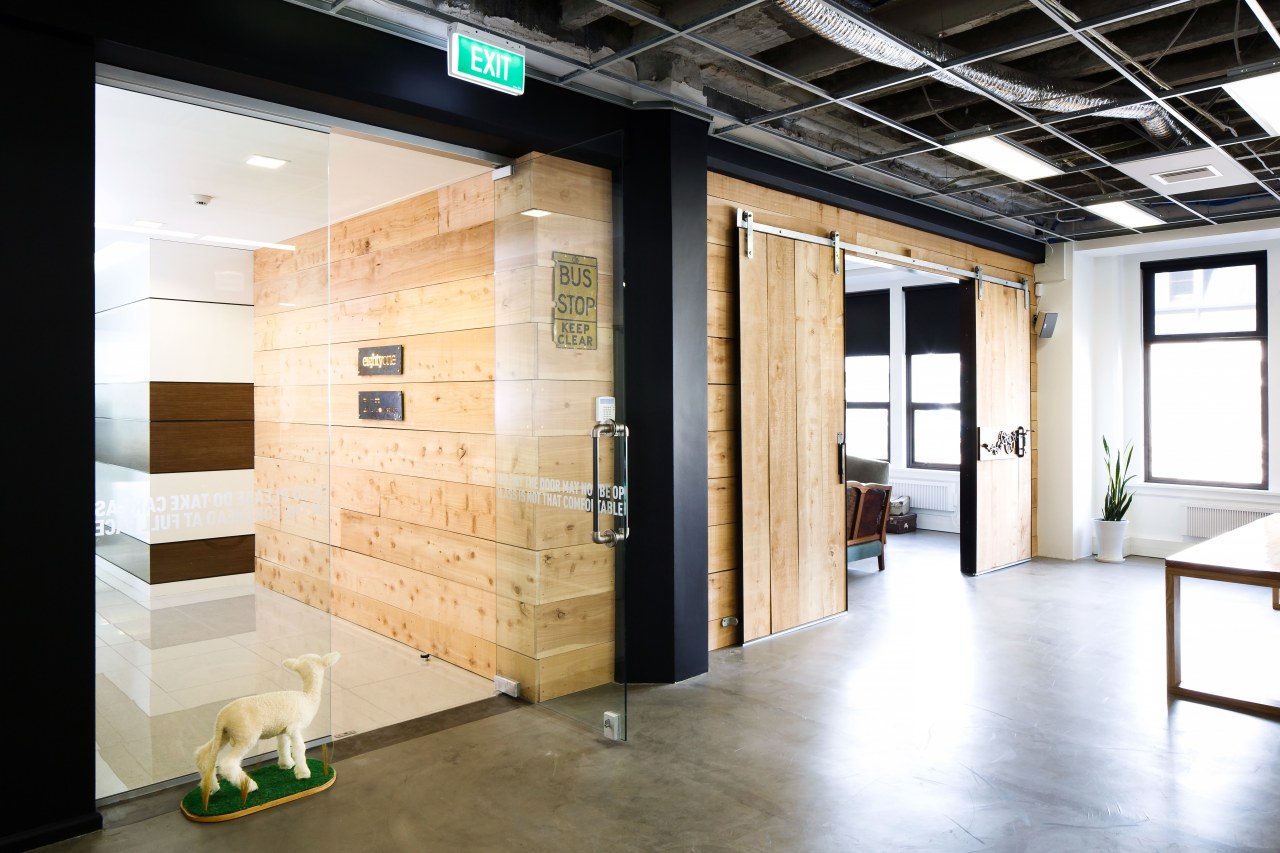
Fit-out of EightyOne design and production company by Inside Design featuring untreated wood, exposed services and whimsical elements
The location is ideal and the space perfect, but sometimes the fit-out leaves a lot to be desired. Turning a bland decor into a positive expression of company culture can be as much about time and forethought as it is about money.
When design and production company EightyOne secured its heart-of-the-city premises, the creative team loved the setting but not the decor. Interiors team Inside Design was asked to strip out the white ceilings, neutral carpet and compartmentalised interiors and create something open, honest, and approachable in their place. Lead designer on the project Seb Bernhardt says inspiration for the new look grew in part from EightyOne's own concept of introducing a central, freestanding feature wall in recycled timber.
"Together, the newly exposed ceiling plant and levelled and honed concrete floor set the scene for a semi-industrial aesthetic, and a rustic timber wall in the centre of the office was a good fit with this approach," says Bernhardt. "The idea was for the wall to capture peoples' attention instantly, upon arrival. Sourced by EightyOne, the distressed Canadian Oregon timber was recycled from Christchurch, post-earthquake."
Complete with small side wings, one of which houses reference libraries, the wall conceals office utilities from the entry and reception area. It also offers a degree of privacy for the in-house photo studio in the open-plan space.
The use of raw timber here inspired a similar material emphasis in other areas. A meeting space to the left of the entry is clad in macrocarpa. With three sides of this room finished in the same wood, it takes on a playful box-like quality, almost like a packing case, when viewed from outside. One wall of the box' extends back out into the entry corridor, offering an early glimpse of this rather unexpected rough-and-ready material. This helps to draw people forward.

The meeting room doors extend the look. These are made from vertical wood planks. Set on sliders, the barn-style doors feature an antique operable latch with cogs, sourced by Inside Design. The rotated cogs indicate whether the room is vacant or in use. Exposed metal bracing on the doors is visible from within the space.
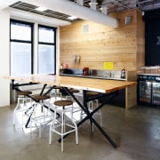
An informal reception area beside the entry overlooks a kitchen unit with a similar box-like, timber treatment. The wood theme continues in this area, with a casual leaner table comprised of chunky industrial-look Kee Klamp components and a macrocarpa top.
"To match these treatments we commissioned simple pine benches as workstations," Bernhardt says. "These pared-back desks were produced by Kerry Hart. However, this desking solution left nowhere to conceal computer cabling, so we introduced metal floor tread plates at the side of each desk again, in line with the semi-industrial look."
Another informal desk area housing data analytics company Dot Loves Data and photographer Richard Bran has a similar aesthetic.
However, if much of the fit-out has a raw, untreated appearance, a contrast awaits clients inside the meeting room.

This was another area where the EightyOne staff had a significant input. They wanted to create a refined, but homely, contrasting environment in this room, the only enclosable space in the design.
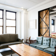
Co-owners and directors of EightyOne, Carlos Constable and Matt West, say their team sourced the pre-loved furniture pieces for the shabby chic environment that resembles a lounge in a home. Besides being cosy, the wickerwork settee, rolled-arm sofa, classic coffee table and traditional open fireplace are in juxtaposition with the exposed timber on one wall and the braced barn doors.
From the reception space, complete with pinball machine, moose head, large wall blackboard and well-stocked bar, to the comfortable and casual feel of the meeting room, EightyOne's interior is designed to exude a youthful dynamic, and to put clients immediately at ease.
Credit list
Project
Construction company
Mechanical and electrical engineer
Flooring
Workstations
Additional furniture
Interior design
Structural engineer
Door joinery
Wallcoverings
Office chairs
Story by: Charles Moxham
Home kitchen bathroom commercial design
Commercial Design Trends Vol. 30/12
Commercial Design Trends is aimed at our professional readers, and showcases commercial buildings. The book features reg...
Read More


