Raising the parents
A new addition to the rear of a one storey home offers open-plan living connecting with the rear yard and also climbs a level for a master bedroom and study
Renovation by Alex Urena, Alex Urena Design Studio
From the building designer
Design brief
As an inner-city location, the original house was quite long and narrow.
It was single storey with very small spaces and generally dark.
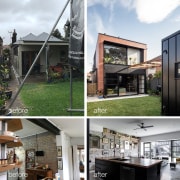
The brief consisted of removing the rear side of the house and replacing it with a two-storey element with a more open and modern living area downstairs, relocating service areas like bathrooms and kitchen while creating a more natural link between the house and yard.
The new upstairs level includes a master bed overlooking the yard, W.I.R, ensuite and studio.
As a family with children heading into teenagehood, the additions needed to be felt like an attached, yet separate wing.
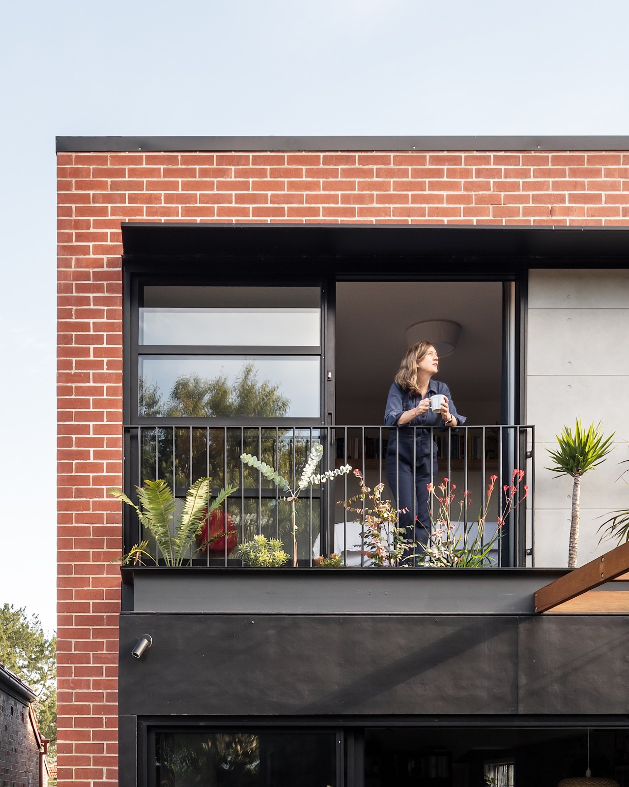
It was requested that the addition connect by contrast with the original house, and create a Brooklyn/New York vibe, with red bricks and black metal features – essentially in visual terms presenting as a modern red cube attached to the existing house.
The challenge was to find a merging point and elements between old and new within this contrasting approach.
Lastly, a detached garage and toilet was to be placed at the back of the site, which has access via a rear lane.
Design solution
As a first step, a new bathroom and laundry were located behind the existing lounge (now teenager's living room), to mark a change between the old and new wings.
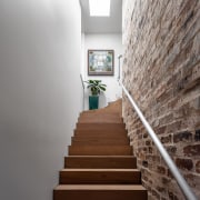
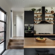
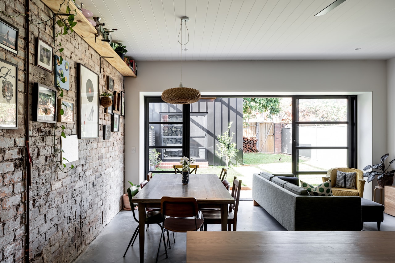
A feature exposed recycled brick wall that holds the stairs going up to the parents' retreat becomes the backing for the new open plan kitchen-dining-living, now fully linked to the yard.
The new space is also accessible from the side exterior walk path, which now becomes the main access for visitors, who now enter the house via the living areas instead of through the bedrooms as before the renovations.
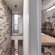
Upstairs, the stairs' void is fully lit by vertical windows and skylights.
Ensuite and W.I.R were placed in the centre, behind the stairs, with high windows and skylights for natural light, and accessible from two sides for versatile functionality.
The master bedroom faces the yard via a Juliette balcony and built-in planter boxes outside.
A private studio was placed on the other side of the stair's void, with floor to ceiling fixed glass in the transition passing by the void, creating the illusion of a bridge style path.
Visually, red bricks around the master bedroom with thin 'legs' continuing down on the side of the living room, framing a pop-up black and steel built-in planter above the doors towards the yard – giving the required the Brooklyn vibe.
At the same time, the black metal claddings provided contrast against the original house.
Internally, the original brick walls were exposed alongside the living areas in a homage to the original house, with all marks left purposely exposed.
Credit list
Home kitchen bathroom commercial design
Thrice as nice
Marvellous in marble
The beauty of understatement
Renovations
Renovating your home is an opportunity to refresh, expand and renew. Here's all the inspiration, ideas and information y...
Read More


