Point of view
A communal family kitchen that doesn't forgo design detail or practicalities befits its new site in a large villa

Colour can make or break the successful union of traditional architectural features and a modern kitchen. Highlighting older elements in bold tones could look tacky, while painting them white can render them insignificant.
Kitchen designer Damian Hannah says a solution lies in the use of aluminium.
"Aluminium is the new white," he says. "It has so many application possibilities: benchtop surfaces and edging, cabinet doors, trim, bar handles and splashbacks. But it also suits all types of homes, from contemporary new apartments to traditional-style residences."
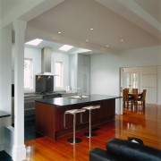
He showcases his theory in this home, a large 1910 weatherboard villa which had been gutted and re-laid to suit to the requirements of a young family. Architect Angela Foster says the concept was for a modern interior and the kitchen was integral in establishing this look, hence the choice of Poggenpohl cabinetry.
However, says the kitchen designer, utmost consideration was required for the integration of old and new in such a contemporary application.
This attention to detail can be seen particularly between the back bench and the island. This area is an extension to the house and it was decided to highlight this fact. So, in the existing section, the floorboards remain with the cabinetry a complementary chestnut brown veneer. In the extension, granite floor tiles and anodised aluminium feature.
"We used the aluminium because most of the home's interior is white," says Hannah. "Aluminium doesn't detract from white but doesn't blend in too much with it either. It was the perfect complement."
The kitchen is in a completely different position to its predecessor, says the architect. It was relocated for a number of reasons establishing a connection to the outdoors was just one. Now the homeowners can watch their children playing outside and pass platters through the back windows when dining outdoors.
Placing the kitchen in this area also made sense because it allowed for the inclusion of a scullery, an idea borrowed from the original kitchen wing.
"This meant the kitchen could become a showpiece and the scullery could conceal cooking and preparation mess," the architect says.
Credit list
Architect
Cabinets
Splashback
Refrigerator
Mixer
Bar stools
Kitchen manufacturer
Benchtops
Stove and rangehood
Dishwasher
Pop-up power point
Flooring
Story by: Damian Hannah

Poggenpohl Kitchens
Cabinetry that will last for years
Damian Hannah is a highly qualified, award-winning kitchen designer who owns and manages German Kitchens Limited in Wellington
New light toned kitchen emerges from design rethink
Prestigious German Design Award goes to luxury appliance brands showspace
Upon reflection


