Pixel perfect – the art of standing out and fitting in
Dynamic and futuristic, Kokaistudios transforms a 20-year old shopping mall into a modern lifestyle destination – breaking up the mall’s boxy silhouette in a surprising way
Designed by Kokaistudios
From the renovating architects/ interior designers:
The Citic Square mall renovation in Shanghai, China brings a historic commercial corner up to date, with new architecture that complements its historic surroundings, opening new vistas and possibilities.
Pixels within pixels
Kokaistudios’ recently completed architectural renovation project of Citic Square shopping mall epitomises Shanghai’s inherent duality.
With a futuristic aesthetic combining multimedia elements and some of today’s most sought-after brands, it sits seamlessly alongside one of the city’s best-preserved examples of traditional, historic lane housing.
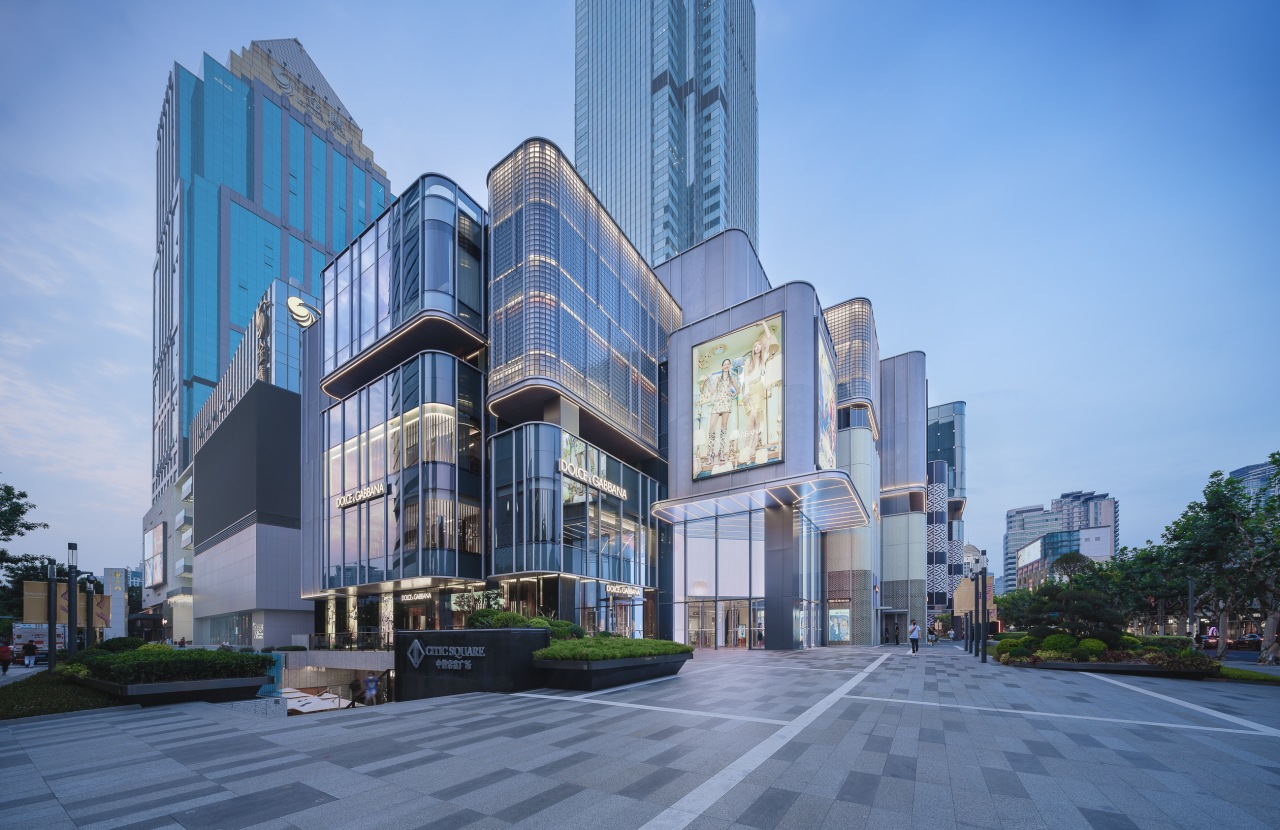
Located in Jingan district on main thoroughfare, the transformed building’s pixel-inspired facade and carefully selected materials break the traditional ‘box’ shape to blur the boundaries between city and mall, public and private.
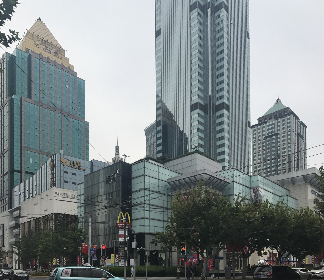
Originally completed in 2000, the mall lacked several of the elements demanded by today’s lifestyle-led retail environment: flexible multimedia components; attractive outdoor spaces; and eye-catching interiors for high-profile, luxury F&B outlets.
Kokaistudios’ interior and exterior renovation not only brings the mall up to date in terms of a destination shopping-hospitality experience, it successfully reintegrates Citic Square into the fabric of Shanghai by opening up previously hidden vistas, and playing on scale to complement the mall’s layered urban context.
Pixels are central to Kokaistudios’ design approach.
Their interpretation is both literal – such as with the mall’s transparent grid facade – as well as conceptual: whereby individual units that come together create a cohesive whole.
High visibility
The pixels are most visible on the mall’s Nanjing Road frontage where an outdated glass and stone facade has been replaced by a series of large-sized rectangles and squares of varying dimensions and gradated opacities, each protruding from the building’s core volume to create the impression of floating.
Effectively acting as individual shop windows, this ‘pixel’ approach allows tenants to customise their own displays.
Because each cube juts out from the building, passing street traffic is subject to three-dimensional impressions of the storefront's exterior.
Despite their contemporary connotations, the ‘pixels’ connect the mall to its historic urban context.
Directly opposite is one of the city’s best-preserved lòngtáng – typical of Shanghai, and dating from the early twentieth century, they are walled compounds of traditional lane housing, usually two- to three-storeys in height.
Citic Square's pixels facade creates a scale in keeping with the older architecture opposite.
The dialogue between old and new continues through the frontage’s materials of fully transparent glass panes, semi-opaque glass bricks, and Ultra High Performance Concrete (UHPC) panel.
Gardens further blur boundaries
A network of gardens both sunken and floating further blur the boundaries between private and public space – between Citic Square and the city of Shanghai.
These include terraces atop each of the facade’s pixel windows, significantly enhancing the stores’ attractiveness to shoppers by the unique views.
Previously a repository for the mall’s mechanical functions and equipment, the roof has also been transformed into an outdoor dining area for Citic Square’s anchor F&B tenant and a square outdoor activity area.
In an expansion of the mall’s footprint, a twin sunken garden has been installed on its eastern side, mirroring an existing one to the west.
The intervention facilitates flow through Citic Square’s basement level, which will focus predominantly on lifestyle.
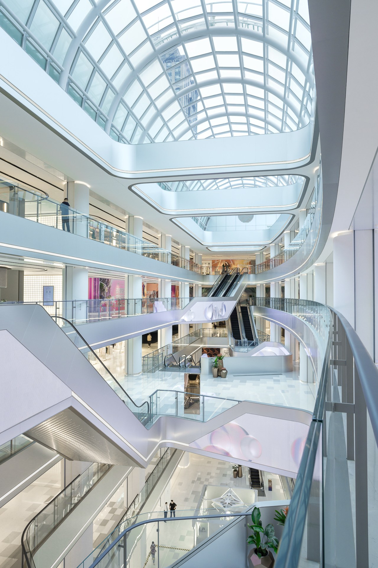
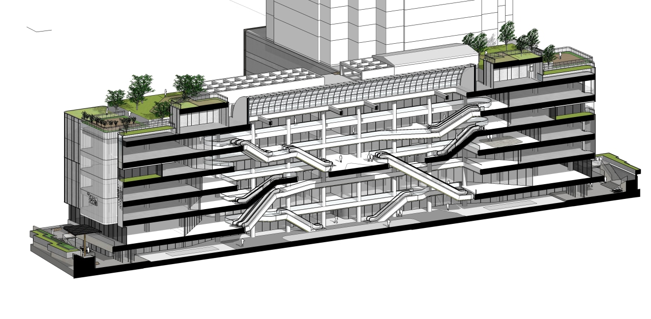
The design approach of breaking up the big-box mall continues inside the space, where a formerly vast atrium is now dissected by a mezzanine.
Fashion below – F&B above
Because lower levels’ flagship custom made facades allows for greater light control as opposed to upper floors’ abundance of transparent glass, the platform creates two distinct atmospheres, signalling shoppers’ journey between fashion below, and F&B above.
The renovation also shifts visitor flow from up and down, to through the space thanks to escalators at the mall’s two entrances, both of which have been configured to anticipate their likely demographic.
For example, the east entrance opens into a lifestyle space due to its proximity to Nanjing Xi Lu subway station.
The western entrance is close to nearby luxury shopping destination Plaza 66, and guides visitors towards thematically similar high-end fashion.
Like a secondary circulation – tracking shoppers' circulation – LED screens run throughout the atrium in an infinite loop.
Fully customisable, they update the mall into a dynamic multimedia space.
Data flow-look brings futuristic feel
Resembling a pulsating data flow, they reinforce Citic Square’s pixel theme to digital, literal, and futuristic effect.
The design trope is revisited in an abstract way in striking lift lobbies, where walls of glass bricks create impactful pixelated numbers.
Moving with the times
In order to stand out in Shanghai’s increasingly congested retail landscape, malls must move with the times.
At the same time, these large-footprint buildings must be comprehensively and seamlessly incorporated into public spaces.
Kokaistudios’ smart renovation of Citic Square achieves just this balance: now a fully flexible multimedia, lifestyle venue, it doesn’t dominate the Jingan skyline; rather it complements a rich, varied urban fabric.
Credit list
Project
Chief architects
Architecture design team
Interior design team
Renovating architect
Architecture design director
Interior design director
Designed by: Kokaistudios
Story by: Frances Arnold
Photography by: Terrence Zhang
Home kitchen bathroom commercial design
Radical yet respectful
Sculptural centrepiece
Curvaceous and connected
