Piece by piece remodeled apartment interior by Mark Williams
Remodeled apartment interior by Mark Williams


Vision is probably the most important attribute needed when you purchase a home in serious need of an upgrade. If you can see beyond the existing furnishings and layout to envision the potential of a space, you have a head start.
Scott Murphy and David Spirt, the owners of this remodeled apartment knew it had good bones, but they also knew it needed a lot of work. Architectural designer Mark Williams was consequently commissioned to redesign the interior to create a modern, clean-lined interior that would also be warm and welcoming.
"The apartment was rather dark and old fashioned, but had the potential to be a very light space," he says. "The owners wanted a contemporary interior, but not so modern that it felt cold and sterile."
Attention was given first to the very compartmentalized layout. A wall between the kitchen and the original dining room was removed to create one large space, which flows through to the living area. The living room, also a good size, now accommodates the formal dining table, leaving space in the kitchen for an extra-large island that incorporates an informal dining area.
"Essentially, the size of the kitchen has quadrupled," says Williams. "It has become an entertaining space, with an easy flow to the living area. For this reason, selecting the Bulthaup walnut cabinets was almost like choosing furniture the material and color palette had to work right through the entire interior."

Williams says the starting point for the palette was the chestnut-toned limestone floor tiles that feature throughout.
"Using the same flooring opens up the space and makes it seem more continuous. The limestone was the foundation for the interior everything followed that. The walnut cabinets, for example, tone in with the color of the tiles. They have a very warm look, but the design is sleek and simple, in keeping with the modern feel."
Restrictions on the position of the utilities were easily accommodated by keeping the sink and cooktop in a similar position to the original.
Williams says most of the furniture is new, but the seating in the living room was chosen to complement the owners' existing cocktail table.
"We devised a furniture plan to ensure pieces were of proper scale and size. We even arranged the artwork with the owners by drawing every piece into the original construction drawings to create a balanced composition."
Furnishings were chosen to complement the modern look, but also for visual impact.
"A warm neutral palette is comforting and soothing, but it can get boring," says the designer. "I like to add color accents through accessories that can be changed easily. Here, we added touches of blue."
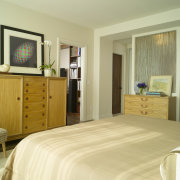
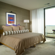
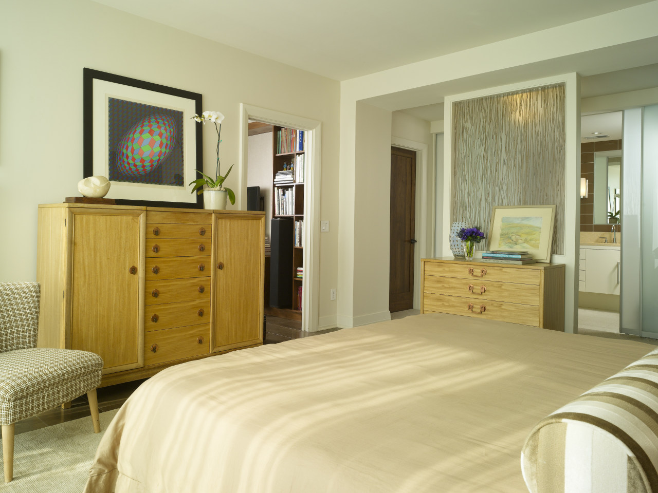
Other changes included sacrificing the third bedroom and hallway to create a cozy den with a wide opening off the living room. This room leads to a completely reconfigured master suite. This room was designed around an authentic Mid-Century Modern suite originally owned by Scott's parents, says Williams.
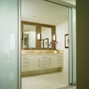
A silk-covered accent wall in the master bedroom provides a neutral, textural element that is a counterpoint to the glass walls, including the reeded glass wall of the dressing room. Translucent glass walls in the bathroom ensure this room also benefits from borrowed light.
Credit list
Builder
Glass sliding doors
Paints and varnishes
Dining table
Living room sofa
Crystal lamp and Stage floor lamp
Kitchen cabinets
Backsplash
Master bathroom faucets
Story by: Colleen Hawkes
Home kitchen bathroom commercial design
Eclectic meets elan
At home in the country
More than an addition
