Orange zest
Bright orange enlivens this white kitchen
Many older homes have kitchens that have evolved over time. And more often than not, the end result is a hodgepodge of styles and poorly executed renovations.
The original kitchen in this house was a good example of what not to do, says designer Royston Wilson.
"The ceiling had so many bulkheads it looked like the surface of the moon. The owners were also unhappy about three awkward corners that could not be used, and disliked the fact that the kitchen window faced a neighbor's house."
Wilson says the owners requested the window be moved. They also asked for a streamlined, highly functional all-white kitchen with plenty of gadgets.
"With one of the owners a passionate cook and one a barista, plenty of storage and a coffee machine were essential."
The designer says once he was armed with all the relevant information, he then set about doing exactly the opposite of what was requested he kept the window and decided a splash of color was just what was needed in the kitchen.
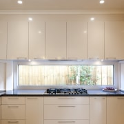
"Rather than remove the window entirely, we introduced a longer, narrow window. This obscures the house next door, yet highlights an attractive creeper. The new window is a fixed panel with a wider frame that creates the illusion of a picture frame."
Bulkheads were removed to create a uniform ceiling and the layout of the open-plan space was flipped. The shape of the kitchen is similar to the original, but on the other side of the room.
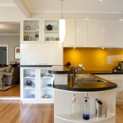
"This created a better work triangle," Wilson says. "To cater to both the cook and the barista, the cabinetry was extended past the peninsula, providing a modern interpretation of a dresser. This houses the coffee machine, and glass-fronted cabinets, which display a teapot collection and stemware. With this area designated for the husband, the wife has the kitchen to herself. We provided a higher counter height here to better suit the husband's taller stature.
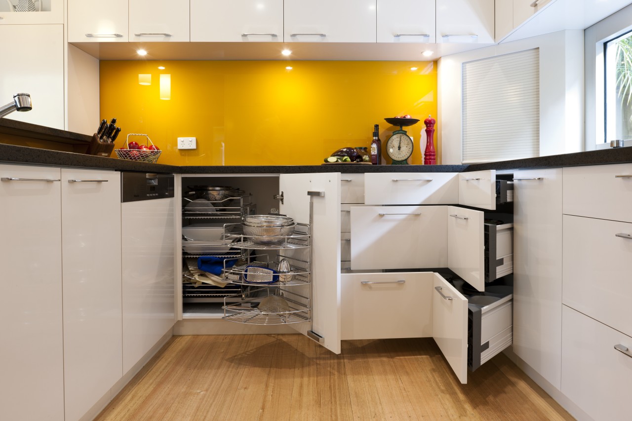
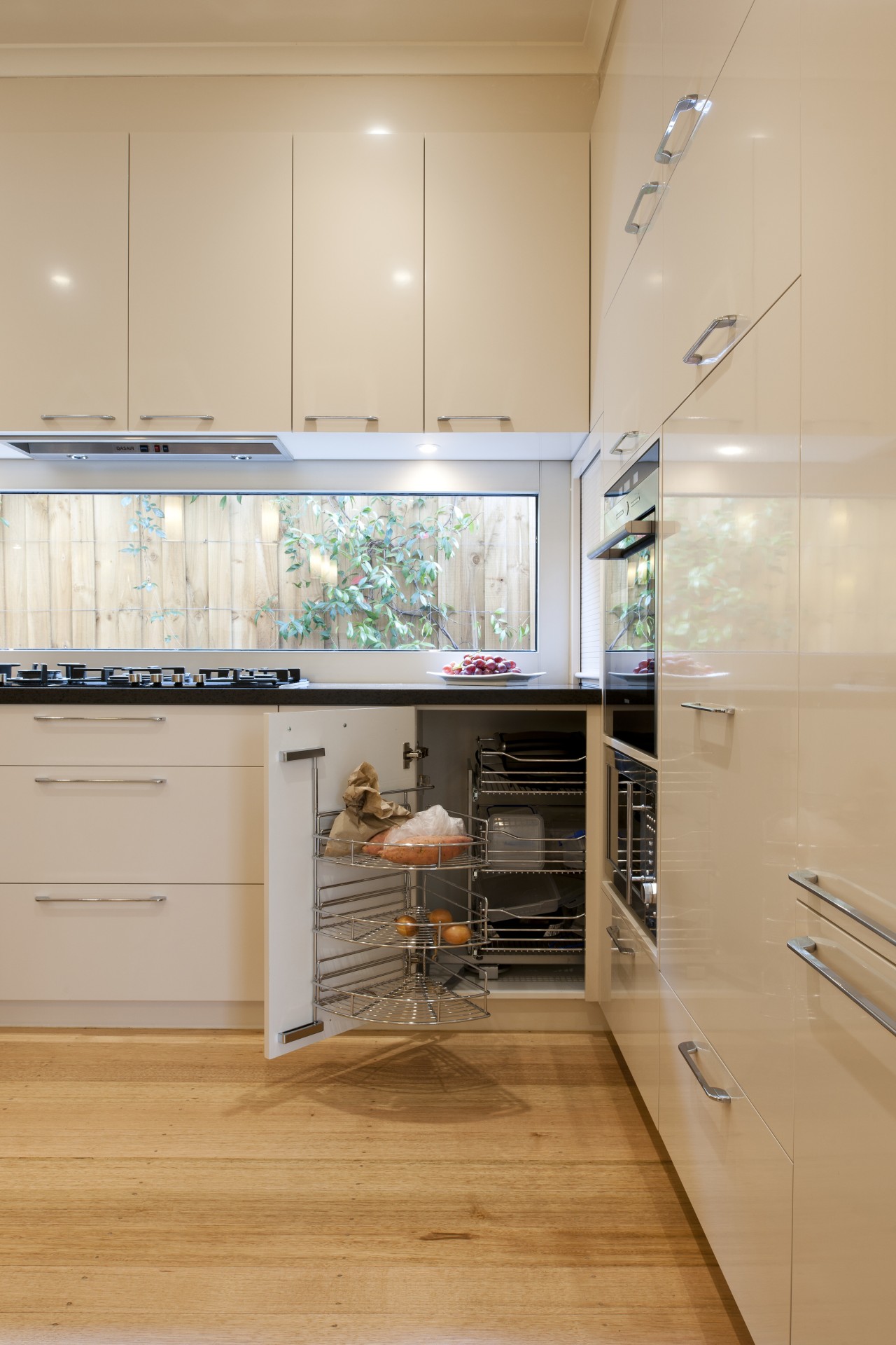
"Due to the shape of the kitchen, we could not get rid of the three corners, but with the right corner systems, these are now usable, easily accessed cupboards."
The piéce de resistance in the space is a bright orange glass backsplash, which makes a dramatic contrast to the dark brown quartz countertops and sleek, white lacquered cabinets.
"The strong orange integrates well with the green landscape, and the clients love it," says Wilson.
Story by: Colleen Hawkes
Photography by: Andrew Ashton
Home kitchen bathroom commercial design
Surface attraction
In tune with the land
Light-hearted by the sea
