Open to view
Corporate branding takes on a whole new look with this purpose-built workplace that reflects the dynamic culture of a progressive telecommunications company
Designing new office space from scratch provides an ideal opportunity to walk the talk when it comes to putting company philosophy into practice.
And for the designers of the new Vodafone premises in Auckland, it was also a chance to create a landmark building in more ways than one.
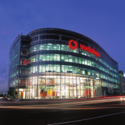
Built on a prominent corner site at Viaduct Harbour, on the fringe of the Auckland CBD, the six-storey Vodafone building is the second of three signature buildings being developed by Newcrest Group. Its high-profile position, and local council requirements, determined the need for a design that would make a strong architectural statement, says architect Andy Anderson of Jasmax.
"The council wanted a design that would give something back to the city a building people could react to," he says. "There was a need to emphasise the corner, hence the offset facade."
The location is further highlighted by a sweeping, curvilinear design that effectively pushes the building to the fore, and by a fully glazed exterior.
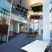
"The whole building delineates the corner and becomes a statement in itself," says Anderson. "Its position as a link between the public spaces of the waterfront and Victoria Park is also acknowledged in the design. There is a line of sight that runs, with a slight twist, from the outdoor podium on the north side, through the double-height atrium to reception on the south side overlooking the park."
The glazed exterior also provides a transparency that fits with Vodafone's corporate image. Finance director David Sullivan says the new premises needed to reflect the Vodafone brand and the way the company works.
"We have a very open, interactive workplace and we wanted to be seen at work living the brand, as it were," he says. "We wanted a work environment that would deliver on our customer expectations, one that would show our mobility and demonstrate our technology at work."
The expansive 2500m² floor plates with 3m-high ceilings provide the right type of space to make this possible, says Anderson.
"Providing a very thin edge to the building with floor-to-ceiling glazing, and setting the bulkheads back from the edge, enhances the transparency."
The interior design was lead by Geyer from Australia in collaboration with Jasmax. Tim Hooson, Jasmax director of interiors, says the company has worked with Vodafone previously and is familiar with the internal culture, and the need for a highly flexible and open workplace.
"The concept of the open-plan office has been taken to a whole new level," he says. "Vodafone determined that a lot of people didn't need to be tethered to a desk. For such a highly mobile work force, unassigned seating was a better option.
"This is also a very collaborative group, so we have promoted the concept of less individual space and more collective space."
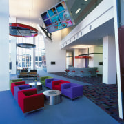
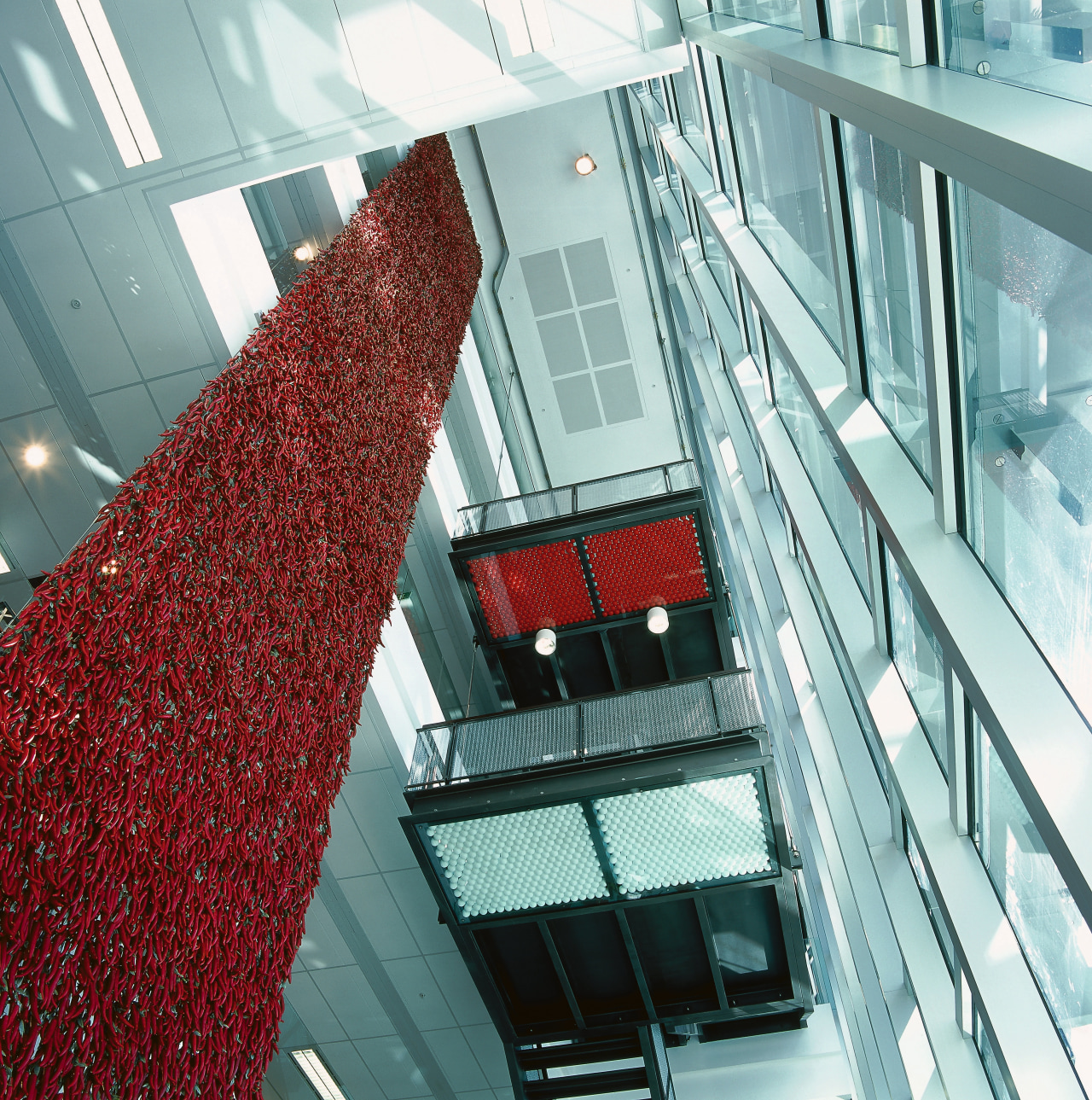
To this end, there are many unassigned desks, collaborative tables with stools, and several casual meeting areas on each floor. Staff interaction is further encouraged by an open internal staircase with large landing areas for chance encounters. Coffee areas are also beside the stairs and positioned to maximise the water views.
There are no fixed phone lines, which adds to staff mobility. But, having such a mobile workforce can make it harder to find people, says Hooson.
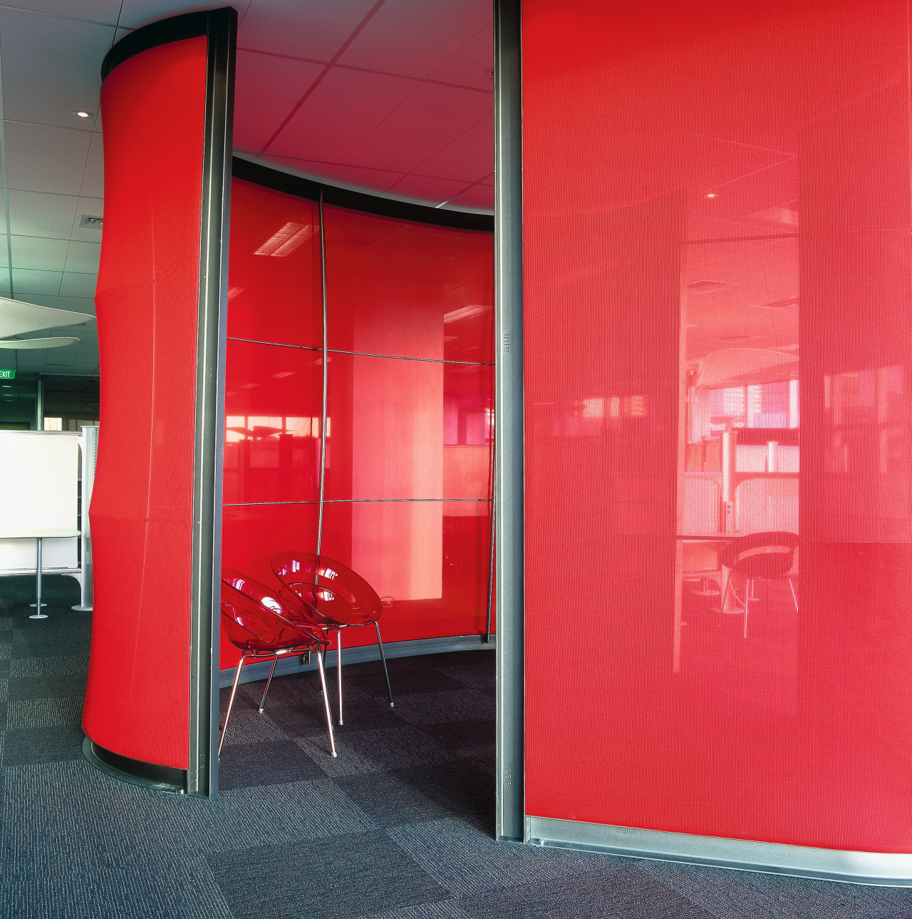
"Bright graphics help by providing signposting the graphics are the same design on each floor. Similarly, there are bright red meeting pods in a similar position on each floor. These vibrant, innovative features also energize the space just as the colourful furniture and lighting fixtures do in reception."
Credit list
Developer
Structural engineering
Services engineering
Canopy glazing
Roofing
Steelwork
Stainless steel metalwork
Internal metalwork
Precast beams
Precast panels
Raised access floors
Lifts
Floor coverings
Doors
Main contractor
Interior contractor
Data and communications
Curtain walling and sun louvres
Stonework
Podium and roof slab waterproofing
Fall restraint metalwork
Aluminium walkway
Precast flooring
Precast stairs
Ceilings
Blinds
Carpentry
Desking
Story by: Trendsideas
Home kitchen bathroom commercial design
Thrice as nice
Marvellous in marble
The beauty of understatement
