On the right wavelength
With its retro '70s styling and eye-catching graphics, this radio station fitout reinforces the funky, creative culture of today's broadcasting media

WKRP in Cincinnati was one of the most successful television comedies of the '70s, but it left a legacy: no radio station would ever be seen again in quite the same light.
And while the larger-than-life characters and improbable situations provided plenty of laughs, there was always an underlying reality broadcasters, DJs and creative account managers need to maintain high energy levels and work in a creative environment.
When Canwest's Waikato operation moved to new premises, the need for a funky, fun workplace was a key part of the brief given to senior designer Kathryn Taylor of Chow:Hill.
The Radioworks, as the Hamilton business is known, provides studio facilities for several radio stations. It is also the national office for Canwest's accounts department and provides office facilities for two television channels.
Canwest chief operating officer Sussan Turner says the work environment needed to reflect the radio culture.
"The fitout had to be interesting, vibrant and upbeat a high-energy environment that would reflect the creative, playful aspect of this business. We wanted staff to enjoy coming to work and we wanted that wow factor."
Turner says durability was also a major concern. The fitout needed to be able to cope with boisterous cricket matches in the corridors and unwieldy promotional material regularly brought into the office.

Taylor says moving into a '70s building provided the ideal opportunity to meet the design objectives. Refurbishing the 12th floor of the high-rise also allowed a more open-plan office interior, which was in keeping with the company culture.
"Function determined the space planning to begin with," she says. "We worked out which groups of people needed to be next to each other, and the type of space each group needed."
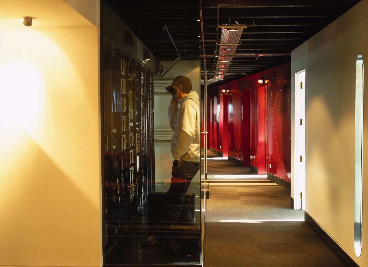
The design incorporates two main corridors either side of a central service core. Broadcasting studios are positioned along one passage, while the other corridor leads to accounts offices, the staff kitchen and the boardroom.
A bright-red wall with large branding graphics is a feature of the corridor leading to the reception area. It's a colour repeated on walls, doors and banquette seating in other areas of the office.
"We wanted some control over the art work in reception, so we could avoid the proliferation of photos and posters that frequently clutter radio station reception areas," says Taylor. "Creating a strong design focus helps achieve this. Using colour and graphics was also a way to inject vibrancy without having a colour or design that would date quickly."
A long, grey-and-white striped carpet in the lift lobby reflects the '70s influence of the building and helps direct visitors to reception. The carpet, which curves up over the reception desk, is also a visual reference to radio waves, says Taylor.
"The stripes have been broken up in other areas, reducing to just an occasional single line on the carpet."

Exposing the concrete double-T section in the ceiling on one side of the building created more height in this area and reinforces the main axis within the space.
"It was also a way to get back the basics of the building structure," says Taylor. "Where possible, we have worked to enhance existing features."
The '70s influence is also reflected in curved shapes and cut-outs in the studio doors where staff can be seen at work.
"The company likes to involve clients in the operation visitors are taken on a tour past the studios where they can see and hear what's going on," says Taylor.
Subtle graphics on the frosted glass doors to the boardroom, kitchen and accounts office are playful elements that indicate the purpose of each room the door to accounts sports a dollar sign, while the boardroom door spells chat'.
Giant metallic copper graphics on a beige wall also line the corridor leading to these rooms.
The project recently won an NZIA Local Award for Interior Design and an NZIA Resene Colour Award.
Credit list
Main contractor
Electrical engineer and lighting
Graphic design
Glass joinery
Hardware
Paints
Panel fixing system
Boardroom table
Banquette seating
Mechanical engineer, heating and airconditioning
Fire consultant
Signage
Carpet tiles
Fabric on acoustic panels
Tiles
Office chairs, reception furniture
Kitchen flooring
Story by: Trendsideas
Home kitchen bathroom commercial design


