Night and day
A dated condominium gets a lively update, with a new interior that is virtually unrecognizable from the original
Moving to a new property isn't always the best solution when you wish to change your living environment. Sometimes it just takes the eye of an experienced designer to see the possibilities in remodeling your home to better suit your lifestyle.
This two-story condominium is a prime example. After initially considering a move to a new house, the owners decided to stay put, and called in the services of designer Vernon Applegate of Applegate Tran Interiors.
"The interior was rather dated, and the flow between rooms was not good," Applegate says. "The kitchen had little connection with the living spaces and was more of a secondary room, with a small pass-through to the dining area."
Applegate says the owners wanted to update the interior, integrating the kitchen into the main living space so the owners could socialize while preparing meals.
"They wanted a very warm and inviting space one that would have a wow factor. As one of the owners is from the Philippines, they also wanted to introduce an Asian aesthetic. But it needed to be a simplistic design nothing too ornate. They wanted the home to feel like a retreat."
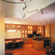
To achieve these objectives the interior was effectively gutted. A wall was removed to integrate the kitchen into the living area.

"We streamlined a lot of features," says Applegate. "The original ceiling, for example, had many different levels. We levelled this surface, and removed the jagged sides of a large structural column accommodating the fireplace, creating a smooth finish to the walls."
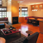
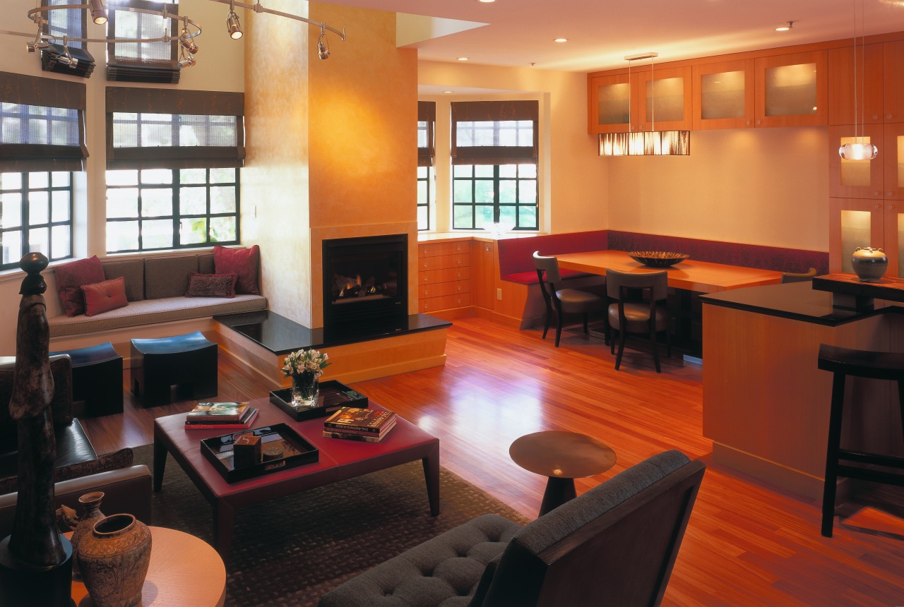
Applegate also ramped the hearth on two sides of the fireplace, providing extra seating when needed. As the owners frequently entertain large numbers of guests, the provision of additional seating was crucial, he says. A new window seat and banquette seating around the dining table also provides space for guests without cluttering up the space with chairs.
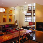
For added visual impact, Applegate designed a new wall with niches to display treasured artifacts. As with other key structural features, the wall has a Venetian plaster finish in a light tangerine shade.
Furnishings in warm tones include a red leather coffee table, bronze stools, a metal side table and a sofa in a textural mix of brown calf-skin leather and fabric.
A single easy chair, while large, has no arms, which helps ensure the room feels spacious. The red banquette seating in the dining area is also space-saving.
Other dramatic touches include black accents, such as the granite countertops and hearth. The black also provides a form of negative detailing in the kitchen, bringing the vertical-grain anigre wood cabinetry into sharp relief. The glass doors of the cabinets are decorated with a hand-carved pattern. With interior lighting, the doors introduce a sense of translucency.
A circular light fixture adds another sculptural element to the room. Applegate says it also helps to visually contain the living area within the two-story void, preventing the space from feeling and looking like an elevator shaft.
The original bleached maple flooring, which squeaked when walked on, was replaced with an African hardwood.
"We chose narrow boards in a select grain to provide uniformity," says Applegate.
Rooms on the second level were also refurbished. Applegate says the master bedroom is long and narrow a shape that was emphasized in the original room by a set of mirrored doors at one end. These were removed, along with other fixtures, and a new wall of cabinets at the entrance was angled to deflect the long shape.
In addition, a new wall of closet space was provided. This features doors with opaque glass panels that add translucency, making the space appear larger. Illuminated niches break up the expanse of cabinetry and provide places to display the owners' collected artworks.
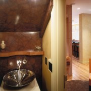
The master bathroom was also gutted, and made larger by taking a small amount of space from the bedroom. A cantilevered wood vanity unit further enhances the sense of space and helps to visually warm the room.
Credit list
Kitchen manufacturer
Blinds
Kitchen cabinetry
Sink
Oven, cooktop and ventilation
Dishwasher
Master bathroom basin and tub
Story by: Trendsideas
Home kitchen bathroom commercial design
In tune with the land
Light-hearted by the sea
Surface attraction
