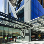
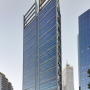
New perspective Brookfield Place
BHP Billiton in Hassell-designed Brookfield Place
Urban renewal is a key focus for city planners, but there is always a dichotomy namely, the need to balance the requirements of commercial tenants with the needs of the people who live, work and play in the CBD.
A new mixed-use development in Perth, which was developed by Brookfield and designed by Hassell and Fitzpatrick + Partners, addresses both these factors. Brookfield Place, at 125 St Georges Terrace, has emerged from an abandoned excavation that had scarred the city for 25 years. Heritage buildings fronting the site had also been left derelict for much of this time.
For Brookfield, the site presented an unparalleled opportunity for redevelopment, says Nicholas Ozich, senior development manager, WA for Brookfield Office Properties.
"It is rare to be able to acquire such a large site in the middle of the CBD, especially one that naturally lends itself to creating a landmark tower within an entertainment precinct with a network of public spaces and connections," Ozich says. "We saw the heritage architecture as a positive attribute, despite its derelict condition. Perth doesn't have many clusters of heritage buildings, and these were quite special in terms of their architecture and building quality."
Ozich says Brookfield undertook extensive research to determine the best use for the site, to ensure the precinct would not only meet the needs of the workforce but also be a destination for visitors.
"It became clear that in addition to the planned office tower, we needed to introduce a wide variety of amenities, including cafes, restaurants, bars, art galleries, convenience retail stores, a gymnasium and childcare centre. All of these facilities would attract people to the precinct, not only by day, but also by night."
The heritage buildings were consequently restored to provide offices on the upper levels and retail amenities on the ground floor. Project architect Andrew Low of Hassell says many of the buildings now open up onto linked courtyards on a street below the main podium level.
"Excavating at the rear of these buildings was a way to maximise the basement areas, and create inviting alfresco spaces. In Perth we have an indoor-outdoor lifestyle, but until now we didn't have it in the centre of the city."
Low says one of the key design challenges for the redevelopment was managing the sheer size of the 45-storey office tower, which boasts one of the largest floorplates in the Southern Hemisphere.
"It was obvious the tower had to be large, but the design needed to relate to the scale, texture and spatial qualities of the heritage buildings within the precinct," Low says. "We wanted to ensure these would not be overwhelmed. Urban spaces are not just about providing a front door to a commercial tower they are about people, so we needed a much more integrated approach. This in turn led to the idea of layering a system of streets, lanes and squares over the top of the development, which would not only address the entry points to the tower but also activate the entire area."

To moderate the perceived size of the tower itself, and to bring a human scale to the development, the design team added a podium level to the building. The scale of the new lobby and associated mass was also deliberately matched to the height of the heritage buildings opposite.
"At street level, the two building masses the new and the old - are roughly equal," says Low. "They flank the street, and there is no sense of disconnection. The public realm bridges the gap between the two, creating a series of spaces that complement the nature of the surrounding built environment."
In keeping with modern practices, the design of the tower was driven by the needs of the workplace, and the desire to achieve 5-Star Green Star and 4½-Star NABERS ratings both desired by the anchor tenant, leading resources company BHP Billiton.
"To maximise the huge floorplates, we moved the core out to the perimeter," says Low. "Having an offset core also provides much better connectivity right across the floorplate, and opens up the view to all workers."
The offset core helped to determine another key design feature of the building the exposed K-frame structure on both sides.
"This structural bracing helps to stabilise the building, which is anchored by the core on the other side. Exposing the bracing creates a strong, robust aesthetic that resonates with BHP Billiton it expresses the very nature of their business."
The exterior is also activated by glass lifts in the core, which provide views for workers.
An angled steel crown element on top of the building has a structural role to play in terms of load transference, but it is also a visual feature.
"We needed a way to finish off the building so it would not be a big square block on the skyline," says Low. "The steel tapers gently, conveying a sense of lightness rather than a monolithic mass, and it alludes to the mining industry."
Hassell also designed the fit-out for BHP Billiton, which occupies 60,000m². Architect Caroline Diesner says the move into new premises was a huge consolidation project for BHP Billiton, which was merging staff from 25 separate locations.

"The move was all about creating one BHP Billiton one place, one culture. The company wanted an equitable, rather than hierarchical working space, with no separate offices. Everyone is valued equally and this needed to be reflected in the design."
In line with this philosophy, the fit-out includes a 1600m² external terrace on top of the podium on Level 4. This faces north overlooking the heritage buildings and is available to all staff. The fit-out also provides a double-height breakout space on the top floor with a diverse range of seating, which Diesner says has more in common with a Qantas lounge than a traditional office.
The first four floors of the fit-out, which include floorplates within the podium, are referred to as the infrastructure zone, says Diesner.
"This is essentially a front-of-house client space that incorporates meeting and training rooms.
"Transparency was another important driver for the design. This building is the highly visible face of BHP Billiton it is clearly part of this city. We wanted to continue this on the inside, so we cut holes in the floorplates, creating voids with internal staircases that link two floors. These voids alternate from one side of the building to the other. It is not an atrium, but rather a collection of linked floors that create an open, interactive workplace. There is now a real sense of connectivity, which is a big change from the discrete units of BHP Billiton's former set-up."
Diesner says that while staff have their own workstations, the office was designed to provide an activity-based workplace if required. It is also future proofed to accommodate change.
"We have addressed environmental concerns as well. We continued on from the base building's 5-Star Green Star specification with a 5-Star Green Star interior. This has included the extensive use of recycled jarrah to many of the floors, from buildings demolished locally."
Nick Ozich says sustainability will also be a key feature of a second tower now being planned for the north side of the site. This will include a tri-generation energy system.
Ozich says the Brookfield Place redevelopment has already met the company's vision, in every possible way.
"We are very happy with the outcome. Brookfield Place has created a destination that can be enjoyed by visitors, residents and inner city workers alike."
Story by: Trendsideas
Home kitchen bathroom commercial design


