New panelled kitchen matches its traditional Queenslander home
Pale and traditional, with just the right amount of detailing, this Hamptons style kitchen connects to disparate spaces as well as city outlooks

Nothing exists in a vacuum and this applies in particular when pursuing design harmony. A wealth of detail in one area, for example, can fast turn into excess when continued into another.
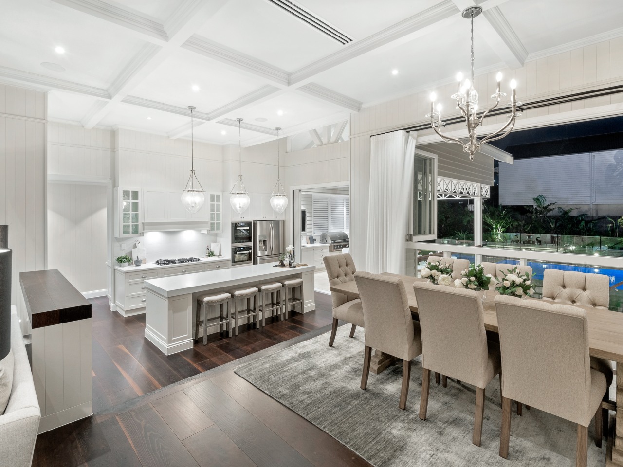
The brief to architect Claus Ejlersten for this kitchen was for it to connect with both the wider interiors and to the adjacent indoor-outdoor room and pool – as well as incorporating views to the city. The owners also wanted the kitchen to have a relaxed Hamptons style, sympathetic to the large Queenslander home.

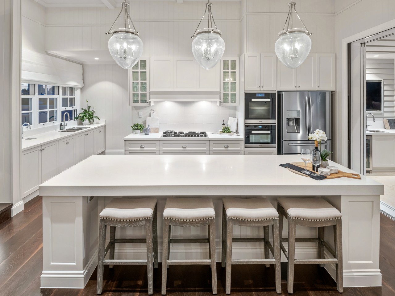
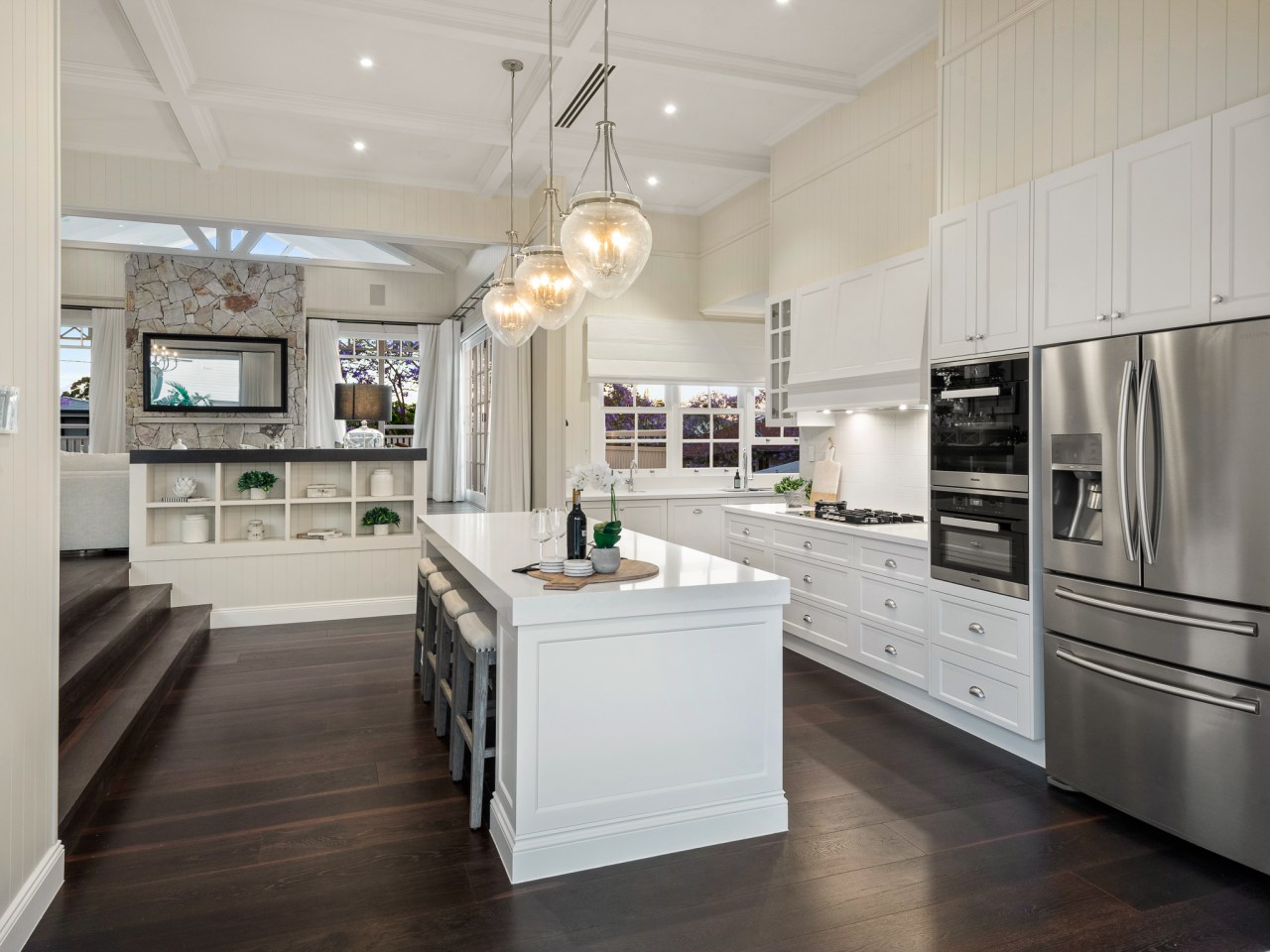
With plenty of detailing seen in the home, Ejlersten designed the new kitchen in a more pared-back, modern version of Hamptons style, with shaker-style drawers and stone benches.
“To achieve the relaxed outdoor connection required, we opened the kitchen to the alfresco room and pool beyond with large sliding doors – so the spaces flow together,” says Ejlersten.

However, connecting the kitchen with the wider interiors presented more of a challenge. Located on the first floor, the kitchen area had a lower floor in relation to the rest of this level. While this made it easier to link to the outdoors, it was also trickier to make the kitchen feel part of the dining and lounge area.
To achieve the latter, Ejlersten extended the high coffered ceilings into the kitchen along with the beadboard finish on the walls.
While the kitchen is oriented to face the outdoor zone and dining/living space, the architect also created a bay window on the other side of the workspace to take in views towards the city. The prep sink is located in this area.
“As the kitchen was a large, open space we had limited room for a pantry. Instead, we introduced a scullery behind the main cooking wall. This includes a dishwasher, microwave tower, extended bench space and plenty of storage.”
Credit list
Architect
Cabinetry
Kitchen splashback
Rangehood
Lighting
Cabinetry manufacturer
Benchtops and scullery splashback
Kitchen sink
Cooktop
Floors
Awards
Story by: Charles Moxham
Photography by: Darren Kerr
Home kitchen bathroom commercial design
Continuity meets subtle separation
Small space, big impact
Classic dovetails contemporary
Home Trends Vol. 35/3
There's a sense in which we've established a layout plan that is the basis for nearly all new kitchens – one in which th...
Read More


