New lean-to adds valuable space to this retro kitchen makeover
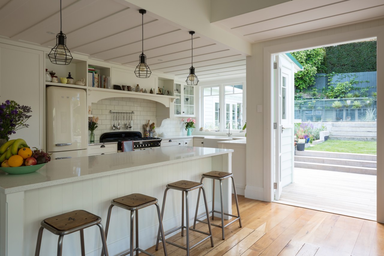
Panelled doors, traditional cabinetry pulls, a retro fridge and subway tiles are all in keeping with the age of the home in this kitchen renovation
What a difference a few added metres make. The existing kitchen prior to this renovation had been pokey and poorly oriented the result of an earlier 1970s refit. As part of a reorganising makeover of the entire transitional bungalow, Architecture Smith + Scully created a seamless lean-to that added valuable space for the kitchen.
Architect Carolyn Smith says the additional metres and a reorientation of the kitchen now opening to the outdoors and adjacent dining room created a space that feels more generous than these changes would suggest.
"The new layout is contemporary in flavour with its open connections and wealth of natural light, but the look of the kitchen is in keeping with the home's 1920s origins," says Smith.
"Elements like the butler's sink, brass pulls, and subway tiles not to mention the gleaming retro Smeg fridge are all suited to the period."
And while slender countertops are again the order of the day in modern kitchens, they also fitted well with the retro feel of this design.
There's a lot of texture in the kitchen the owners definitely did not want a minimal look hence the panelled doors on the cabinetry.
"We added a hearth with shelving at the back of the space, which also suited the period."
The kitchen's low ceiling had to be retained, constricted by other earlier reworkings upstairs. Exposed beams were part of this and now have feature pendant lights suspended from one of them signalling the most social area of the kitchen, the island and pull-up stools.

"We extended the batten ceiling from the dining area for continuity," says Smith. "And similarly, the existing floors were retained and reworked for a seamless flow throughout."
These provide an ideal contrast for a kitchen design where everything is white or cream.
Credit list
Architect
Cabinetmaker
Kitchen sink
Splashback
Refrigeration
Awards
Story by: Charles Moxham
Photography by: Mark Scowen
Home kitchen bathroom commercial design
Silver moons rising
Vibrant spiral stairs improve penthouse connections
With deep affection
Home Trends Vol. 33/7
While we might all have ideas for the home design that we want, consulting a good architect or designer will also open u...
Read More