Modern addition design contrasts and complements heritage cottage
Ruby red brick gives way to vertical timber cladding in a modern extension to a 100-year-old home

So you love your beautiful heritage home, but while the classic, detailed facade is stunning, inside the rooms lack logical flow and natural light struggles to penetrate deep into the home. This was the scenario for the owners of this ruby-red brick heritage cottage before designer Janik Dalecki became involved.
"The owners wanted to transform the home into an entertainer's dream, also suitable for their young family," says Dalecki. "While we could have extended the cottage in similar period style, the decision was made to open up the home to a new clean-lined addition at the rear. This was to be a contemporary building that contrasts and yet complements the 100-year-old home creating a strong design statement."
A straight-on street view allows the cottage facade to dominate, but walk on a few steps to view the house at an angle and the minimalist addition in waxed hardwood is seen behind.
"By opening up the layout of the cottage and complementing its intricate architectural detailing with a striking, modern addition, we gave the home a second life, transforming it into a modern three-bedroom, two-bathroom home," Dalecki says.
Of course, as well as achieving a stand-out look, a contemporary addition allows for all the other benefits of modern architecture, such as flowing airy spaces, flooded with natural light.

Much of the cottage layout was retained, but the master suite was relocated to the rear of the addition, for privacy, while the kitchen was repositioned from the rear corner of the existing cottage to the heart of the interior.
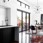
And its the new central combined living, dining and kitchen space ideal for family and entertaining that's the star of the transformed home. The large, open-plan room is partly in the footprint of the modern addition and partly in the cottage, which was opened up at the rear with a rectangular cut-out to facilitate the link.
The old and new work well together here, with the main differences being the raised ceiling and clerestory windows in the kitchen and dining wing area and a subtle change in the jarrah flooring.
Large sliding doors in the dining wing open up to new outdoor areas at the side of the home and capture the sun on the north-facing side.
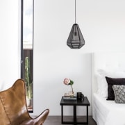
Elsewhere, the detailing or lack of it reminds you whether you are in the new or old part of the home. For example the tall, narrow window in the master suite demarks where the original home ended and is distinctly modern in style.

However, the new family bathroom reflects both old and new. As it is on view from the entry hall, it had to retain a period charm an existing fireplace was retained here while still offering the bathing benefits of modern features.
Besides the living-entertaining space, one of the features of the interior is its sheer flow and ease of use. For example, older homes often had bathrooms at the end of a run of spaces, meaning children might have to traipse from bath to bed through the living spaces. This new plan allows the main bathroom to be accessed from the existing bedrooms and the living area.
"The addition is only a third of the size of the cottage again. However, its arrangement and architecture gives a sense that the original home has almost doubled in size," says Dalecki.
While the addition has contrasting materials and sharp, minimalist lines to let the intricate details of the existing heritage home shine, the neutral colour scheme and continuation of the existing floorboards into the new section offers a relaxed transition between two distinct eras.
Story by: Charles Moxham
Photography by: Dion Robeson
Home kitchen bathroom commercial design
Sculptural centrepiece
Radical yet respectful
Curvaceous and connected
Home Trends Vol. 33/7
While we might all have ideas for the home design that we want, consulting a good architect or designer will also open u...
Read More


