Matched to memories
Evocative textures connect with the owner's vintage trinkets in this kitchen – the new and old elevating each other's presence
Designed by Michael Murray Studio
Design brief and resolution:
Within our homes, many of us strive to perfect the art of balancing the old with the new.
Bold and textural, this kitchen does this effortlessly.
With their lives spent collecting and curating vintage furniture, the homeowners wanted a space that was both contemporary yet harmonious with their sentimental treasures.
With a generous ceiling height, the eye is immediately drawn to the earthy tones and textures within the kitchen.
The two geometric pendant lights make a dramatic statement in the open plan room.
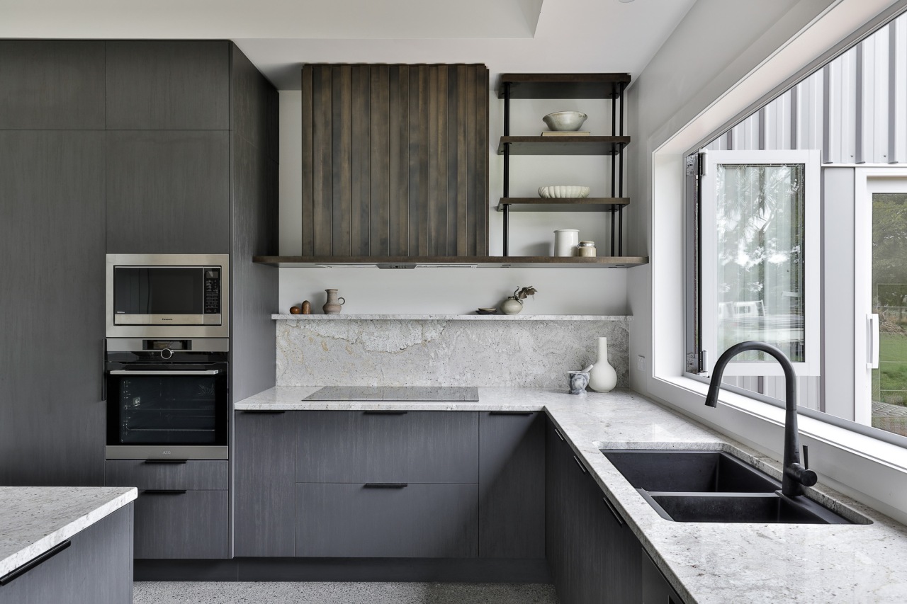
The brassy Melamine Patina battening on the rangehood and around the island adds linear uniformity to the space.
This is offset by the organic flowing veins in the natural granite benchtop.
Just like most vintage pieces, the river stone reveals its true beauty when witnessed up close – its embedded red stones sparkle when met with natural light.
The tonal colour palette is complemented by a polished concrete floor, enhancing the overall sophistication of this kitchen.
All the stainless steel appliances sit within carbon timberland finish cabinetry, making their presence unobtrusive to the flow of the space.
The matte black handles are a discrete and minimal feature on the Blum soft-close drawers.
The powder-coated shelving and stone upstand situated above the cooktop displays the couple’s beloved trinkets – not only an intriguing focal point when guests enter the kitchen, but also a cherished nod to the past for the homeowners.
The vintage and the new elevate and embrace each other's presence in this striking setting.
Points of note:
- Placement of fridge, which is outside the NKBA working triangle distance, was requested by owners.
- Fridge has a recessed frame to hide the ventilation gap and to allow the owners to transition to a 90cm fridge at a later date – extra ventilation for fridge is in bulkhead.
- Dishwasher placement was designed to be well away from the high traffic cooking zone.
- Batten detail is 18mm Melamine in the Patina colour to mimic aged metal to add a warmth to the other colours in the room – the battens are glued and biscuit joined with 50mm spacing and width.
- Ambient Led lighting was requested by the homeowner – recessed Led lighting was used under the island benchtop and upwards around the batten rangehood – this allowed the homeowner to have a warm ambient glow on the Melamine Patina at night.
- Owner also requested a corner solution for the only corner in the design for better access.
Credit list
Cabinetry
Benchtops
Lighting
Kitchen sink
Oven
Ventilation
Kitchen manufacturer
Flooring
Splashback
Taps
Cooktop and refrigeration
Awards
Home kitchen bathroom commercial design


