Making room in the kitchen
Sometimes the big picture is central to a kitchen's design – here, adroit planning resulted in a more roomy, functional heart-of-the-home kitchen
Designed by Felicity Brenchley Architects
From the architects:
Set in a leafy pocket of Hillsborough, the original three-bedroom 1970s house had an architectural charm typical of the period as well as several common issues: uninsulated concrete blockwork walls, a leaking flat roof, mouldy ceilings, draughty windows, small rooms and old cabinetry.
The brief
The owners’ brief was simple: they loved the character of the original house but couldn’t live there long-term with the issues that came with it, so something had to change.
A new roof, thermal insulation & double-glazed windows were non-negotiables.
The kitchen was narrow and dark although perfectly positioned next to the dining nook with its curved feature wall.
Kitchen & laundry cabinetry had long exceeded its intended lifespan.
The wider setting
The design response was also simple: keep as much of the existing building fabric as possible while making appropriate alterations to better utilise the existing space and extend the building footprint just enough to meet the needs of a growing family.
This was important to maintain the character of the building as well as for waste-minimisation and to work within the project budget.
Overhead powerlines made it impossible to create a large extension (as the owners had originally hoped) with living & kitchen areas to the north-east.
Instead, a smaller extension to the south-west houses two new children’s bedrooms whilst careful re-planning of the bathroom, laundry & exisng bedroom spaces provided a home-office & a larger family room with wide sliding doors providing direct access to the outdoor terrace.
Because the owners' priority was increasing the space available for these rooms it made sense to keep the footprint of the kitchen unchanged.
The kitchen
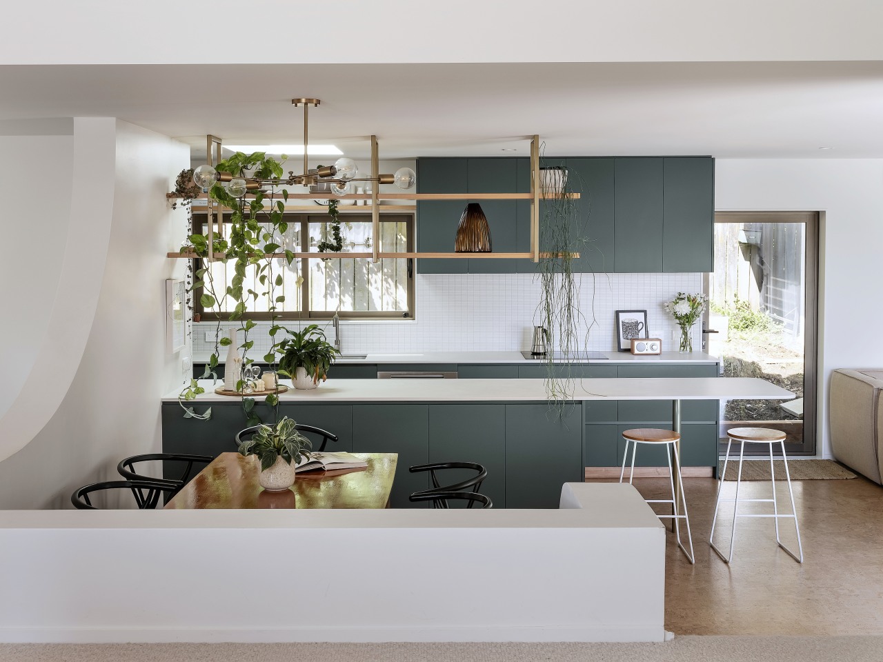
To reduce the feeling of narrowness the wall separating the kitchen from the dining nook was removed.
In its place there is now a peninsula bench with ample storage on both sides & a seating area at one end.
An open shelf hangs over the bench providing a degree of separation whilst still letting light and views into the kitchen.
This shelf also serves as a perfect spot to introduce indoor plants into the space, where they receive daylight from the new double-glazed skylight overhead.
A built-in seat was proposed in the dining area to make better use of the existing nook.
The curves of the nook walls are subtly referenced in the radiused end of the benchtop & the new curved wall leading to the bedrooms from the family room.
The narrowest part of the kitchen houses the pantry, ovens and fridge so that preparation areas can be prioritised in the more open part.
Finishes and insulation
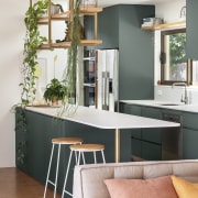
Dark green Dezignatek cabinetry references the site's leafy surrounds and the green outlook from the elevated lounge to the new carport roof garden.
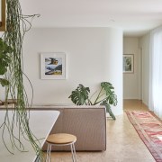
Timber veneer accents reference the original timber wall panelling in the lounge while natural cork flooring brings warmth and softness to the space and suits the era of the original home.
With the kitchen already feeling narrow it was critical that insulating the external walls added minimal thickness to the wall construction.
Spray-foam insulation was used to achieve R3.1 wall insulation within only 65mm thickness.
Double glazed aluminium windows and skylights improve natural daylight & sunlight access to the kitchen, providing much needed warmth whilst eliminating draught and condensation issues.
Credit list
Cabinetry
Benchtops
Splashback
Oven, cooktop, ventilation, dishwasher
Awards
Home kitchen bathroom commercial design
'Worthy of Architectural Digest'
Classic dovetails contemporary
Small space, big impact


