Living your best life
This majestic home has been lovingly restored and renovated, with interiors expanded and reworked for modern living – close attention to design detail and symmetry make it difficult to see where the changes lie
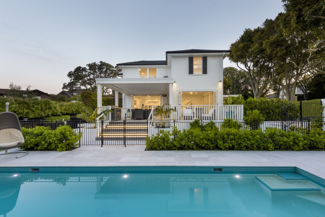
There's something truly selfless about pouring all your architectural and design know-how into painstakingly restoring and almost invisibly modernising an already grand residence. Such was the case with this substantial yet subtle renovation of an iconic St Heliers Home by designer Mark Wilson of Masonry Design Solutions, or MDS.
"When our clients purchased this home, it had previously stayed in one family for a very long time and hadn't been touched for many years. So the home had some really amazing architectural features, traditional features, especially around the staircase and also some of the mouldings in the living rooms and things," says Wilson. "However, the existing layout just didn't work for a modern family and they needed more space."
From the street, the front of the home is a picture of formal symmetry with a stately porte cochère, dignified shutters, weatherboard cladding and a shingle tile roof. While the porte cochère was fairly modest in size, this was retained as it so perfectly matched the proportions of the home.
This front facade was essentially just restored and repainted, with a new garage introduced to one side – the only real external addition to the floorplan. The two and a half car garage seamlessly connects to the home in visual terms, being finished in the same solid timber weatherboards and slate shingles.

However, the home's rear facade was quite a different story in terms of design input, with several factors addressed. The house is two storeys from the front but three storeys at the rear, as it follows the slope of the hill.
Previously, the top level of the house had extended only part way back, with the side roofs providing indication of how the entire rear roofline had looked. However, this top level was extended back to the form seen here – allowing more room for the expanded top level interiors to come.
At the same time a pop-out section was added to the rear facade, culminating at the bottom in a skirt roof over a new further pushed out window/door bay with French doors opening to the rear yard and tennis court.
The ground level pushed element is something of an echo of the porte cochère at the front, but with a slanting skirt roof instead of a flat one, as this better addressed the proportions of the taller rear facade.

Partly due to some changes made way many years earlier, the rear facade had a slightly rambling nature – and this, too, was addressed.
"We kept some windows and introduced others, identical to the existing ones. Essentially, we just tidied up that entire face by moving things around, just to give it more of a sense of verticality and elegance.
"The house certainly doesn't have perfect symmetry from this side but it was really important to get that centre to pop out and to give it some definition, otherwise it was a very flat faced building."
As well as adding a pleasing verticality, the new rear windows were also reconfigured to suit the rooms within.
Other work undertaken in this area was replanting and refreshing the tennis court while MDS also added an outdoor area with fireplace at the end of the court.
And the interiors are as painstakingly celebrated as the home's facade. Entering through the front door you are greeted by an ornate period staircase original to the home.
The art of a great restorer/renovator is knowing when to wade in and when to leave well alone. Here, Wilson reoriented the lower part of the stairs leading to the newly excavated and expanded ground floor. However, from this mid level up the staircase was simply restored and painted, the same with the traditional front door with its delicate lead light windows.

Beside the staircase to the left is a formal living room. As with the exterior, subtle modernising changes were undertaken, but it's hard to spot where.
"Personally, I love this room," says Mark Wilson. "We closed off a doorway to the long family room alongside and extended the existing panelling to make this work – two large paintings occupy the existing panel alongside.
"Similarly, we pulled out all of the ceiling linings and the wall linings but left the ceiling cornice in place – cutting either side of it so that that wouldn't get damaged, ready for the reinstatement of the walls and ceiling.
This restoration and celebration of internal architectural detailing is also an important part of the wider renovation.
"This formal room had windows at the end, but the family like to entertain and wanted to be able to spill out from this room to the deck. So we replaced the fixed windows with bifold doors in the identical style."
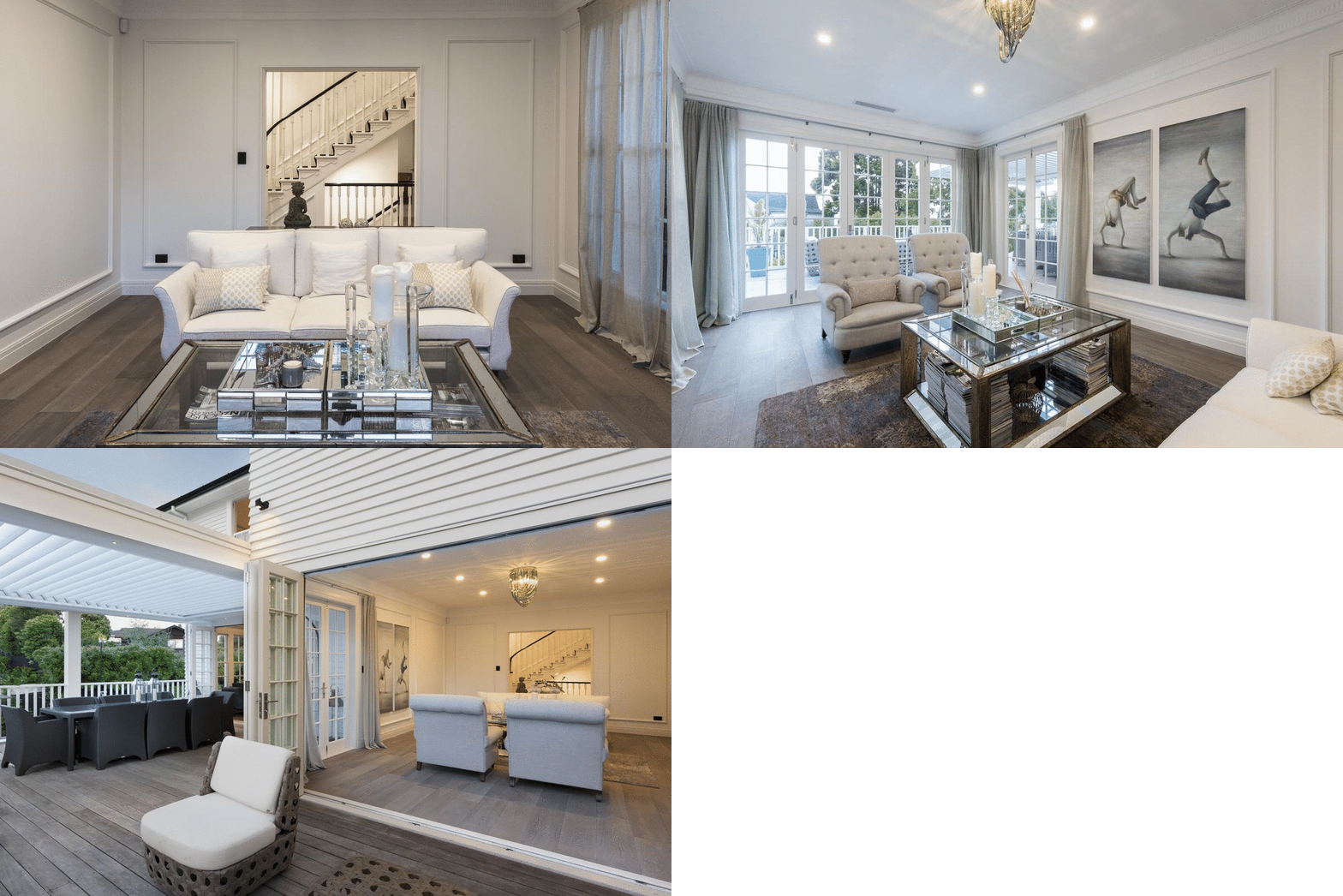
The family room beyond the living room extends along the back of the home, from the new kitchen out to the newly expanded and covered side deck that overlooks the new pool.
The newly stepped out section on the rear of the house accommodates the intimate dining area with its grandstand view of the tennis court.
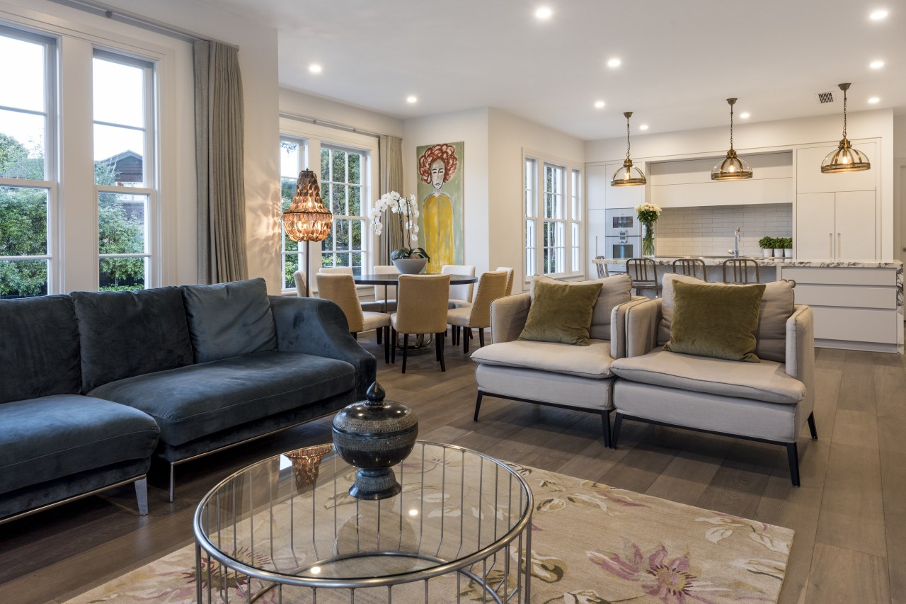
"The well appointed but understated kitchen is served by a walk-in scullery. The owners wanted to let the house itself, tell its own story, rather than us adding too many special features to things like hero cabinetry – they wanted the existing features to sing and, and the new stuff not to take over."
Behind the kitchen there is a door through to a new laundry which in turn connects to the garage.

However, perhaps the most transformative undertaking is seen on the lower level.
"Originally, this was just a small, sort of weird living space and a storage room – probably 30 or 40m² max. Basically, we blasted that out completely and extended that lower floor into the hillside and right along the width to the house.
"So if you're looking at that rear facade, underneath the garage is a full cinema room at left; then in the centre is a large games/rumpus room with a wine cellar, to the rear of that. And lastly to the right, there's a gym that sits underneath the mid level deck. It was in this area that the house gains the most additional living space."
Of course, the newly opened up ground floor is not only great for table tennis, pool and foosball, it also provides a ringside seat to the court action outside.

Climbing up the ornate stairs instead of descending you arrive at the top floor.
"We did do some reconfiguration upstairs in the bedroom areas as well. The existing bedrooms were quite small. However, with the upper level extended back, together with the area the pop out afforded, we had sufficient space to expand from three bedrooms and one bathroom to four bedrooms with three bathrooms, also retaining an existing small office on this level."
Despite all this work, the home looks more like a faithful restoration than an out and out renovation/expansion. Authentic period detailing is celebrated at every turn, while the restructured rear of the home looks similar to the original, but is now crisper, more dynamic, and more symmetrical.
In addition, the owners have travelled extensively and their choice of occasional pieces, beautiful lighting and furniture in particular, really help to make the interior resonate.
With its good bones celebrated and amplified, this grand home really is now living its best life.
Designed by: MDS
Story by: Trendsideas
Home kitchen bathroom commercial design
Radical yet respectful
Sculptural centrepiece
Curvaceous and connected
Home Builders
Start your new home build or renovation project with confidence by choosing the right home builder for you and your fami...
Read More


