Light hearted
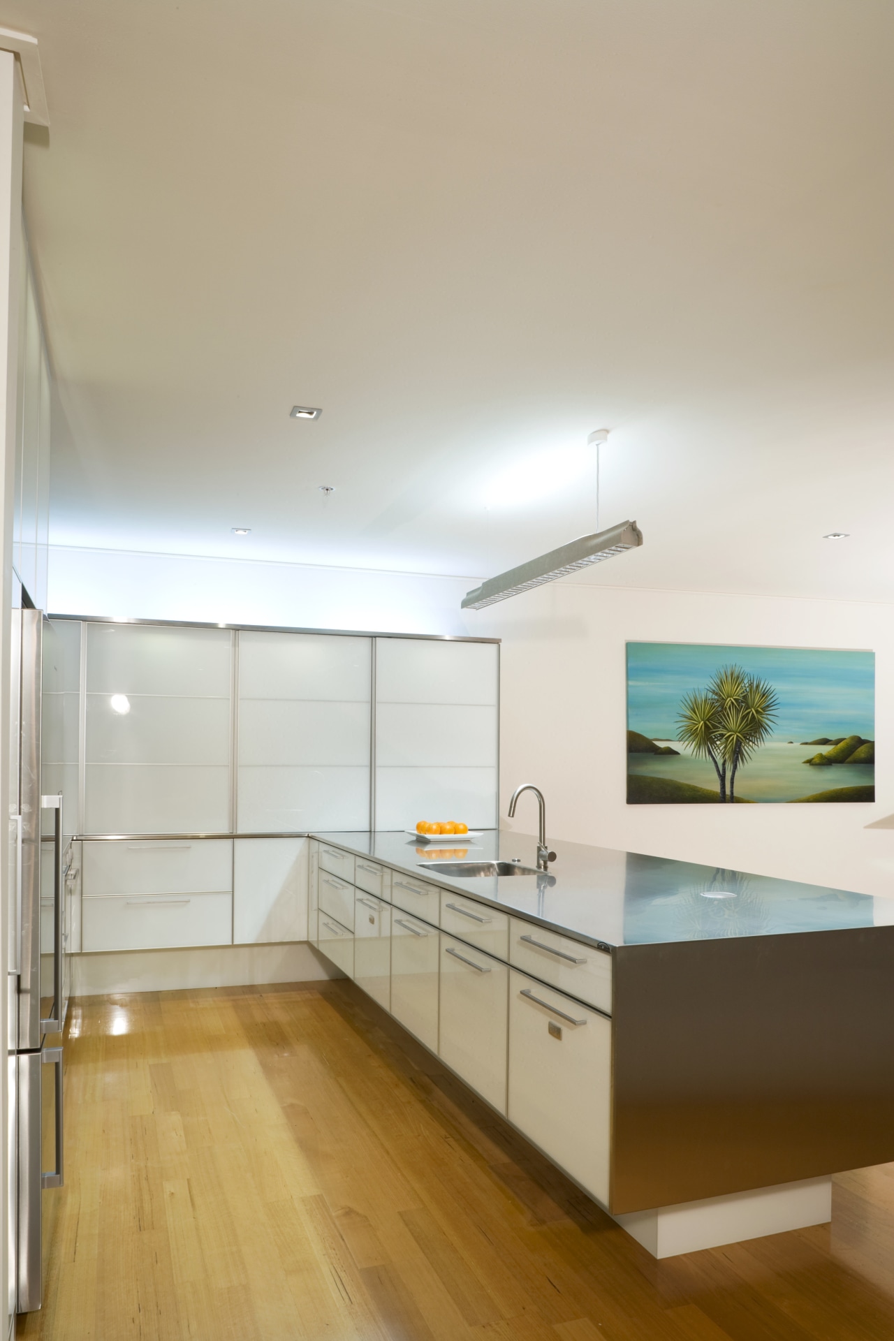
Internally lit glass cabinetry floats above sturdy stainless steel surfaces to bring balance to this kitchen
Designing a new kitchen means thinking about choices of materials carefully. Wear-and-tear will be a factor, as will colour and harmony, but the feel of the materials is just as important. The touch of a steel benchtop, for example, is in marked contrast to that of a textured tile splashback creating an interesting material juxtaposition.
This kitchen was created by kitchen and interior designer Natalie Du Bois in response to the client's request for a striking, minimalist design. The contrast of textures, a subtle interplay of tones and indirect light sources all play their part.
"The kitchen is seen straight ahead along a hall as you enter the apartment, so I wanted it to create a strong first impression," says Du Bois. "To do this, I used two main materials white-backed glass on the cabinetry and brushed stainless steel for the benchtops and appliances. Aluminium, with a similar look to the stainless steel, is used for the cabinetry frames."
Stainless steel forms an enduring, practical work surface and contributes to the kitchen's semi-industrial feel. The stainless steel benchtop on the island wraps over and down one end of the peninsula. Seen from the front door, this gives the illusion that the island is a large, solid block of metal.
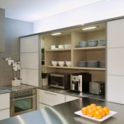
"While the stainless steel reflects light to some extent, the cabinets actually glow from within," says Du Bois. "Lighting the interior of the cabinetry creates a floating, ethereal effect and balances out the stainless steel's solid presence."
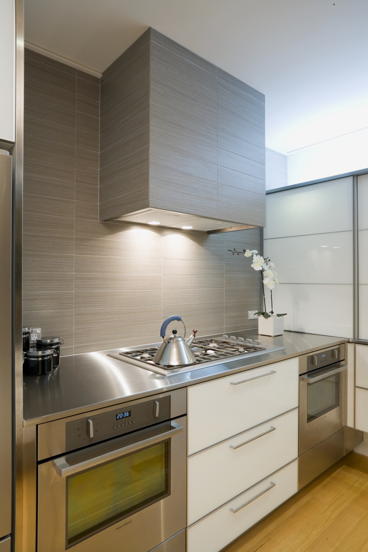
Appearances aside, stainless steel and glass share the qualities of being hygienic and smooth to the touch. To contrast these sleek surfaces, Du Bois introduced textured tiles as a feature wall surface on the oven side of the kitchen. She also ran the tiles right around the rangehood set on this wall.
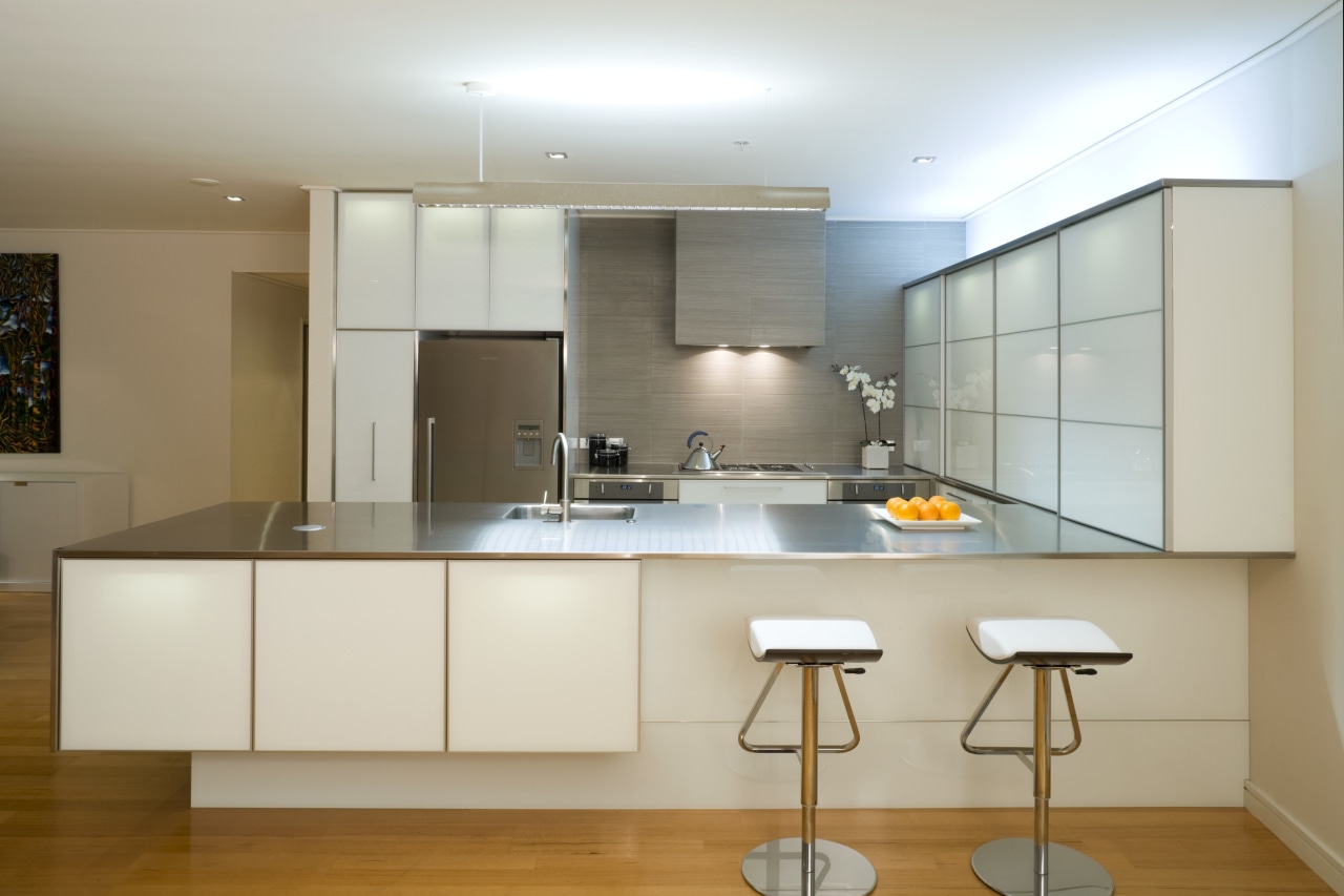
"A combination of taupe, off-red and grey tones contributes to the earthy, reed-like quality of the tiles. Together with the almost shoji look of the internally lit cabinetry, they bring a slight Japanese accent to the design," says Du Bois. "This delicate, refined atmosphere acts as a counterpoint, and at the same time accentuates the semi-industrial look of the benchtops and appliances."
Lighting is an important part of the kitchen's wow factor. Indirect lighting plays onto the ceiling from the tops of the cabinetry, reinforcing the impression that the cabinets are floating in the space. An unusual concrete strip light over the peninsula offers another semi-industrial element to the pared-back design.
Credit list
Kitchen manufacturer
Splashback
Kitchen sink
Oven, cooktop, refrigerator, dishwasher
Lighting
Cabinetry
Benchtops
Taps
Ventilation
Flooring
Story by: Charles Moxham
Home kitchen bathroom commercial design
Classic dovetails contemporary
Small space, big impact
'Worthy of Architectural Digest'
