Let me entertain you
Larger, more spacious and suitable for entertaining were the watchwords from the owners and this well-connected design more than delivers
Designed by Natalie Du Bois, Du Bois Designer Kitchens & Interiors
From the designer:
The brief
My homeowners wanted their new kitchen to feel larger and more spacious than the configuration of their current, small, cramped galley style kitchen.
They also wanted the new space to encourage more entertaining at home – something they didn’t do very often, due to the constraints of the existing space.
The idea of a walk-in pantry room was also on their wish list, so if this could be achieved, they would be very happy.
The room originally had a large angled wall which backed onto the master bedroom, making both rooms very hard to work with.
Both the kitchen and the master bedroom had issues with placement of furniture etc as nothing quite felt right.
The response and problem solving
I advised them that by straightening the wall it would make it feel larger and become more practical.
In the new kitchen design, a long window seat, with a built-in coffee table and large storage drawers, forms a continuation of the kitchen space, making it feel grander – this was achieved by using all the same finishes as I used in the kitchen area.
The upholstered window seat in outdoor fabric not only provides a relaxed area to socialise in but a space for a good-sized dining area and island seating to use day-to-day, and when entertaining, too.
Large bi-fold doors and windows allow natural light to flow into the kitchen and encourage indoor-outdoor flow to the pool and BBQ areas.
The fully clad Caesarstone Rugged concrete island, made by GFL Benchtops, becomes a focal point when you enter the room.
This island has a Miele downdraft induction hob in the centre to reduce the impact of an overhead extractor which would have limited the natural light from the windows and also looked quite cumbersome.
Lastly, an overhead extractor would have detracted from the beautiful Tom Dixon beat pendants over the dining table.
The owners originally couldn’t see past a white kitchen but were later convinced by my suggestion of using soft tonal greys instead, these are teamed up with earthy autumnal tones seen in the accessories and cushions.
Warmth is created by the wire brushed timber shelving and cabinetry as well as the floor.
Both wood stains have been carefully eye matched to work together.
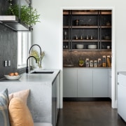
The hexagonal, black marble-look porcelain tiles add more texture and these are brought through into the pantry room to continue the theme.
Black is also found as an accent for many items in this kitchen, including the power points, black sink, mat boiling/chilled tap, and the striking double matt black steel shelf supports. This doubled up look is also seen on the fridge door handles.
Push-to-open Blum servo drive cabinetry is found above the fridge and ovens to make the high cabinetry easy to access.
To give the owners their walk-in pantry room, the bedroom that shares the kitchen’s back wall was reconfigured.
A wide sliding door into the pantry makes the small pantry feel roomier – it also showcases the striking black marble porcelain tiles and shelving that also appear in the kitchen.
We had to work around the owners’ existing dining table and chairs, so new cushions and accessories were sourced and introduced to bring the colours through and blend the old with the new.
I also decided to abut my homeowners' existing dining table to the island to create further room which adds to the wider room's spacious feel.
The outcome
The new kitchen now has flow unlike its cramped predecessor. This flow continues from the kitchen area into the dining and then to the exterior through the new large French doors.
The new kitchen and wider space now feels light and open and really does encourage togetherness with friends and family. And of course it is perfect for entertaining.
(This project comprised of a full home renovation, I was also involved in the design details of their living room, wardrobes and bedrooms, home office, master suite and laundry.)
Credit list
Shelving
Benchtops
Kitchen sink
Ovens
Refrigeration
Waste
Lighting
Cabinetry
Cabinetry hardware
Splashback
Taps
Cooktop/ventilation
Dishwasher
Flooring
Awards
Designed by: Du Bois Designer Kitchens & Interiors
Story by: Trendsideas
Photography by: Michelle Weir
Home kitchen bathroom commercial design
Marvellous in marble
Thrice as nice
The beauty of understatement


