Kitchen renovation opens up surrounding spaces for better flow and functionality
As well as wanting their new kitchen to be open-plan and light-filled, the homeowners needed enough space for more than one family member to use it at a time
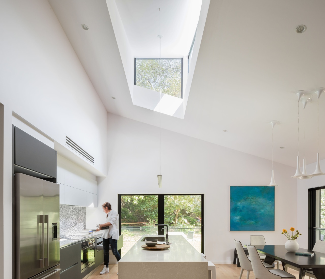
What are the stand-out heroes of the design? It's a question that architects and interior designers ask themselves on every project. On this kitchen design, part of a comprehensive whole-house makeover by architect Melonie Bayl-Smith, the heroes were the abstracts of space and light.
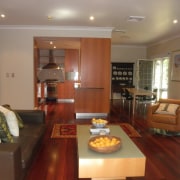
"Prior to this renovation, the interiors had a compartmentalised feel, says Bayl-Smith. "The original heavy, wooden kitchen had been situated at the end of a dead-end U-shaped space."
"This had meant there wasn't room for more than one person to be using it at a time."
Together with wanting an open-plan, light-filled new kitchen, the owners needed sufficient usable space to accommodate more than one family member. They also wanted it to be discreet within the wider area and Bayl-Smith took several approaches to achieve this.
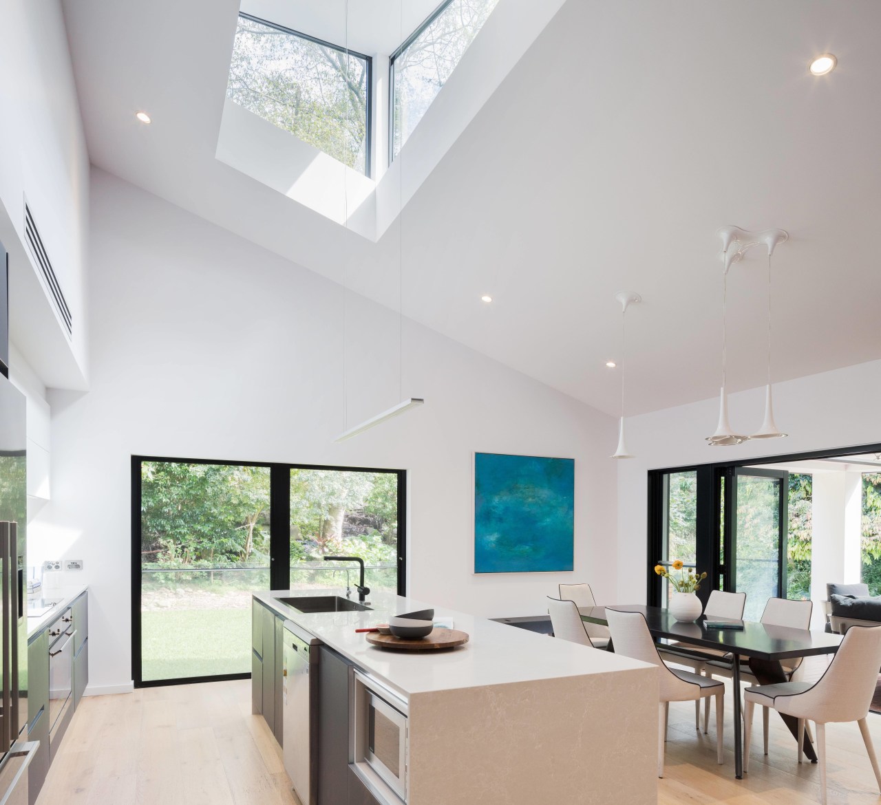
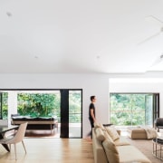
"We decided to hide the kitchen in plain sight. But first we took out walls and opened up the spaces while being mindful to create an overall sense of scale that would be in keeping with the new look.
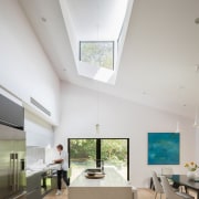
To this end, we removed the old ceiling and replaced it with a raked version to follow the roofline opening up rooms while retaining low ceilings can create a flat look.
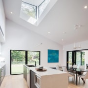
A two-sided clerestory window was also added over the kitchen area."
Having a large bulkhead containing the air conditioning, services, rangehood and lighting allowed the cabinetry and cooking area to integrate with the building.
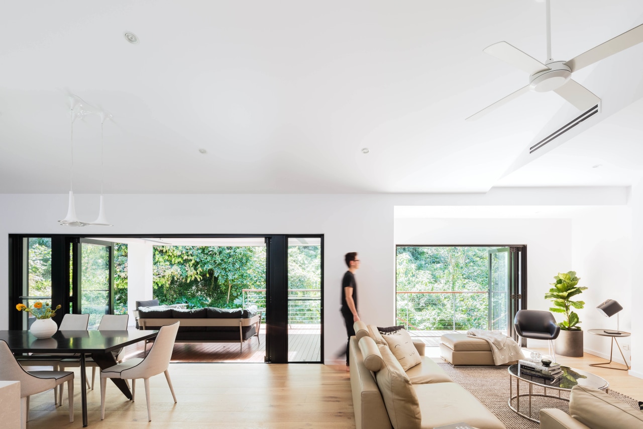
Using components in the Aleve kitchen model by Stosa Cucina, the architect's integrating strategy also included placing pantry cupboards in a nearby stairwell, thereby keeping food storage close by but out of sight.
The light-toned benchtops and glass-fronted doors and drawer fronts reflect light across the space, while the darker cabinetry anchors the island bench in the larger dining and living area.
Large-format tiles on the splashback respond to the proportions of the now open-plan volume.
Credit list
Architect
Cabinetry
Benchtops
Lighting
Kitchen sink
Awards
Interior designer
Flooring
Splashback
Taps
Story by: Charles Moxham
Home kitchen bathroom commercial design
Curvaceous and connected
Silver moons rising
Vibrant spiral stairs improve penthouse connections
Home Trends Vol. 33/6
Renovating a tired and dated kitchen will not only add to your enjoyment of cooking – it can also totally transform the ...
Read More