Kitchen makeover architect Nils Finne's own kitchen
Detail defines this architect's remodeled kitchen
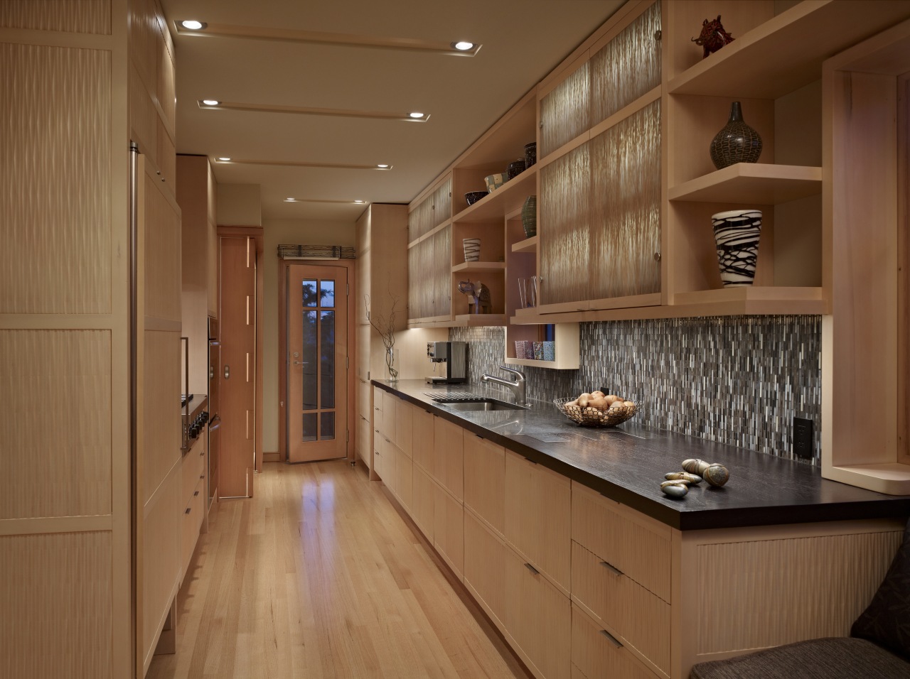
Designing a kitchen for a 1920s Tudor home doesn't have to involve masses of traditional detailing and ornate fixtures and fittings. For architect Nils Finne of Finne Architects, the solution for the remodeled kitchen in his own house was a much more contemporary design but he says he still took a cue from tradition.
"I wanted to bring a fresh, new spirit to the house, which was built in 1927. Although there are no mouldings or traditional details in the kitchen, there is a common language between the two eras. This is based on the use of richly textured materials and obsessive attention to detail and crafting."
Finne says the existing kitchen, which was built decades earlier, was not well laid out, had insufficient counter space, unattractive cabinets and a peeling green linoleum floor.
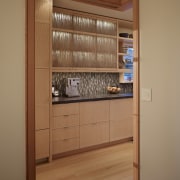
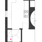
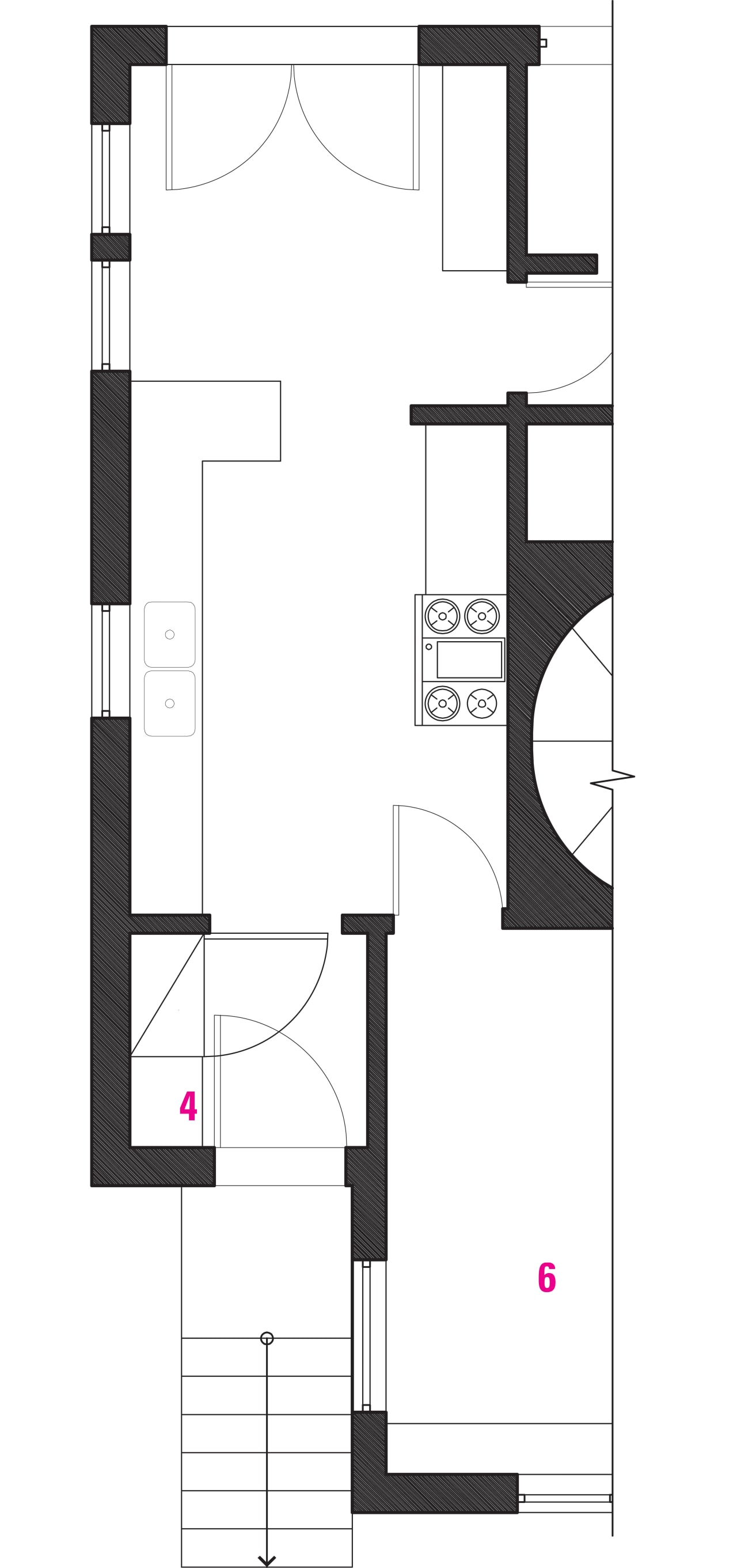
To provide more room, an internal wall was removed, creating a continuous, 25ft-long space for a galley-style kitchen. Custom CNC-routed doors in Alaskan yellow cedar were built without vertical stiles, to create a seamless texture across the lower cabinets. The upper cabinets have resin panels backlit by LED lighting and aluminum reflectors.
The cabinets are teamed with Belgian Blue limestone and black walnut counters. Finne designed an interlocking pattern where the surfaces meet.
"The unusual finger joint not only adds visual interest, but also allows the hard, fossilized quality of the limestone and the rich, warm grain of the walnut to emerge side by side. Behind these tops, a continuous backsplash of glass mosaics provides visual continuity."
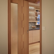
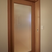
Finne also designed a new L-shaped pocket door with finger joints to screen the adjacent dining room. When open, the door is completely concealed.
Other key features include a new window seat, deep open shelving around a window and laser-cut steel lighting brackets. Sustainability was also a design driver the kitchen is well insulated and filled with natural light. Green materials were used throughout the remodel.
Story by: Trendsideas
Home kitchen bathroom commercial design
