Inside story
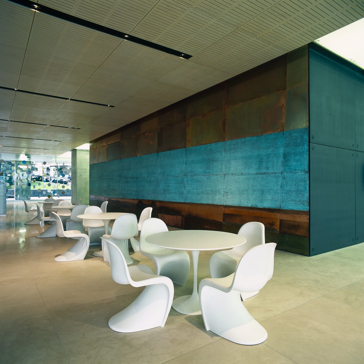
A high level of specification is evident throughout Lumley Centre's interior, from the intricately planned foyer through to lighting and office design

First impressions count for a lot, so if there's any part of an office building where no expense should be spared, it's the foyer.
Art and creative consultant Trish Clark worked with MAP architects and Rod Barnett Exterior Landscaping to create Lumley Centre's foyer. Clark says this collaborative approach is important.

"We needed to work together so we could create an integrated environment across the foyer level," she says.
Clark's major concern was to ensure the foyer's design would be future proof.

"How do you make a foyer feel fresh 40 years on? One of the key things is to have art that has real substance and significance," she says.
Seven artworks are on display in the foyer, four of which were commissioned especially for the project. Clark says it's crucial to incorporate art choices from the very beginning of the design process. This way, art can be literally embedded in the site, so it doesn't look like a token addition. An example of this is a new work by Stephen Bambury that actually forms one wall of the foyer without the artwork, the wall would be incomplete. The work is unusual for Bambury, depicting a typical New Zealand landscape in copper.
Story by: Trendsideas
Home kitchen bathroom commercial design
Small space, big impact
Classic dovetails contemporary
Tranquil waters


